5. Mapping and Monitoring Conflict#
Using ACLED data.
5.1. Summary#
ACLED collects reported information on the type, agents, location, date, and other characteristics of political violence events, demonstration events, and other select non-violent, politically-relevant developments in every country and territory in the world. ACLED focuses on tracking a range of violent and non-violent actions by or affecting political agents, including governments, rebels, militias, identity groups, political parties, external forces, rioters, protesters, and civilians. Source.
This notebook will teach the student how to access ACLED data, analyze it and produce insightful visualizations with it.
5.2. Learning Objectives#
5.2.1. Overall goals#
The main goal of this class is to teach students to work with ACLED data to monitor conflicts in an area of interest.
5.2.2. Specific goals#
At the end of this notebook, you should have gained an understanding and appreciation of the following:
ACLED data:
How to download the data with Export Tool.
How to make an API request to ACLED server.
Understand the ACLED data.
Visualize ACLED data:
Conflict events overtime.
Conflict heatmaps.
Fatalities events maps.
5.3. Get the ACLED data#
Accessing this dataset requires registration in ACLED Access Portal. Once the account is approved, a key for retrieving data can be created.
Data can be obtained using ACLED Export Tool or through an API call.
5.3.1. Using the Data Export Tool#
The Data Export Tool can be accessed here.
Set up any necessary filter. In this example, Syria is studied.
Export the data.
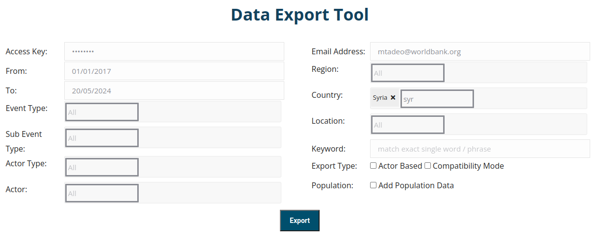
Fig. 5.1 Filters available at Acled Data Export Tool.#
5.3.2. Using the API#
5.3.2.1. What is an API call?#
Application Programming Interface (API) allows applications to communicate between themselves and share information. This example uses API calls to get information from the ACLED database.
5.3.2.2. Example using API call#
To create the API call, first, a URL from where data will be downloaded is needed. ACLED offers a User Guide API that can be explored in order to build the necessary URL, here.
import os
import requests
import pandas as pd
key = os.environ.get('acled') # Retrieve access key from environmental variables
email = os.environ.get('wb_email') # Use the email you used to generate the key
# Filters to apply. This example uses the same filters that were used to download the data with the Data Export Tool
iso_country_code = 760 # 760 is for Syria
start_date = '2017-01-01'
end_date = '2024-05-20'
url = 'https://api.acleddata.com/acled/read?key={}&email={}&iso={}&event_date={}|{}&event_date_where=BETWEEN&limit=0'.format(key, email, iso_country_code, start_date, end_date)
response = requests.get(url)
data = pd.DataFrame(response.json()['data'])
data.head(3)
| event_id_cnty | event_date | year | time_precision | disorder_type | event_type | sub_event_type | actor1 | assoc_actor_1 | inter1 | ... | location | latitude | longitude | geo_precision | source | source_scale | notes | fatalities | tags | timestamp | |
|---|---|---|---|---|---|---|---|---|---|---|---|---|---|---|---|---|---|---|---|---|---|
| 0 | SYR128321 | 2024-05-20 | 2024 | 1 | Political violence | Violence against civilians | Abduction/forced disappearance | QSD: Syrian Democratic Forces | Rebel group | ... | Al-Hawayij | 35.0574 | 40.4924 | 1 | Facebook; SHAAM | New media-National | On 20 May 2024, QSD forces detained four civil... | 0 | 1720477752 | ||
| 1 | SYR128365 | 2024-05-20 | 2024 | 1 | Political violence | Battles | Armed clash | Unidentified Armed Group (Syria) | Political militia | ... | Talilah | 34.5258 | 38.5272 | 2 | New media | On 20 May 2024, an unidentified armed group at... | 3 | 1720477752 | |||
| 2 | SYR128369 | 2024-05-20 | 2024 | 1 | Strategic developments | Strategic developments | Arrests | Police Forces of Syria (2000-) | State forces | ... | Madaya | 33.6900 | 36.0963 | 1 | SOHR | Other | On 20 May 2024, Syrian police forces arrested ... | 0 | 1720477752 |
3 rows × 31 columns
5.3.2.3. Which method should be used to download the data?#
It depends on the application. If the user does not know how to make API calls and there is no interest in downloading data frequently, then it might be easier to use the Data Export Tool. However, if having up-to-date data is paramount for the project, then the API call is the correct way to proceed. Since the goal of this course is to monitor crisis, the second option makes the most sense. For example, one could create a crisis monitor dashboard that updates ACLED data daily through the API without needing a person to execute the data download.
5.4. Data Analysis#
First, we will open the data and visualize the information.
5.4.1. Load the data and necessary functions#
import pandas as pd
import geopandas as gpd
from shapely.geometry import Point
import folium
from folium.plugins import HeatMap
from datetime import datetime
import warnings
warnings.simplefilter(action='ignore', category=FutureWarning)
pd.set_option('display.max_columns', 100)
def convert_to_gdf(df, lat_col, lon_col, crs = "EPSG:4326"):
'''Take a dataframe that has latitude and longitude columns and tranform it into a geodataframe'''
geometry = [Point(xy) for xy in zip(df[lon_col], df[lat_col])]
gdf = gpd.GeoDataFrame(df, crs=crs, geometry=geometry)
return gdf
# Define the color palette (make sure this has enough colors for the categories you will be using)
color_palette = ["#1f77b4", "#ff7f0e", "#2ca02c", "#d62728", "#9467bd", "#8c564b"]
import bokeh
from bokeh.layouts import column
from bokeh.models import Legend, TabPanel, Tabs
from bokeh.core.validation.warnings import EMPTY_LAYOUT, MISSING_RENDERERS
bokeh.core.validation.silence(EMPTY_LAYOUT, True)
bokeh.core.validation.silence(MISSING_RENDERERS, True)
from bokeh.plotting import figure, show, output_notebook
from bokeh.plotting import ColumnDataSource
from bokeh.io import output_notebook
from bokeh.core.validation import silence
from bokeh.core.validation.warnings import EMPTY_LAYOUT
# Use the silence function to ignore the EMPTY_LAYOUT warning
silence(EMPTY_LAYOUT, True)
def get_line_plot(dataframe, title, source, x_axis_label, y_axis_label, subtitle=None, measure="measure",
category="category", color_code=None):
# Initialize the figure
p = figure(x_axis_type="datetime", width=1000, height=400, toolbar_location="above",
x_axis_label=x_axis_label, y_axis_label=y_axis_label)
p.add_layout(Legend(), "right")
# Loop through each unique category and plot the line
for id, unique_category in enumerate(dataframe[category].unique()):
# Filter the DataFrame for each category
category_df = dataframe[dataframe[category] == unique_category].copy()
category_source = ColumnDataSource(category_df)
color_code = color_palette[id]
# Plot the line
p.line(
x="event_date",
y=measure,
source=category_source,
color=color_code,
legend_label = unique_category
)
# Configure legend
p.legend.click_policy = "hide" # What happens when clicking in the legend category
p.legend.location = "top_right"
# Set the subtitle as the title of the plot if it exists
if subtitle:
p.title.text = subtitle
# Create title and subtitle text using separate figures
title_fig = figure(title=title, toolbar_location=None, width=800, height=40)
title_fig.title.align = "left"
title_fig.title.text_font_size = "20pt"
title_fig.border_fill_alpha = 0
title_fig.outline_line_color = None
sub_title_fig = figure(title=source, toolbar_location=None, width=800, height=40)
sub_title_fig.title.align = "left"
sub_title_fig.title.text_font_size = "10pt"
sub_title_fig.title.text_font_style = "normal"
sub_title_fig.border_fill_alpha = 0
sub_title_fig.outline_line_color = None
# Combine the title, plot, and subtitle into a single layout
layout = column(title_fig, p, sub_title_fig)
return layout
# Data manipulation
data['year'] = data['year'].astype('int')
data['fatalities'] = data['fatalities'].astype('int')
data = data[data['year'].isin([2022, 2023, 2024])] # Adjust the data to the timespam needed
# Parse string date into datetime
data.event_date = data.event_date.apply(lambda x: datetime.strptime(x, '%Y-%m-%d'))
data.head(3)
| event_id_cnty | event_date | year | time_precision | disorder_type | event_type | sub_event_type | actor1 | assoc_actor_1 | inter1 | actor2 | assoc_actor_2 | inter2 | interaction | civilian_targeting | iso | region | country | admin1 | admin2 | admin3 | location | latitude | longitude | geo_precision | source | source_scale | notes | fatalities | tags | timestamp | |
|---|---|---|---|---|---|---|---|---|---|---|---|---|---|---|---|---|---|---|---|---|---|---|---|---|---|---|---|---|---|---|---|
| 0 | SYR128321 | 2024-05-20 | 2024 | 1 | Political violence | Violence against civilians | Abduction/forced disappearance | QSD: Syrian Democratic Forces | Rebel group | Civilians (Syria) | Civilians | Rebel group-Civilians | Civilian targeting | 760 | Middle East | Syria | Deir ez Zor | Al Mayadin | Thiban | Al-Hawayij | 35.0574 | 40.4924 | 1 | Facebook; SHAAM | New media-National | On 20 May 2024, QSD forces detained four civil... | 0 | 1720477752 | |||
| 1 | SYR128365 | 2024-05-20 | 2024 | 1 | Political violence | Battles | Armed clash | Unidentified Armed Group (Syria) | Political militia | Military Forces of Syria (2000-) | State forces | State forces-Political militia | 760 | Middle East | Syria | Homs | Tadmor | Tadmor | Talilah | 34.5258 | 38.5272 | 2 | New media | On 20 May 2024, an unidentified armed group at... | 3 | 1720477752 | |||||
| 2 | SYR128369 | 2024-05-20 | 2024 | 1 | Strategic developments | Strategic developments | Arrests | Police Forces of Syria (2000-) | State forces | Civilians (Syria) | Civilians | State forces-Civilians | 760 | Middle East | Syria | Rural Damascus | Az Zabdani | Madaya | Madaya | 33.6900 | 36.0963 | 1 | SOHR | Other | On 20 May 2024, Syrian police forces arrested ... | 0 | 1720477752 |
5.4.2. Trends - Absolute#
The goal of this section is to create a trend line chart with absolute number of conflict events by type over time (aggregated monthly), with tabs by administrative zone 1.
events_by_type_month = data.groupby([pd.Grouper(key="event_date", freq="ME", label = 'left', closed = 'left')] + ['event_type','admin1'])["fatalities"].agg(["sum", "count"]).reset_index()
events_by_type_month.rename(columns={"sum": "fatalities", "count": "nrEvents"}, inplace=True)
events_by_type_month.head()
| event_date | event_type | admin1 | fatalities | nrEvents | |
|---|---|---|---|---|---|
| 0 | 2021-12-31 | Battles | Al Hasakeh | 203 | 24 |
| 1 | 2021-12-31 | Battles | Aleppo | 8 | 32 |
| 2 | 2021-12-31 | Battles | Ar Raqqa | 52 | 22 |
| 3 | 2021-12-31 | Battles | As Sweida | 1 | 2 |
| 4 | 2021-12-31 | Battles | Dara | 9 | 12 |
from bokeh.resources import INLINE
import bokeh.io
from bokeh import *
bokeh.io.output_notebook(INLINE)
bokeh.core.validation.silence(EMPTY_LAYOUT, True)
bokeh.core.validation.silence(MISSING_RENDERERS, True)
tabs = []
events_by_type_month = events_by_type_month.sort_values(by=['admin1', 'event_date'], ascending=True)
for admin in events_by_type_month.admin1.unique():
plot_data = events_by_type_month[events_by_type_month['admin1']==admin]
tabs.append(
TabPanel(
child=get_line_plot(
plot_data,
"Monthly Trend in Number of Events for {}".format(admin),
"Source: ACLED",
"date",
"number of events",
subtitle="",
category="event_type",
measure='nrEvents',
color_code=None,
),
title=admin.capitalize(),
)
)
from bokeh.io import output_file
tabs = Tabs(tabs=tabs, sizing_mode="scale_both")
output_file("debug_tabs.html")
show(tabs)
5.4.3. Trends - Percentage change#
events_by_type_month = data.groupby([pd.Grouper(key="event_date", freq="ME", label = 'right', closed = 'left')] + ['event_type','admin1'])["fatalities"].agg(["sum", "count"]).reset_index()
events_by_type_month.rename(columns={"sum": "fatalities", "count": "nrEvents"}, inplace=True)
events_by_type_month.head()
| event_date | event_type | admin1 | fatalities | nrEvents | |
|---|---|---|---|---|---|
| 0 | 2022-01-31 | Battles | Al Hasakeh | 203 | 24 |
| 1 | 2022-01-31 | Battles | Aleppo | 8 | 32 |
| 2 | 2022-01-31 | Battles | Ar Raqqa | 52 | 22 |
| 3 | 2022-01-31 | Battles | As Sweida | 1 | 2 |
| 4 | 2022-01-31 | Battles | Dara | 9 | 12 |
# Add period from previous year period, if available
events_by_type_month['period'] = events_by_type_month['event_date'].apply(lambda x: pd.Period(year=x.year, month=x.month, freq='M'))
events_by_type_month['last_year'] = events_by_type_month['period'] - 12
events_by_type_month.set_index(['last_year', 'event_type', 'admin1'], inplace = True)
events_by_type_month['nrEvents_last_year'] = (events_by_type_month.copy().reset_index()).set_index(['period', 'event_type', 'admin1'])['nrEvents']
events_by_type_month.reset_index(inplace = True)
events_by_type_month.fillna({'nrEvents_last_year': 0}, inplace = True)
events_by_type_month['percentage_change'] = (events_by_type_month['nrEvents_last_year']-events_by_type_month['nrEvents'])/events_by_type_month['nrEvents']
events_by_type_month.head()
| last_year | event_type | admin1 | event_date | fatalities | nrEvents | period | nrEvents_last_year | percentage_change | |
|---|---|---|---|---|---|---|---|---|---|
| 0 | 2021-01 | Battles | Al Hasakeh | 2022-01-31 | 203 | 24 | 2022-01 | 0.0 | -1.0 |
| 1 | 2021-01 | Battles | Aleppo | 2022-01-31 | 8 | 32 | 2022-01 | 0.0 | -1.0 |
| 2 | 2021-01 | Battles | Ar Raqqa | 2022-01-31 | 52 | 22 | 2022-01 | 0.0 | -1.0 |
| 3 | 2021-01 | Battles | As Sweida | 2022-01-31 | 1 | 2 | 2022-01 | 0.0 | -1.0 |
| 4 | 2021-01 | Battles | Dara | 2022-01-31 | 9 | 12 | 2022-01 | 0.0 | -1.0 |
# Filter data to plot for the information we have available
events_by_type_month = events_by_type_month[events_by_type_month['period']>=pd.Period(year=2023, month=1, freq='M')].copy()
output_notebook()
bokeh.core.validation.silence(EMPTY_LAYOUT, True)
bokeh.core.validation.silence(MISSING_RENDERERS, True)
tabs = []
events_by_type_month = events_by_type_month.sort_values(by=['admin1', 'event_date'], ascending=True)
for admin in events_by_type_month.admin1.unique():
plot_data = events_by_type_month[events_by_type_month['admin1']==admin]
tabs.append(
TabPanel(
child=get_line_plot(
plot_data,
"Percentage change wrt to previous year for {}".format(admin),
"Source: ACLED",
x_axis_label = 'date',
y_axis_label = 'Percentage change in number of events',
subtitle="",
category="event_type",
measure='percentage_change',
color_code=None,
),
title=admin.capitalize(),
)
)
tabs = Tabs(tabs=tabs, sizing_mode="scale_both")
show(tabs, warn_on_missing_glyphs=False)
5.4.4. Maps#
5.4.4.1. Heatmap of number of conflicts#
map = folium.Map(
location = [35.183456, 38.636849],
titles = 'Heatmap of number of conflicts',
zoom_start = 7
)
HeatMap(data[['latitude','longitude']]).add_to(map)
map
5.4.4.2. Map of events with fatalities#
grouped_data = convert_to_gdf(
data.groupby(["latitude", "longitude"])["fatalities"].agg(["sum", "count"]).reset_index(),
'latitude', 'longitude', 'epsg:4326'
)
grouped_data.rename(
columns={"sum": "nr_fatalities", "count": "nr_events"}, inplace=True
)
grouped_data = grouped_data[grouped_data["nr_fatalities"] > 0]
m = grouped_data.explore(
column="nr_fatalities",
zoom_start=7,
marker_kwds={"radius": 5},
vmin=1,
vmax=50,
cmap="coolwarm",
)
m
5.4.4.3. Map of density of events by administrative level 3#
admlevel3 = gpd.read_file('C:/Users/Usuario/Downloads/syr_admbnda_adm3_uncs_unocha.json')
admlevel3.set_index('ADM3_PCODE', inplace = True)
admlevel3.drop(['date', 'validOn', 'validTo'], axis = 1, inplace = True)
admlevel3 = admlevel3.to_crs("EPSG:32632")
admlevel3['area_km2'] = admlevel3['geometry'].apply(lambda x: x.area/1000000)
# Transform the dataframe into a geodataframe
geo_data = convert_to_gdf(data, 'latitude', 'longitude', crs = "EPSG:4326")
# There is a difference in the country limits from acled and HDX, thus, we perform a sjoin near. For this, we need a Projected CRS
sjoin_near = gpd.sjoin_nearest(geo_data.to_crs("EPSG:32632"),
admlevel3[['ADM3_EN', 'geometry']].to_crs("EPSG:32632"),
how = 'left')
admlevel3['nrEvents'] = sjoin_near.groupby(['ADM3_PCODE'])["fatalities"].size()
admlevel3['Density - nrEvents /Km2'] = admlevel3['nrEvents']/admlevel3['area_km2']
admlevel3['fatalities'] = sjoin_near.groupby(['ADM3_PCODE'])["fatalities"].sum()
admlevel3['Density - fatalities /Km2'] = admlevel3['fatalities']/admlevel3['area_km2']
m = admlevel3.explore(
column="Density - nrEvents /Km2",
scheme="naturalbreaks", # Use mapclassify's natural breaks scheme
legend=True, # Show legend
k=10, # Use 10 bins
tooltip=False, # Hide tooltip
popup=['Density - nrEvents /Km2', 'Density - fatalities /Km2', 'fatalities', 'nrEvents'], # Show popup (on-click)
legend_kwds=dict(colorbar=False), # Do not use colorbar
name="ACLED", # Name of the layer in the map
)
m
5.5. Practice#
Download the data for Lebanon using the API.
Create a trend line showing monthly number of events over time by admin level 1. In this case, the tabs should be the type of event.
Create a map that shows the proportion of events by administrative level 3.
Create a map that shows the percentage change in number of events for March 2024 with respect to March 2023.