20.6. Practice#
The following practice should be performed using the data downloaded in the previous section.
20.6.1. Monthly Trade Charts#
Given that there are several weeks with no trade data in the PortWatch dataset, please recreate the “Weekly Trade Volume” plots from above by changing the aggregation level from weekly to monthly.
20.6.2. Summary Statistics#
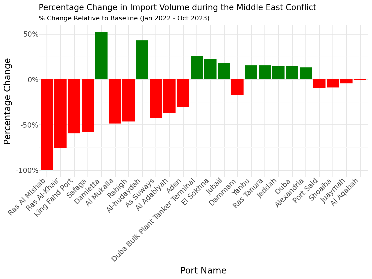
Using the monthly data, follow a similar methodology as the one used in the chokepoints analysis and calculate monthly average values for each time period of interest:
Baseline: January 1st, 2022 – October 6th, 2023
Middle East Conflict: October 7th, 2023 - November 16th, 2023
Red Sea Crisis: November 17th, 2023 - February 19th, 2024
Your table shoud look like this:
Country |
Port |
Period |
Cargo Import |
Cargo Export |
Tanker Import |
Tanker Export |
Total Import |
Total Export |
|---|---|---|---|---|---|---|---|---|
Djibouti |
Djibouti |
Reference |
– |
– |
– |
– |
– |
– |
Djibouti |
Djibouti |
Middle East Conflict |
– |
– |
– |
– |
– |
– |
Djibouti |
Djibouti |
Red Sea Crisis |
– |
– |
– |
– |
– |
– |
Note
Notice that for each port, there will be 3 datapoints: Baseline, Middle East Conflict, and Red Sea Crisis.
Once your table is ready, calculate the percentage change from the baseline for each conflict and port. The new table should look like follows:
Country |
Port |
Period |
Cargo Import |
Cargo Export |
Tanker Import |
Tanker Export |
Total Import |
Total Export |
|---|---|---|---|---|---|---|---|---|
Djibouti |
Djibouti |
Middle East Conflict |
– |
– |
– |
– |
– |
– |
Djibouti |
Djibouti |
Red Sea Crisis |
– |
– |
– |
– |
– |
– |
20.6.3. Summary Charts#
Using the table calculated in the previous exercise, create bar plots showing the percentage change from baseline for:
Middle East Conflict - Total Import
Middle East Conflict - Total Export
Red Sea - Total Import
Red Sea - Total Export
Please sort ports by greatest difference (absolute values). As a reference, your first chart should look like follows: