Chapter 6 Constructing and analyzing research data
The process of data analysis is typically a back-and-forth discussion between people with differing skill sets. For effective collaboration in a team environment, data, code, and outputs must be well organized and well documented, with a clear system for version control, analysis scripts that all team members can run, and fully automated output creation. Putting in time up front to structure the data analysis workflow in a reproducible manner pays substantial dividends throughout the process. Similarly, documenting research decisions made during data analysis is essential not only for the quality and transparency of research but also for the smooth implementation of a project.
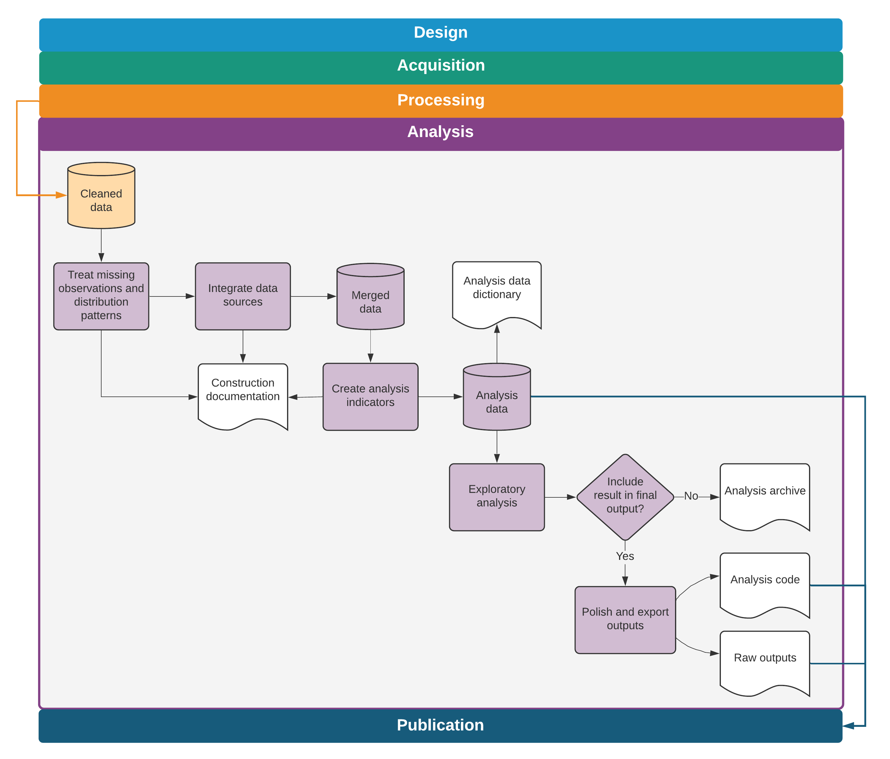
This chapter discusses the steps needed to transform cleaned data into informative outputs such as tables and figures. The suggested workflow starts where chapter 5 ended, with the outputs of data cleaning. The first section covers variable construction: transforming the cleaned data into meaningful indicators. The second section discusses the analysis code itself. The chapter does not offer instructions on how to conduct specific analyses, because this process is determined by research design, and many excellent guides address this issue. Rather, it discusses how to structure and document data analysis in a fashion that is easy to follow and understand, both for members of the research team and for consumers of research. The third section discusses ways to automate common outputs so that the work is fully reproducible, and the final section discusses tools for incorporating these outputs into fully dynamic documents. Box 6.1 summarizes the main points, lists the responsibilities of different members of the research team, and supplies a list of key tools and resources for implementing the recommended practices.
BOX 6.1 SUMMARY: CONSTRUCTING AND ANALYZING RESEARCH DATA
Moving from raw data to the final data sets used for analysis almost always requires combining and transforming variables into the relevant indicators and indexes. These constructed variables are then used to create analytical outputs, ideally using a dynamic document workflow. Construction and analysis involve three main steps:
- Construct variables and purpose-built data sets. The process of transforming observed data points into abstract or aggregate variables and analyzing them properly requires guidance from theory and is unique to each study. However, it should always follow these protocols:
- Maintain separate construction and analysis scripts, and put the appropriate code in the corresponding script, even if they are being developed or executed simultaneously.
- Merge, append, or otherwise combine data from different sources or units of observation, and transform data to appropriate levels of observation or aggregation.
- Create purpose-built analytical data sets, name and save them appropriately, and use them for the corresponding analytical tasks, rather than building a single analytical data set.
- Carefully document each of these steps in plain language so that the rationale behind each research decision is clear for any consumer of research.
- Generate and export exploratory and final outputs. Tables and figures are the most common types of analytical outputs. All outputs must be well organized and fully replicable. When creating outputs, the following tasks are required:
- Name exploratory outputs descriptively, and store them in easily viewed formats.
- Store final outputs separately from exploratory outputs, and export them using publication-quality formats.
- Version-control all code required to produce all outputs from analysis data.
- Archive code when analyses or outputs are not used, with documentation for later recovery.
- Set up an efficient workflow for outputs. Efficient workflow means the following:
- Exploratory analyses are immediately accessible, ideally created with dynamic documents, and can be reproduced by executing a single script.
- Code and outputs are version-controlled so it is easy to track where changes originated.
- Final figures, tables, and other code outputs are exported from the statistical software fully formatted, and the final document is generated in an automated manner, so that no manual workflow is needed to update documents when changes are made to outputs.
Key responsibilities for task team leaders and principal investigators
- Provide the theoretical framework for and supervise the production of analytical data sets and outputs, reviewing statistical calculations and code functionality.
- Approve the final list of analytical data sets and their accompanying documentation.
- Provide rapid review and feedback for exploratory analyses.
- Advise on file format and design requirements for final outputs, including dynamic documents.
Key responsibilities for research assistants
- Implement variable construction and analytical processes through code.
- Manage and document data sets so that other team members can understand them easily.
- Flag ambiguities, concerns, or gaps in translation from theoretical framework to code and data.
- Draft and organize exploratory outputs for rapid review by management.
- Maintain release-ready code and organize output with version control so that current versions of outputs are always accessible and final outputs are easily extracted from unused materials.
Key resources
- DIME’s Research Assistant Onboarding Course, for technical sessions on best
practices:
- See variable construction at https://osf.io/k4tr6
- See analysis at https://osf.io/82t5e
- Visual libraries containing well-styled, reproducible graphs in an easily
browsable format:
- Stata Visual Library at https://worldbank.github.io/stata-visual-library
- R Econ Visual Library at https://worldbank.github.io/r-econ-visual-library
- Andrade, Daniels, and Kondylis (2020), which discusses best practices and links to code demonstrations of how to export tables from Stata, at https://blogs.worldbank.org/impactevaluations/nice-and-fast-tables-stata
Creating analysis data sets
This chapter assumes that the analysis is starting from one or multiple well-documented tidy data sets (Wickham and Grolemund (2017)). It also assumes that these data sets have gone through quality checks and have incorporated any corrections needed (see chapter 5). The next step is to construct the variables that will be used for analysis—that is, to transform the cleaned data into analysis data. In rare cases, data might be ready for analysis as acquired, but in most cases the information will need to be prepared by integrating different data sets and creating derived variables (dummies, indexes, and interactions, to name a few; for an example, see Adjognon, Soest, and Guthoff (2019)). The derived indicators to be constructed should be planned during research design, with the preanalysis plan serving as a guide. During variable construction, data will typically be reshaped, merged, and aggregated to change the level of the data points from the unit of observation101 in the original data set(s) to the unit of analysis.
Each analysis data set is built to answer a specific research question. Because the required subsamples and units of observation often vary for different pieces of the analysis, it will be necessary to create purpose-built analysis data sets for each one. In most cases, it is not good practice to try to create a single “one-size-fits-all” analysis data set. For a concrete example of what this means, think of an agricultural intervention that was randomized across villages and affected only certain plots within each village. The research team may want to run household-level regressions on income, test for plot-level productivity gains, and check to see if village characteristics are balanced. Having three separate data sets for each of these three pieces of analysis will result in cleaner, more efficient, and less error-prone analytical code than starting from a single analysis data set and transforming it repeatedly.
Organizing data analysis workflows
Variable construction102 follows data cleaning and should be treated as a separate task for two reasons. First, doing so helps to differentiate correction of errors (necessary for all data uses) from creation of derived indicators (necessary only for specific analyses). Second, it helps to ensure that variables are defined consistently across data sets. For example, take a project that has a baseline survey and an endline survey. Unless the two data collection instruments are exactly the same, which is preferable but rare, the data cleaning for each of these rounds will require different steps and will therefore need to be done separately. However, the analysis indicators must be constructed in the same way for both rounds so that they are exactly comparable. Doing this all correctly will therefore require at least two separate cleaning scripts and a unified construction script. Maintaining only one construction script guarantees that, if changes are made for observations from one data set, they will also be made for the other.
In the research workflow, variable construction precedes data analysis, because derivative variables need to be created before they are analyzed. In practice, however, during data analysis, it is common to revisit construction scripts continuously and to explore various subsets and transformations of the data. Even if construction and analysis tasks are done concurrently, they should always be coded in separate scripts. If every script that creates a table starts by loading a data set, reorganizing it in subsets, and manipulating variables, any edits to these construction tasks need to be replicated in all analysis scripts. Doing this work separately for each analysis script increases the chances that at least one script will have a different sample or variable definition. Coding all variable construction and data transformation in a unified script, separate from the analysis code, prevents such problems and ensures consistency across different outputs.
Integrating multiple data sources
To create the analysis data set, it is typically necessary to combine information from different data sources. Data sources can be combined by adding more observations, called “appending,” or by adding more variables, called “merging.” These are also commonly referred to as “data joins.” As discussed in chapter 3, any process of combining data sets should be documented using data flowcharts103, and different data sources should be combined only in accordance with the data linkage table104. For example, administrative data may be merged with survey data in order to include demographic information in the analysis, geographic information may be integrated in order to include location-specific controls, or baseline and endline data may be appended to create a panel data. To understand how to perform such operations, it is necessary to consider the unit of observation and the identifying variables for each data set.
Appending data sets is the simplest approach because the resulting data set
always includes all rows and all columns from each data set involved. In
addition to combining data sources from multiple rounds of data acquisition,
appends are often used to combine data on the same unit of observation from
multiple study contexts, such as different regions or countries, when the
different tables to be combined include the same variables but not the same
instances of the unit of observation. Most statistical software requires
identical variable names across all data sets appended, so that data points
measuring the same attribute are placed in a single column in the resulting
combined data set. A common source of error in appending data sets is the use of
different units of measurement or different codes for categories in the same
variables across the data sets. Examples include measuring weights in kilograms
and grams, measuring values in different local currencies, and defining the
underlying codes in categorical variables differently. These differences must be
resolved before appending data sets. The iecodebook append105 command in the iefieldkit package
was designed to facilitate this process.
Merges are more complex operations than appends, with more opportunities for errors that result in incorrect data points. This is because merges do not necessarily retain all the rows and columns of the data sets being combined and are usually not intended to. Merges can also add or overwrite data in existing rows and columns. Whichever statistical software is being used, it is useful to take the time to read through the help file of merge commands to understand their options and outputs. When writing the code to implement merge operations, a few steps can help to avoid mistakes.
The first step is to write pseudocode to understand which types of observations from each data set are expected to be matched and which are expected to be unmatched, as well as the reasons for these patterns. When possible, it is best to predetermine exactly which and how many matched and unmatched observations should result from the merge, especially for merges that combine data from different levels of observation. The best tools for understanding this step are the three components of the data map discussed in chapter 3. The second step is to think carefully about whether the intention is to keep matched and unmatched observations from one or both data sets or to keep only matching observations. The final step is to run the code to merge the data sets, compare the outcome to the expectations, add comments to explain any exceptions, and write validation code so the script will return an error if unexpected results show up in future runs.
Paying close attention to merge results is necessary to avoid unintentional changes to the data. Two issues that require careful scrutiny are missing values and dropped observations. This process entails reading about how each command treats missing observations: Are unmatched observations dropped, or are they kept with missing values? Whenever possible, automated checks should be added in the script to throw an error message if the result is different than what is expected; if this step is skipped, changes in the outcome may appear after running large chunks of code, and these changes will not be flagged. In addition, any changes in the number of observations in the data need to be documented in the comments, including explanations for why they are happening. If subsets of the data are being created, keeping only matched observations, it is helpful to document the reason why the observations differ across data sets as well as why the team is only interested in observations that match. The same applies when adding new observations from the merged data set.
Some merges of data with different units of observation are more conceptually complex. Examples include overlaying road location data with household data using a spatial match; combining school administrative data, such as attendance records and test scores, with student demographic characteristics from a survey; or linking a data set of infrastructure access points, such as water pumps or schools, with a data set of household locations. In these cases, a key contribution of the research is figuring out a useful way to combine the data sets. Because the conceptual constructs that link observations from the two data sources are important and can take many possible forms, it is especially important to ensure that the data integration is documented extensively and separately from other construction tasks (see box 6.2 for an example of merges followed by automated tests from the Demand for Safe Spaces project).
BOX 6.2 INTEGRATING MULTIPLE DATA SOURCES: A CASE STUDY FROM THE DEMAND FOR SAFE SPACES PROJECT
The research team received the raw crowdsourced data acquired for the Demand for Safe Spaces study in a different level of observation than the one relevant for analysis. The unit of analysis was a ride, and each trip was represented in the crowdsourced data set by three rows, one for questions answered before boarding the train, one for those answered during the trip, and one for those answered after leaving the train. The Tidying data example in box 5.3 explains how the team created three intermediate data sets for each of these tasks. To create the ride-level data set, the team combined the individual task data sets. The following code shows how the team assured that all observations had merged as expected, showing two different approaches depending on what was expected.
/*******************************************************************************
*   Merge ride tasks                                                           *
*******************************************************************************/

    use  "${dt_int}/compliance_pilot_ci.dta", clear
    merge 1:1  session  using "${dt_int}/compliance_pilot_ride.dta", assert(3) nogen
    merge 1:1  session  using "${dt_int}/compliance_pilot_co.dta"  , assert(3) nogen
The first code chunk shows the quality assurance protocol for when the team
expected that all observations would exist in all data sets so that each merge
would have only matched observations. To test that this was the case, the team
used the option assert(3). When two data sets are merged in Stata without
updating information, each observation is assigned the merge code 1, 2, or
3. A merge code of 1 means that the observation existed in the data set only
in memory (called the “master data”), 2 means that the observation existed
only in the other data set (called the “using data”), and 3 means that the
observation existed in both. The option assert(3) tests that all observations
existed in both data sets and were assigned code 3.
When observations that do not match perfectly are merged, the quality assurance
protocol requires the research assistant to document the reasons for mismatches.
Stata’s merge result code is, by default, recorded in a variable named _merge.
The Demand for Safe Space team used this variable to count the number of unique
riders in each group and used the command assert to throw an error if the
number of observations in any of the categories changed, ensuring that the
outcome remained stable if the code was run multiple times.
/*******************************************************************************
*   Merge demographic survey                                                   *
*******************************************************************************/

    merge m:1  user_uuid  using "${dt_int}/compliance_pilot_demographic.dta"

    * 3 users have rides data, but no demo
    unique user_uuid if _merge == 1
    assert r(unique) == 3

    * 49 users have demo data, but no rides: these are dropped
    unique user_uuid if _merge == 2
    assert r(unique) == 49
    drop if _merge == 2

    * 185 users have ride & demo data
    unique user_uuid if _merge == 3
    assert r(unique) == 185
For the complete do-file, visit the GitHub repository at https://git.io/JtgYf.
Creating analysis variables
After assembling variables from different sources into a single working data set
with the desired raw information and observations, it is time to create the
derived indicators of interest for analysis. Before constructing new indicators,
it is important to check and double-check the units, scales, and value
assignments of each variable that will be used. This step is when the knowledge
of the data and documentation developed during cleaning will be used the most.
The first step is to check that all categorical variables have the same value
assignment, such that labels and levels have the same correspondence across
variables that use the same options. For example, it is possible that 0 is
coded as “No” and 1 as “Yes” in one question, whereas in another question the
same answers are coded as 1 and 2. (Coding binary questions either as 1
and 0 or as TRUE and FALSE is recommended, so that they can be used
numerically as frequencies in means and as dummy variables106 in
regressions. This recommendation often implies recoding categorical variables
like gender to create new binary variables like woman.) Second, any numeric
variables being compared or combined need to be converted to compatible scales
or units of measure: it is impossible to add 1 hectare and 2 acres and get a
meaningful number. New derived variables should be given functional names, and
the data set should be ordered so that related variables remain together.
Attaching notes to each newly constructed variable if the statistical software
allows it makes the data set even more user-friendly.
At this point, it is necessary to decide how to handle any outliers or unusual values identified during data cleaning. How to treat outliers is a research question. There are multiple possible approaches, and the best choice for a particular case will depend on the objectives of the analysis. Whatever the team decides, the decision and how it was made should be noted explicitly. Results can be sensitive to the treatment of outliers; keeping both the original and the new modified values for the variable in the data set will make it possible to test how much the modification affects the outputs. All of these points also apply to the imputation of missing values and other distributional patterns. As a general rule, original data should never be overwritten or deleted during the construction process, and derived indicators, including handling of outliers, should always be created with new variable names.
Two features of data create additional complexities when constructing indicators: research designs with multiple units of observation and analysis and research designs with repeated observations of the same units over time. When research involves different units of observation, creating analysis data sets will probably mean combining variables measured at these different levels. To make sure that constructed variables are consistent across data sets, each indicator should be constructed in the data set corresponding to its unit of observation.
Once indicators are constructed at each level of observation, they may be either
merged or first aggregated and then merged with data containing different units
of analysis. Take the example of a project that acquired data at both the
student and teacher levels. To analyze the performance of students on a test
while controlling for teacher characteristics, the teacher-level indicators
would be assigned to all students in the corresponding class. Conversely, to
include average student test scores in the analysis data set containing
teacher-level variables, the analysis data set would start at the student level,
the test score of all students taught by the same teacher would be averaged
(using commands like collapse in Stata and summarise from R’s dplyr
package), and this teacher-level aggregate measure would be merged onto the
original teacher data set. While performing such operations, two tasks are
important to keep in mind: documenting the correspondence between identifying
variables at different levels in the data linkage table and applying all of the
steps outlined in the previous section because merges are inevitable.
Finally, variable construction with combined data sets involves additional attention. It is common to construct derived indicators soon after receiving each data set. However, constructing variables for each data set separately increases the risk of using different definitions or samples in each of them. Having a well-established definition for each constructed variable helps to prevent that mistake, but the best way to guarantee that it will not happen is to create the indicators for all data sets in the same script after combining the original data sets.
The most common example is panel data with multiple rounds of data collection at
different times. Say, for example, that some analysis variables were constructed
immediately after an initial round of data collection and that later the same
variables will need to be constructed for a subsequent round. When a new round
of data is received, best practice is first to create a cleaned panel data set,
ignoring the previous constructed version of the initial round, and then to
construct the derived indicators using the panel as input. The DIME Analytics
team created the iecodebook append subcommand in the Stata package
iefieldkit to make it easier to reconcile and append data into this type of
cleaned panel data set, and the command also works well for similar data
collected in different contexts (for instructions and details, see the DIME Wiki
at https://dimewiki.worldbank.org/iecodebook).
This harmonization and appending process is done by completing an Excel spreadsheet codebook to indicate which changes in names, value assignments, and value labels should be made so the data are consistent across rounds or settings (Bjärkefur, Andrade, and Daniels (2020)). Doing so creates helpful documentation about the appending process. Once the data sets have been harmonized and appended, it is necessary to adapt the construction script so that it can be used on the appended data set. In addition to preventing inconsistencies and documenting the work, this process also saves time and provides an opportunity for the team to review the original code (see box 6.3 for an example of variable construction using a combined data set).
BOX 6.3 CREATING ANALYSIS VARIABLES: A CASE STUDY FROM THE DEMAND FOR SAFE SPACES PROJECT
The header of the script that created analysis variables for the crowdsourced data in the Demand for Safe Spaces study is shown below. It started from a pooled data set that combined all waves of data collection. The variable was constructed after all waves had been pooled to make sure that all variables were constructed identically across all waves.
/*******************************************************************************
*      Demand for "Safe Spaces": Avoiding Harassment and Stigma                *
*      Construct analysis variables                                            *
********************************************************************************

    REQUIRES:  ${dt_final}/pooled_rider_audit_rides.dta
               ${dt_final}/pooled_rider_audit_exit.dta
               ${doc_rider}/pooled/codebooks/label-constructed-data.xlsx

    CREATES:   ${dt_final}/pooled_rider_audit_constructed_full.dta
               ${dt_final}/pooled_rider_audit_constructed.dta

    WRITTEN BY: Luiza Andrade, Kate Vyborny, Astrid Zwager

    OVERVIEW:  1 Load and merge data
               2 Construct new variables
               3 Recode values
               4 Keep only variables used for analysis
               5 Save full data set
               6 Save paper sample

*******************************************************************************/
See the full construction script here https://git.io/JtgY5 and the script where data from all waves are pooled here: https://git.io/JtgYA.
Documenting variable construction
Because variable construction involves translating concrete observed data points into measures of abstract concepts, it is important to document exactly how each variable is derived or calculated. Careful documentation is linked closely to the research principles discussed in chapter 1. It makes research decisions transparent, allowing someone to look up how each variable was defined in the analysis and what the reasoning was behind these decisions. By reading the documentation, persons who are not familiar with the project should be able to understand the contents of the analysis data sets, the steps taken to create them, and the decision-making process. Ideally, they should also be able to reproduce those steps and recreate the constructed variables. Therefore, documentation is an output of construction as important as the code and data, and it is good practice for papers to have an accompanying data appendix listing the analysis variables and their definitions.
The development of construction documentation provides a good opportunity for the team to have a wider discussion about creating protocols for defining variables: such protocols guarantee that indicators are defined consistently across projects. A detailed account of how variables are created is needed and will be implemented in the code, but comments are also needed explaining in human language what is being done and why. This step is crucial both to prevent mistakes and to guarantee transparency. To make sure that these comments can be navigated more easily, it is wise to start writing a variable dictionary as soon as the team begins thinking about making changes to the data (for an example, see Jones et al. (2019)). The variable dictionary can be saved in an Excel spreadsheet, a Word document, or even a plain-text file. Whatever format it takes, it should carefully record how specific variables have been transformed, combined, recoded, or rescaled. Whenever relevant, the documentation should point to specific scripts to indicate where the definitions are being implemented in code.
The iecodebook export subcommand is a good way to ensure that the project
has easy-to-read documentation. When all final indicators have been created, it
can be used to list all variables in the data set in an Excel sheet. The
variable definitions can be added to that file to create a concise metadata
document. This step provides a good opportunity to review the notes and make
sure that the code is implementing exactly what is described in the
documentation (see box 6.4 for an example of variable construction
documentation).
BOX 6.4 DOCUMENTING VARIABLE CONSTRUCTION: A CASE STUDY FROM THE DEMAND FOR SAFE SPACES PROJECT
In an appendix to the working paper, the Demand for Safe Spaces team documented the definition of every variable used to produce the outputs presented in the paper:
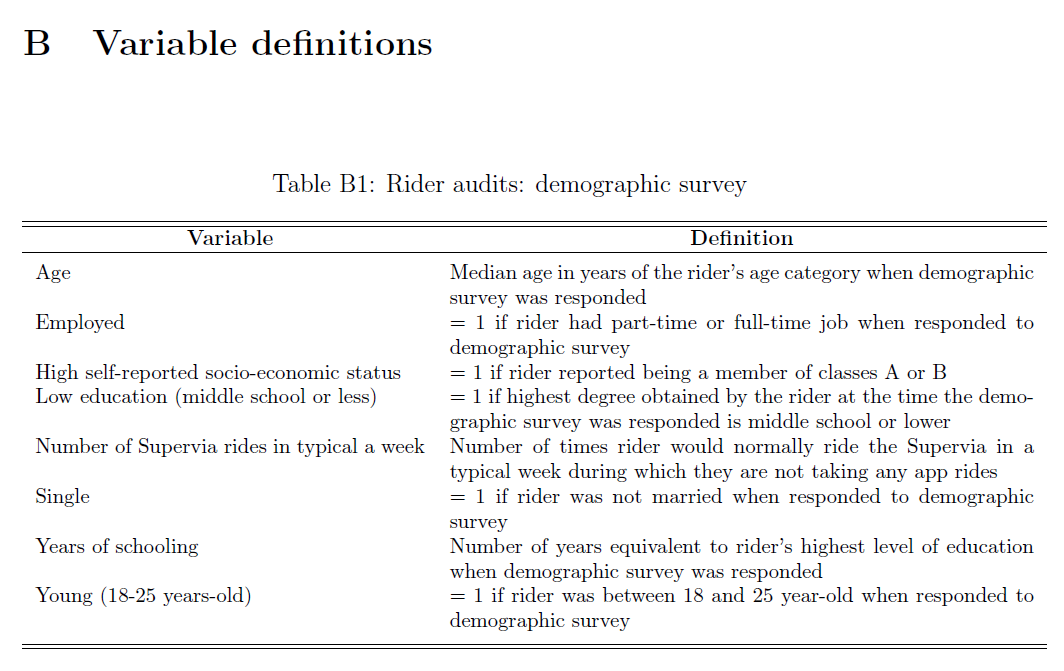
Appendix B in the working paper presents a set of tables with variable definitions in nontechnical language, including variables collected through surveys, variables constructed for analysis, and research variables assigned by random processes.
The full set of tables can be found on Appendix B of the Working Paper: https://openknowledge.worldbank.org/handle/10986/33853
Writing analysis code
After data have been cleaned and indicators constructed, it is time to start analyzing the data. Many resources deal with data analysis and statistical methods, such as R for Data Science (Wickham and Grolemund (2017)); A Gentle Introduction to Stata (Acock 2018); Mostly Harmless Econometrics (Angrist and Pischke (2008)); Mastering ’Metrics (Angrist and Pischke 2014); and Causal Inference: The Mixtape (Cunningham (2018)). The discussion here focuses on how to structure code and files for data analysis, not how to conduct specific analyses.
Organizing analysis code
The analysis usually starts with a process called exploratory data analysis, which is when researchers begin to look for patterns in the data, create descriptive graphs and tables, and try different statistical tests to understand the results. It progresses into final analysis when the team starts to decide which are the “main results”— those that will make it into a research output. Code and code outputs for exploratory analysis are different from those for final analysis. During the exploratory stage, the temptation is to write lots of analysis into one big, impressive, start-to-finish script. Although this is fine when writing the research stream of consciousness into code, it leads to poor practices in the final code, such as not clearing the workspace and not loading a fresh data set before each analysis task.
To avoid mistakes, it is important to take time to organize the code that will be kept—that is, the final analysis code. The result is a curated set of polished scripts that will be part of a reproducibility package. A well-organized analysis script starts with a completely fresh workspace and, for each output it creates, explicitly loads data before analyzing them. This setup encourages data manipulation to be done earlier in the workflow (that is, in separate cleaning and construction scripts). It also prevents the common problem of having analysis scripts that depend on other analysis scripts being run before them. Such dependencies tend to require manual instructions so that all necessary chunks of code are run in the right order. Coding each task so that it is completely independent of all other code, except for the master script, is recommended. It is possible to go so far as to code every output in a separate script, but the key is to make sure that it is clear which data sets are used for each output and which code chunks implement each piece of analysis (see box 6.5 for an example of an analysis script structured like this).
BOX 6.5 WRITING ANALYSIS CODE: A CASE STUDY FROM THE DEMAND FOR SAFE SPACES PROJECT
The Demand for Safe Spaces team split the analysis scripts into one script per output and reloaded the analysis data before each output. This process ensured that the final exhibits could be generated independently from the analysis data. No variables were constructed in the analysis scripts: the only transformation performed was to subset the data or aggregate them to a higher unit of observation. This transformation guaranteed that the same data were used across all analysis scripts. The following is an example of a short analysis do-file:
/*******************************************************************************
*   Demand for "Safe Spaces": Avoiding Harassment and Stigma                   *
********************************************************************************
    OUTLINE:  PART 1: Load data
              PART 2: Run regressions
              PART 3: Export table
    REQUIRES: ${dt_final}/platform_survey_constructed.dta
    CREATES:  ${out_tables}/priming.tex
    WRITTEN BY:  Luiza Andrade

********************************************************************************
*   PART 1: Load data                                                          *
*******************************************************************************/

    use "${dt_final}/platform_survey_constructed.dta", clear

/*******************************************************************************
*   PART 2: Run regressions                                                    *
*******************************************************************************/

    reg scorereputation i.q_group, robust
    est sto priming1

    sum scorereputation
    estadd scalar mean `r(mean)'

    reg scoresecurity i.q_group, robust
    est sto priming2

    sum scoresecurity
    estadd scalar mean `r(mean)'

/*******************************************************************************
*   PART 3: Export table                                                       *
*******************************************************************************/

    esttab priming1 priming2                ///
        using "${out_tables}/priming.tex",  ///
        ${star}                             ///
        tex se replace label                ///
        nomtitles nonotes                   ///
        drop(1.q_group)                     ///
        b(%9.3f) se(%9.3f)                  ///
        scalar("mean Sample mean")          ///
        posthead("\hline \\[-1.8ex]")       ///
        postfoot("\hline\hline \end{tabular}")
See this script and how the regression results were exported to a table at https://git.io/JtgOk.
There is nothing wrong with code files being short and simple. In fact, analysis scripts should be as simple as possible, so whoever is reading them can focus on the concepts, not the coding. Research questions and statistical decisions should be incorporated explicitly in the code through comments, and their implementation should be easy to detect from the way the code is written. This process includes clustering, sampling, and controlling for different variables, to name a few. If the team is working with multiple analysis data sets, the name of each data set should describe the sample and unit of observation it contains. As a decision is made about model specification, the team can create functions and globals (or objects) in the master script to use across scripts. The use of functions and globals helps to ensure that specifications are consistent throughout the analysis. It also makes code more dynamic, because it is easy to update specifications and results through a master file with- out changing every script (see box 6.6 for an example of this from the Demand for Safe Spaces project).
BOX 6.6 ORGANIZING ANALYSIS CODE: A CASE STUDY FROM THE DEMAND FOR SAFE SPACES PROJECT
The Demand for Safe Spaces team defined the control variables in globals in the
master analysis script. Doing so guaranteed that control variables were used
consistently across regressions. It also provided an easy way to update control
variables consistently across all regressions when needed. In an analysis
script, a regression that includes all demographic controls would then be
expressed as regress y x ${demographics}.
/*********************************************************************************
*   Set control variables                                                        *
*********************************************************************************/

    global star               star (* .1 ** .05 *** .01)
    global demographics       d_lowed d_young d_single d_employed d_highses
    global interactionvars    pink_highcompliance mixed_highcompliance         ///
                              pink_lowcompliance mixed_lowcompliance
    global interactionvars_oc pos_highcompliance zero_highcompliance           ///
                              pos_lowcompliance zero_lowcompliance
    global wellbeing          CO_concern CO_feel_level CO_happy CO_sad         ///
                              CO_tense CO_relaxed CO_frustrated CO_satisfied   ///
                              CO_feel_compare

    * Balance variables (Table 1)
    global balancevars1       d_employed age_year educ_year ride_frequency     ///
                              home_rate_allcrime home_rate_violent             ///
                              home_rate_theft grope_pink_cont grope_mixed_cont ///
                              comments_pink_cont comments_mixed_cont
    global balancevars2       usual_car_cont nocomp_30_cont nocomp_65_cont     ///
                              fullcomp_30_cont fullcomp_65_cont

    * Other adjustment margins (Table A7)
    global adjustind          CI_wait_time_min d_against_traffic CO_switch     ///
                              RI_spot CI_time_AM CI_time_PM
The above code is excerpted from the full master script, which you can find at https://git.io/JtgeT.
Creating this setup entails having an effective data management system,
including file naming, organization, and version control. Just as for the
analysis data sets, each of the individual analysis files needs to have a
descriptive name. File names such as spatial-diff-in-diff.do,
matching-villages.R, and summary-statistics.py are clear indicators of what
each file is doing and make it easy to find code quickly. If the script files
will be ordered numerically to correspond to exhibits as they appear in a paper
or report, such numbering should be done closer to publication, because script
files will be reordered often during data analysis.
Visualizing data
Data visualization is increasingly popular and is becoming a field of expertise in its own right (Healy (2018); Wilke (2019)). Although the same principles for coding exploratory and final data analysis apply to visualizations, creating them is usually more involved than the process of running an estimation routine and exporting numerical results into a table. Some of the difficulty of creating good visualizations of data is due to the difficulty of writing code to create them. The amount of customization necessary to create a nice graph can result in quite intricate commands.
Making a visually compelling graph is hard enough without having to go through many rounds of searching and reading help files to understand the graphical options syntax of a particular software. Although getting each specific element of a graph to look exactly as intended can be hard, the solution to such problems is usually a single well-written search away, and it is best to leave these details to the very last. The trickiest and more immediate problem of creating graphical outputs is getting the data into the right format. Although both Stata and R have plotting functions that graph summary statistics, a good rule of thumb is to ensure that each observation in the data set corresponds to one data point in the desired visualization whenever more complex visualizations are desired. This task may seem simple, but it often requires the use of aggregation and reshaping operations discussed earlier in this chapter.
On the basis of DIME’s accumulated experience creating visualizations for impact evaluations, the DIME Analytics team has developed a few resources to facilitate this workflow. First of all, DIME Analytics maintains easily searchable data visualization libraries for both Stata (https://worldbank.github.io/stata-visual-library) and R (https://worldbank.github.io/r-econ-visual-library). These libraries feature curated data visualization examples, along with source code and example data sets, that provide a good sense of what data should look like before code is written to create a visualization. (For more tools and links to other data visualization resources, see the DIME Wiki at https://dimewiki.worldbank.org/Data_visualization .)
The ietoolkit package also contains two commands to automate common impact
evaluation graphs: iegraph107 plots the values of
coefficients for treatment dummies, and iekdensity108 displays the
distribution of an outcome variable across groups and adds the treatment effect
as a note. (For more on how to install and use commands from ietoolkit, see
the DIME Wiki at https://dimewiki.worldbank.org/ietoolkit.) To create a
uniform style for all data visualizations across a project, setting common
formatting settings in the master script is recommended (see box 6.7 for an
example of this process from the Demand for Safe Spaces project).
BOX 6.7 VISUALIZING DATA: A CASE STUDY FROM THE DEMAND FOR SAFE SPACES PROJECT
The Demand for Safe Spaces team defined the settings for graphs in globals in
the master analysis script. Using globals created a uniform visual style for all
graphs produced by the project. These globals were then used across the project
when creating graphs like the following:
twoway (bar cum x, color(${col_aux_light})) (lpoly y x, color(${col_mixedcar})) (lpoly z x, color(${col_womencar})), ${plot_options}
/*******************************************************************************
*   Set plot options
*******************************************************************************/

    set scheme s2color

    global grlabsize      4
    global col_mixedcar   `" "18 148 144" "'
    global col_womencar   purple
    global col_aux_bold   gs6
    global col_aux_light  gs12
    global col_highlight  cranberry
    global col_box        gs15
    global plot_options   graphregion(color(white))   ///
                          bgcolor(white)              ///
                          ylab(, glcolor(${col_box})) ///
                          xlab(, noticks)
    global lab_womencar   Reserved space
    global lab_mixedcar   Public space
For the complete do-file, visit the GitHub repository at https://git.io/JtgeT.
Creating reproducible tables and graphs
Many outputs are created during the course of a project, including both raw outputs, such as tables and graphs, and final products, such as presentations, papers, and reports. During exploratory analysis, the team will consider different approaches to answer research questions and present answers. Although it is best to be transparent about different specifications tried and tests performed, only a few will ultimately be considered “main results.” These results will be exported from the statistical software. That is, they will be saved as tables and figures in file formats that the team can interact with more easily. For example, saving graphs as image files allows the team to review them quickly and to add them as exhibits to other documents. When these code outputs are first being created, it is necessary to agree on where to store them, what software and formats to use, and how to keep track of them. This discussion will save time and effort on two fronts: less time will be spent formatting and polishing tables and graphs that will not make their way into final research products, and it will be easier to remember the paths the team has already taken and avoid having to do the same thing twice. This section addresses key elements to keep in mind when making workflow decisions and outputting results.
Managing outputs
Decisions about storage of outputs are limited by technical constraints and
dependent on file format. Plain-text file formats like .tex and .csv can be
managed through version-control systems like Git, as discussed in chapter 2.
Binary outputs like Excel spreadsheets, .pdf files, PowerPoint presentations,
or Word documents, by contrast, should be kept in a synced folder. Exporting all
raw outputs as plain-text files, which can be done through all statistical
software, facilitates the identification of changes in results. When code is
rerun from the master script, the outputs will be overwritten, and any changes
(for example, in coefficients or numbers of observations) will be flagged
automatically. Tracking changes to binary files is more cumbersome, although
there may be exceptions, depending on the version-control client used. GitHub
Desktop, for example, can display changes in common binary image formats such as
.png files in an accessible manner.
Knowing how code outputs will be used supports decisions regarding the best
format for exporting them. It is often possible to export figures in different
formats, such as .eps, .png, .pdf, or .jpg. However, the decision
between using Office software such as Word and PowerPoint versus LaTeX and other
plain-text formats may influence how the code is written, because this choice
often necessitates the use of a particular command.
Outputs generally need to be updated frequently, and anyone who has tried to recreate a result after a few months probably knows that it can be hard to remember where the code that created it was saved. File-naming conventions and code organization, including easily searchable filenames and comments, play a key role in not having to rewrite scripts again and again. Maintaining one final analysis folder and one folder with draft code or exploratory analysis is recommended. The latter contains pieces of code that are stored for reference, but not polished or refined to be used in research products.
Once an output presents a result in the clearest manner possible, the
corresponding script should be renamed and moved to the final analysis folder.
It is typically desirable to link the names of outputs and scripts—for example,
the script factor-analysis.do creates the graph factor-analysis.eps, and so
on. Documenting output creation in the master script running the code is
necessary so that a few lines of comments appear before the line that runs a
particular analysis script; these comments list data sets and functions that are
necessary for the script to run and describe all outputs created by that script
(see box 6.8 for how this was done in the Demand for Safe Spaces project).
BOX 6.8 MANAGING OUTPUTS: A CASE STUDY FROM THE DEMAND FOR SAFE SPACES PROJECT
It is important to document which data sets are required as inputs in each script and what data sets or output files are created by each script. The Demand for Safe Spaces team documented this information both in the header of each script and in a comment in the master do-file where the script was called.
The following is a header of an analysis script called response.do that
requires the file platform_survey_constructed.dta and generates the file
response.tex. Having this information on the header allows people reading the
code to check that they have access to all of the necessary files before trying
to run a script.
/*******************************************************************************
*   Demand for "Safe Spaces": Avoiding Harassment and Stigma                   *
********************************************************************************
    OUTLINE:  PART 1: Load data
              PART 2: Run regressions
              PART 3: Export table
    REQUIRES: ${dt_final}/platform_survey_constructed.dta
    CREATES:  ${out_tables}/response.tex
*******************************************************************************/
To provide an overview of the different subscripts involved in a project, this information was copied into the master do-file where the script above is called, and the same was done for all of the script called from that master, as follows:
* Appendix tables ==================================================================

    ********************************************************************************
    *   Table A1: Sample size description                                          *
    *------------------------------------------------------------------------------*
    *   REQUIRES: ${dt_final}/pooled_rider_audit_constructed.dta                   *
    *             ${dt_final}/platform_survey_constructed.dta                      *
    *   CREATES:  ${out_tables}/sample_table.tex                                   *
    ********************************************************************************

    do "${do_tables}/sample_table.do"

    ********************************************************************************
    *   Table A3: Correlation between platform observations data and rider reports *
    *------------------------------------------------------------------------------*
    *   REQUIRES: ${dt_final}/pooled_rider_audit_constructed.dta                   *
    *   CREATES:  ${out_tables}/mappingridercorr.tex                               *
    ********************************************************************************

    do "${do_tables}/mappingridercorr.do"

    ********************************************************************************
    *   Table A4: Response to platform survey and IAT                              *
    *------------------------------------------------------------------------------*
    *   REQUIRES: ${dt_final}/platform_survey_constructed.dta                      *
    *   CREATES:  ${out_tables}/response.tex                                       *
    ********************************************************************************

    do "${do_tables}/response.do"
For the complete analysis script, visit the GitHub repository at https://git.io/JtgYB. For the master do-file, visit the GitHub repository at https://git.io/JtgY6.
Exporting analysis outputs
As discussed briefly in the previous section, it is not necessary to export each and every table and graph created during exploratory analysis. Most statistical software allows results to be viewed interactively, and doing so is often preferred at this stage. Final analysis scripts, in contrast, must export outputs that are ready to be included in a paper or report. No manual edits, including formatting, should be necessary after final outputs are exported. Manual edits are difficult to reproduce; the less they are used, the more reproducible the output is. Writing code to implement a small formatting adjustment in a final output may seem unnecessary, but making changes to the output is inevitable, and completely automating each output will always save time by the end of the project. By contrast, it is important not to spend much time formatting tables and graphs until it has been decided which ones will be included in research products; see Andrade, Daniels, and Kondylis (2020) for details and workflow recommendations. Polishing final outputs can be a time-consuming process and should be done as few times as possible.
It cannot be stressed too much: do not set up a workflow that requires copying and pasting results. Copying results from Excel to Word is error-prone and inefficient. Copying results from a software console is even more inefficient and totally unnecessary. The amount of work needed in a copy-paste workflow increases rapidly with the number of tables and figures included in a research output and so do the chances of having the wrong version of a result in a paper or report.
Numerous commands are available for exporting outputs from both R and Stata. For
exporting tables, Stata 17 includes more advanced built-in capabilities. Some
currently popular user-written commands are estout (Benn Jann (2005)),
outreg2 (Wada (2014))
, and outwrite (Daniels (2019)). In R, popular tools include
stargazer (Hlavac (2015)), huxtable (Hugh-Jones 2021), and ggsave (part of
ggplot2; Wickham (2016)). They allow for a wide variety of output formats. Using
formats that are accessible and, whenever possible, lightweight is recommended.
Accessible means that other people can open them easily. For figures in Stata,
accessibility means always using graph export to save images as .jpg,
.png, .pdf, and so forth, instead of graph save, which creates a .gph
file that can only be opened by Stata. Some publications require “lossless”
.tif or .eps files, which are created by specifying the desired extension.
Whichever format is used, the file extension must always be specified
explicitly.
There are fewer options for formatting table files. Given the recommendation to
use dynamic documents, which are discussed in more detail both in the next
section and in chapter 7, exporting tables to .tex is preferred. Excel .xlsx
files and .csv files are also commonly used, but they often require the extra
step of copying the tables into the final output. The ietoolkit package
includes two commands to export formatted tables, automating the creation of
common outputs and saving time for research; for instructions and details, see
the DIME Wiki at https://dimewiki.worldbank.org/ietoolkit. The
iebaltab109 command
creates and exports balance tables to Excel or LaTeX, and the
ieddtab110 command does the same for
difference-in-differences regressions.
If it is necessary to create a table with a very specific format that is not
automated by any known command, the command can be written manually (using
Stata’s filewrite and R’s cat, for example). Manually writing the file often
makes it possible to write a cleaner script that focuses on the econometrics,
not on complicated commands to create and append intermediate matrixes. Final
outputs should be easy to read and understand with only the information they
contain. Labels and notes should include all of the relevant information that is
not otherwise visible in the graphical output. Examples of information that
should be included in labels and notes are sample descriptions, units of
observation, units of measurement, and variable definitions. For a checklist
with best practices for generating informative and easy-to-read tables, see the
DIME Wiki at https://dimewiki.worldbank.org/Checklist:_Submit_Table.
Increasing efficiency of analysis with dynamic documents
It is strongly recommended to create final products using a software that allows for direct linkage to raw outputs. In this way, final products will be updated in the paper or presentation every time changes are made to the raw outputs. Files that have this feature are called dynamic documents111. Dynamic documents are a broad class of tools that enable a streamlined, reproducible workflow. The term “dynamic” can refer to any document-creation technology that allows the inclusion of explicitly encoded links to output files. Whenever outputs are updated, and a dynamic document is reloaded or recompiled, it will automatically include all changes made to all outputs without any additional intervention from the user. This is not possible in tools like Microsoft Office, although tools and add-ons can produce similar functionality. In Word, by default, each object has to be copied and pasted individually whenever tables, graphs, or other inputs have to be updated. This workflow becomes more complex as the number of inputs grows, increasing the likelihood that mistakes will be made or updates will be missed. Dynamic documents prevent this from happening by managing the compilation of documents and the inclusion of inputs in a single integrated process so that copying and pasting can be skipped altogether.
Conducting dynamic exploratory analysis
If all team members working on a dynamic document are comfortable using the same
statistical software, built-in dynamic document engines are a good option for
conducting exploratory analysis. These tools can be used to write both text
(often in Markdown; see https://www.markdownguide.org) and code in the script,
and the output is usually a .pdf or .html file including code, text, and
outputs. These kinds of complex dynamic document tools are typically best used
by team members working most closely with code and can be great for creating
exploratory analysis reports or paper appendixes including large chunks of code
and dynamically created graphs and tables. RMarkdown (.Rmd) is the most widely
adopted solution in R; see https://rmarkdown.rstudio.com. Stata offers a
built-in package for dynamic documents—dyndoc—and user-written commands are
also available, such as markstat (Rodriguez (2017)), markdoc (Haghish (2016)),
webdoc (B. Jann (2017)), and texdoc (B. Jann (2016)). The advantage of these tools in
comparison with LaTeX is that they create full documents from within statistical
software scripts, so the task of running the code and compiling the document is
reduced to a single step.
Documents called “notebooks” (such as Jupyter Notebook; see https://jupyter.org) work similarly, because they also include the underlying code that created the results in the document. These tools are usually appropriate for short or informal documents because users who are not familiar with them find it difficult to edit the content, and they often do not offer formatting options as extensive as those in Word. Other simple tools for dynamic documents do not require direct operation of the under- lying code or software, simply access to the updated outputs. For example, Dropbox Paper is a free online writing tool that can be linked to files in Dropbox, which are updated automatically anytime the file is replaced. These tools have limited functionality in terms of version control and formatting and should never include any references to confidential data, but they do offer extensive features for collaboration and can be useful for working on informal outputs. Markdown files on GitHub can provide similar functionality through the browser and are version-controlled. However, as with other Markdown options, the need to learn a new syntax may discourage take-up among team members who do not work extensively with GitHub.
Whatever software is used, what matters is that a self-updating process is
implemented for table and figures. The recommendations given here are best
practices, but each team has to find out what works for it. If a team has
decided to use Microsoft Office, for example, there are still a few options for
avoiding problems with having to copy and paste. The easiest solution may be for
the less code-savvy members of the team to develop the text of the final output
pointing to exhibits that are not included inline. If all figures and tables are
presented at the end of the file, whoever is developing the code can export them
into a Word document using Markdown or simply produce a separate .pdf file for
tables and figures, so at least this part of the manuscript can be updated
quickly when the results change. Finally, statistical programming languages can
often export directly to binary formats—for example, using the putexcel and
putdocx commands in Stata can update or preserve formatting in Office
documents.
Using LaTeX for dynamic research outputs
Although formatted text software such as Word and PowerPoint are still prevalent, researchers are increasingly choosing to prepare final outputs like documents and presentations using LaTeX, a document preparation and typesetting system with a unique code syntax. Despite LaTeX’s significant learning curve, its enormous flexibility in terms of operation, collaboration, output formatting, and styling makes it DIME’s preferred choice for most large technical outputs. In fact, LaTeX operates behind the scenes of many other dynamic document tools. Therefore, researchers should learn LaTeX as soon as possible; DIME Analytics has developed training materials and resources available on GitHub at https://github.com/worldbank/DIME-LaTeX-Templates.
The main advantage of using LaTeX is that it updates outputs every time the
document is compiled, while still allowing for text to be added and formatted
extensively to publication-quality standards. Additionally, because of its
popularity in the academic community, the cost of entry for a team is often
relatively low. Because .tex files are plain text, they can be
version-controlled using Git. Creating documents in LaTeX using an integrated
writing environment such as TeXstudio, TeXmaker, or LyX is great for outputs
that focus mainly on text but also include figures and tables that may be
updated. It is good for adding small chunks of code into an output. Finally,
some publishers make custom LaTeX templates available or accept manuscripts as
raw .tex files, so research outputs can be formatted more easily into custom
layouts.
Looking ahead
This chapter discussed the steps needed to create analysis data sets and outputs from original data. Combining the observed variables of interest for the analysis (measurement variables) with the information in the data map describing the study design (research variables) creates original data sets that are ready for analysis, as shown in figure 6.1. Doing so is difficult, creative work, and it cannot be reproduced by someone who lacks access to the detailed records and explanations of how the data were interpreted and modified. The chapter stressed that code must be well organized and well documented to allow others to understand how research outputs were created and used to answer the research questions. The next chapter of this book provides a guide to assembling the raw findings into publishable work and describes methods for making data, code, documentation, and other research outputs accessible and reusable alongside the primary outputs.
The unit of observation is the type of entity that is described by a given data set. In tidy data sets, each row should represent a distinct entity of that type. For more details, see the DIME Wiki at https://dimewiki.worldbank.org/Unit\_of\_Observation.↩︎
Variable construction is the process of transforming cleaned data into analysis data by creating the derived indicators that will be analyzed. For more details, see the DIME Wiki at https://dimewiki.worldbank.org/Variable_Construction.↩︎
A data flowchart is the component of a data map that lists how the data sets acquired for the project are intended to be combined to create the data sets used for analysis. For more details and an example, see the DIME Wiki at https://dimewiki.worldbank.org/Data_Flow_Charts.↩︎
The data linkage table is the component of a data map that lists all the data sets in a particular project and explains how they are linked to each other. For more details and an example, see the DIME Wiki at https://dimewiki.worldbank.org/Data_Linkage_Table.↩︎
iecodebookis a Stata command to document and execute repetitive data-cleaning tasks such as renaming, recoding, and labeling variables; to create codebooks for data sets; and to harmonize and append data sets containing similar variables. It is part of theiefieldkitpackage. For more details, see the DIME Wiki at https://dimewiki.worldbank.org/iecodebook.↩︎Dummy variables are categorical variables with exactly two mutually exclusive values, where a value of
1represents the presence of a characteristic and0represents its absence. Common types include yes/no questions, true/false questions, and binary characteristics such as being below the poverty line. This structure allows dummy variables to be used in regressions, summary statistics, and other statistical functions without further transformation.↩︎iegraphis a Stata command that generates graphs directly from results of regression specifications commonly used in impact evaluation. It is part of the ietoolkit package. For more details, see the DIME Wiki at https://dimewiki.worldbank.org/iegraph.↩︎iekdensityis a Stata command that generates plots of the distribution of a variable by treatment group. It is part of the ietoolkit package. For more details, see the DIME Wiki at https://dimewiki.worldbank.org/iekdensity.↩︎iebaltabis a Stata command that generates balance tables in both Excel and.tex. It is part of theietoolkitpackage. For more details, see the DIME Wiki at https://dimewiki.worldbank.org/iebaltab.↩︎ieddtabis a Stata command that generates tables from difference-in-differences regressions in both Excel and.tex. It is part of theietoolkitpackage. For more details, see the DIME Wiki at https://dimewiki.worldbank.org/ieddtab.↩︎Dynamic documents are files that include direct references to exported materials and update them automatically in the output. For more details, see the DIME Wiki at https://dimewiki.worldbank.org/Dynamic_documents.↩︎