Insights#
The final aggregation of all three dimensions is carried out by applying weights to each dimension, ensuring a balanced and comprehensive representation. This tab provides users with deeper insights by identifying regions where conditions are optimal—or at least favorable—for women to access job opportunities in a specific sector. The outputs from this tab assign a combined classification score to the input raster, aggregate results at desired adminstrative level and extract aggregated polygons or administrative units intersecting these regions. Additionally, GEEST highlights key infrastructure investments that could boost women's participation in the workforce. Population data can also be incorporated into the analysis to provide more nuanced insights that account for both population levels and enablement. This process integrates proximity data, classification scores, population data and weighted dimensions to support informed decision-making.
Computing the Women’s Enablement Environments Indicator (WEE)#
Before accessing the full insights tab, it is necessary to aggregate all the factors processed in the previous steps. This is achieved by assigning weights to each dimension, resulting in the WEE (Women’s Enablement Environments) output. The output is categorized into five classes: highly enabling, enabling, moderately enabling, low enablement and very low enablement.
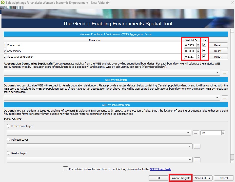
🖱️🖱️ Double-click on the WEE Score section to open the pop-up.
⚖️ Assign Weights: Ensure the weights are correctly assigned, as they determine the relative importance of each factor in the analysis. Carefully review these values to ensure they are aligned with your project’s objectives and reflect the significance of each factor accurately.
🚫 Exclude Unused Dimensions (optional): If a specific dimension is not intended to be included in the process, uncheck the Use button associated with it.
🔄 Readjust Weights: After excluding any dimensions, make sure to Balance Weights of the remaining ones. This step ensures the weight distribution remains balanced and totals correctly, preserving the integrity of the analysis, then click OK to proceed.
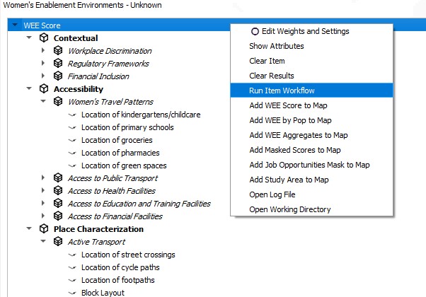
After configuring the dimensions and adjusting their weights to achieve balance, you can initiate the process workflow:
🖱️Right-click on WEE Score.
▶️Select Run Item Workflow from the context menu.
The process should be successfully completed and indicated by a green checkmark widget.
Optional Steps After Defining the WEE Score#
WEE can be visualized in relation to female population distribution by providing a raster dataset containing female population density and/or by job distribution by providing job locations. These datasets are combined with the WEE score to calculate the WEE by Population score and/or WEE by Job Distribution score. If an administrative layer is defined, results are aggregated by subnational boundaries to display the predominant WEE outputs for each region.
1. Aggregation Boundaries (Optional)#
This step allows aggregating the WEE analysis results by subnational boundaries (e.g., districts, provinces).
🛠️ What to do: Select or upload a layer containing subnational boundaries (e.g., administrative polygons).
📊 What can be done: Calculate the majority WEE score for each boundary. If population data is available, calculate the majority WEE by Population score for each boundary. If job distribution data is configured (see Step 3), calculate the majority WEE by Job Distribution score for each boundary.
2. WEE by Population (Optional)#
This step combines female population data with the WEE score to provide insights into population-weighted WEE results.
🛠️ What to do: Upload or select a raster dataset containing female population density.
📊 What can be done: Combine the population data with WEE scores to calculate the WEE by Population score. If an aggregation layer has been defined (in Step 1), the results will be summarized per subnational boundary to show the predominant WEE by Population score. The final output is a comprehensive dataset consisting of 15 classes, representing a combination of 5 levels of enablement and 3 population density categories: low, medium and high.
3. WEE by Job Distribution (Optional)#
This step enables targeted analysis based on job locations, identifying areas where WEE intersects with job opportunities.
🛠️ What to do: Upload or select job location data, either as:
Point Layer: Locations of individual jobs (e.g., existing or planned job sites).
Polygon Layer: Job regions (e.g., industrial zones or employment clusters).
Raster Layer: Job density data in raster format.
Specify a buffer distance for point data to analyze the surrounding area.
The Mask Source section allows limiting the analysis to specific areas based on:
Buffer Point Layer: Creates a buffer around points (e.g., job sites or facilities).
Polygon Layer: Limits analysis to selected polygons (e.g., administrative regions or zones).
Raster Layer: Uses raster data to define areas for focused analysis.
📊 What can be done: Explore how WEE scores relate to existing or planned job opportunities. Identify areas with high WEE potential that align with job locations. Can restrict the analysis to areas of specific interest, such as around job sites, within administrative boundaries, or in high-density regions.
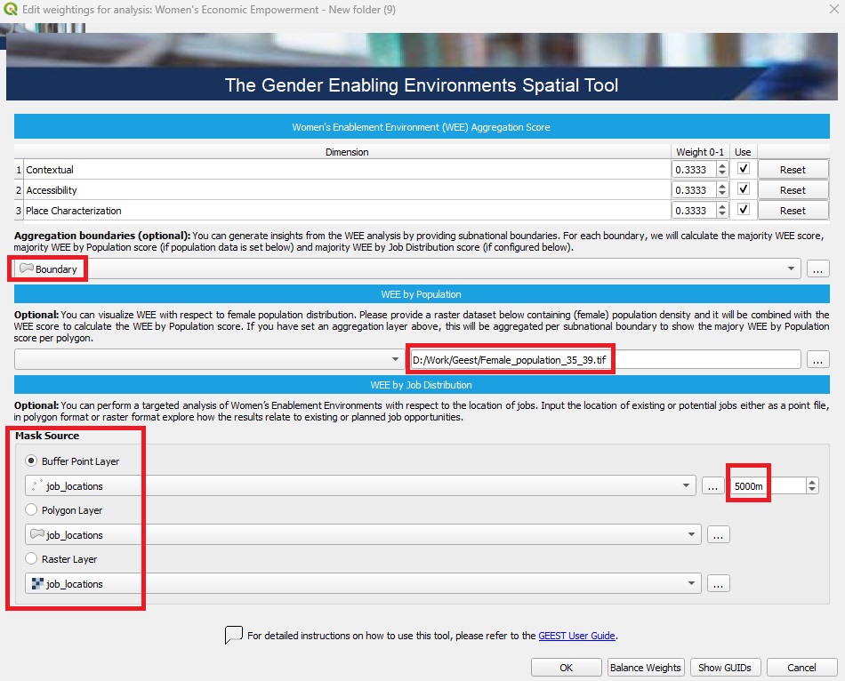
After configuring the optional features you can initiate the process workflow:
🖱️Right-click on WEE Score.
▶️Select Run Item Workflow from the context menu.

Visualizing the Outputs#
After completing the process, the outputs are automatically added to the Layer Panel in QGIS as a group layer. This group layer has the *Mutually Exclusive Group* feature activated, which ensures that only one layer within the group can be visible at a time. When this feature is enabled, turning on the visibility of one layer automatically turns off the visibility of the others within the same group, making it easier to compare results without overlapping visualizations.
The outputs consist of all WEE score outputs (aggreagated at administrative level, by population or by job distribution). All scores are assessed on a scale from 0 to 15, categorized as follows: 14 - 15: Highly enabling, high population | 13 - 14: Highly enabling, medium population | 12 - 13: Highly enabling, low population | 11 - 12: Enabling, high population | 10 - 11: Enabling, medium population | 9 - 10: Enabling, low population | 8 - 9: Moderately enabling, high population | 7 - 8: Moderately enabling, medium population | 6 - 7: Moderately enabling, low population | 5 - 6: Low enablement, high population | 4 - 5: Low enablement, medium population | 3 - 4: Low enablement, low population | 2 - 3: Very low enablement, high population | 1 - 2: Very low enablement, medium population | 0 - 1: Very low enablement, low population.
The outputs are stored within the project folder created during the setup phase as raster files. These files can be shared and further utilized for various purposes, such as visualization in QGIS or other GIS software, integration into reports, overlaying with other spatial datasets, or performing advanced geospatial analyses, such as identifying priority areas or conducting trend analysis based on the scores.
If the results do not immediately appear in the Layer Panel after processing the WEE Scores, you can resolve this by either adding them manually from the folder path or by right-clicking on the WEE Score and selecting Add to map from the context menu.
🖥️ Key attributes of WEE Score tab
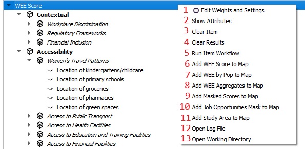
| 1. Edit Weights and Settings | Allows users to modify weights and settings for the analysis. |
| 2. Show Attributes | Displays detailed attribute data for the items in the analysis. |
| 3. Clear Item | Removes the selected item from the analysis. |
| 4. Clear Results | Clears all previously generated results. |
| 5. Run Item Workflow | Executes the workflow. |
| 6. Add WEE Score to Map | Adds the Women’s Enablement Environment (WEE) score to the map display. |
| 7. Add WEE by Population to Map | Displays WEE scores combined with population data on the map. |
| 8. Add WEE Aggregates to Map | Visualizes aggregated WEE scores on the map. |
| 9. Add Masked Scores to Map | Adds scores that are filtered or masked to the map display. |
| 10. Add Job Opportunities Mask to Map | Overlays a mask of job opportunities on the map. |
| 11. Add Study Area to Map | Displays the study area boundaries on the map. |
| 12. Open Log File | Opens the log file to review detailed workflow processes or errors. |
| 13. Open Working Directory | Opens the directory containing the project files. |
