Evaluating Data Quality and Representativeness#
Accurate and representative data are critical for conducting meaningful analyses and deriving valuable insights. In this notebook, we will explore methods to evaluate the quality and check its quality and representativeness of mobility data.
Data#
In this section, we import data from various sources, either publicly available or obtained through data sharing agreements.
Mobility Data#
This study used longitudinal human mobility data, which includes anonymized, timestamped geographical points from GPS-enabled devices. The mobility data has been provided by Veraset Movement and obtained through the Monitoring Near-Time Changes in Urban Space Usage after Climate Shocks: ECA Urban Resilience proposal of the Development Data Partnership. This dataset covers the countries of Bosnia and Herzegovina, North Macedonia, Serbia and Türkiye for the timeframe specified below.
Show code cell source
ddf = dd.read_parquet(PANEL)
Data Quality Metrics#
Data quality metrics are essential in ensuring the reliability and usability of any dataset. These metrics typically include completeness, accuracy, consistency, among others. Throughout this notebook, we explore these metrics and visulizations with the support of the packages mobilyze and mobilkit [1], the last developed by Mindearth, the Global Facility for Disaster Reduction and Recovery (GFDRR) and Purdue University.
Important
Mobility data, while valuable for understanding movement patterns, suffers from significant sample bias and Limitations.
One of the primary limitations of mobility data is the reliance on convenience sampling, which often results in non-representative samples. Convenience sampling involves collecting data from sources that are readily accessible rather than from a randomly selected, statistically representative sample of the population. This method can introduce significant biases, as it may overrepresent certain groups (e.g., urban residents, younger individuals, or tech-savvy users) while underrepresenting others (e.g., rural residents, older individuals, or those less likely to use GPS-enabled devices). These biases can skew the results and limit the generalizability of the findings.
Another prominent issue is urban skewness, where data is often disproportionately collected from urban areas with higher smartphone usage, better infrastructure, and more active digital services. This results in an overrepresentation of densely populated, affluent cities while underrepresenting rural or underserved regions where mobile device usage may be lower or less consistent.
Additionally, mobility data often lacks demographic diversity, as it predominantly captures movements of individuals who are more tech-savvy or have access to mobile technology, leaving out vulnerable or marginalized populations. These biases can lead to incomplete or misleading insights, especially when used to inform policy decisions or urban planning. Moreover, data privacy concerns and inconsistent data quality further limit the reliability of such datasets, necessitating careful interpretation and complementary data sources to mitigate skewed conclusions.
Completeness#
Completeness measures the extent to which all required data is present, identifying any missing or null values that could impact analysis. Completeness refers to the percentage of data points that are present compared to the expected total number of data points.
First, we calculate the cardinality, which refers to the total number of unique devices in the dataset.
Show code cell source
len(ddf)
1426447505
And number of unique devices,
Show code cell source
ddf["uid"].nunique().compute()
24771920
Secondly, we look at the timeframe.
And visualize the spatial density of the mobility data panel.
Show code cell source
plot_spatial_distribution(ddf)


Fig. 1 Map showing the spatial distribution of mobility data. The visualization represents various levels of mobility density across different regions, indicating areas with higher and lower movement patterns. This data can be crucial for understanding regional differences in transportation, urban planning, and public health interventions. The map highlights key trends and hotspots, providing insights into how people move within the country.#
Show code cell source
count = (
ddf.groupby(["country"], observed=False)["uid"]
.count()
.compute()
.to_frame("count")
.reset_index()
)
fig = px.treemap(
count, path=["country"], values="count", title="Distribution of Pings By Country"
)
fig.update_layout(margin=dict(t=50, l=25, r=25, b=25))
fig.show()
Accuracy#
Accuracy assesses whether the data correctly represents the real-world entities it intends to model, while consistency checks for uniformity across different datasets or within the same dataset over time.
Note
Coverage Gaps:
Spatial Coverage: GPS data may not cover all geographic areas equally. Remote or rural areas might have sparse data compared to urban areas.
Temporal Coverage: The data may not be continuous over time. There can be gaps due to various reasons like battery life, device settings, or loss of signal.
User Participation:
Voluntary Participation: Many GPS datasets rely on voluntary participation. This can lead to non-representative samples if certain demographics are more likely to opt-in.
Device Ownership: Not everyone owns a GPS-enabled device. This can exclude certain populations from the dataset, such as the elderly, children, or those in lower socio-economic brackets.
Data Quality:
Accuracy: GPS signals can be inaccurate due to multipath errors, atmospheric conditions, or obstructions like buildings and trees.
Resolution: The granularity of data can vary. Some datasets may have high-frequency, high-resolution data, while others might be coarse.
Incomplete Trips:
Start and End Points: Data might only capture partial trips if the device is turned off, the signal is lost, or the user stops recording.
Data Collection Methods:
Location Data Colletion: Different applications and services may use different algorithms and methods for collecting and processing GPS data, leading to inconsistencies.
Update Frequency: The frequency of GPS updates can vary between applications, affecting the granularity and continuity of the data.
Consistency#
Consistency refers to the reliability and uniformity of data across different sources or time periods.
Source consistency#
Source consistency is critical to ensure that study provides a coherent and accurate picture of mobility patterns. In this analysis, we assess the data quality, looking for variations in data collection methods, frequency of updates, and completeness of the GPS traces. Inconsistencies between sources can lead to biases and misinterpretations of mobility behaviors.
One of the primary limitations of mobility data is the reliance on convenience sampling, which often results in non-representative samples. Convenience sampling involves collecting data from sources that are readily accessible rather than from a randomly selected, statistically representative sample of the population. This method can introduce significant biases, as it may overrepresent certain groups (e.g., urban residents, younger individuals, or tech-savvy users) while underrepresenting others (e.g., rural residents, older individuals, or those less likely to use GPS-enabled devices). These biases can skew the results and limit the generalizability of the findings.
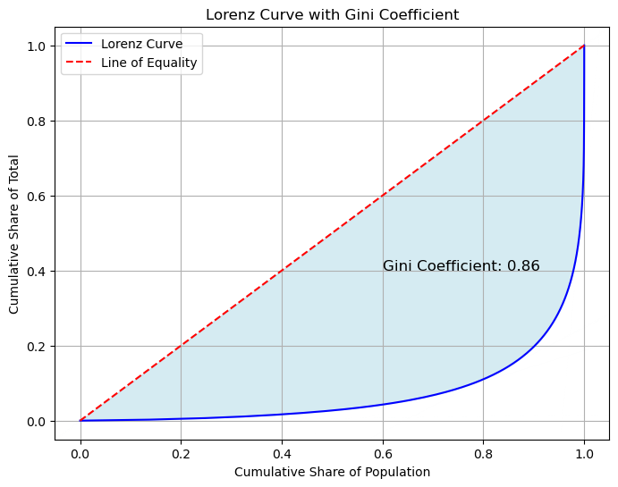
0.8614137512796518
Dealing with imbalanced datasets, where some users have many more observations than others, can be challenging because it can lead to biased result. The analysis may become overly influenced by the users with more data, potentially neglecting those with fewer or no observations
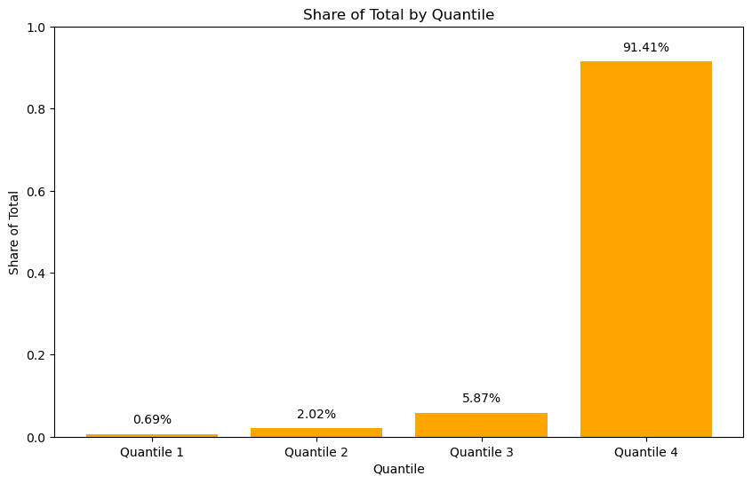
Important
The high Gini coefficient observed in the mobility data, as illustrated above, indicates a significant level of inequality in the distribution of mobility traces and pigs. The illustration highlights that a substantial proportion of pings are concentrated among a relatively small segment of users. In conclusion, the high Gini coefficient thus reflects the pronounced imbalance in mobility data, pointing to the need for a deeper analysis of the factors contributing to this disparity.
When comparing iPhone and Android devices, there are distinct differences in the user identification types and how these platforms handle user privacy and tracking. iPhones primarily use Apple’s Identifier for Advertisers (IDFA), which allows advertisers to track user activity across apps, but with strict privacy controls. On the other hand, Android devices use Google’s Android Advertising ID (GAID), which functions similarly. Both platforms allow users to reset their identifiers.
Show code cell source
id_type = (
ddf.groupby(["country", "id_type"])["datetime"]
.count()
.to_frame("value")
.reset_index()
.compute()
)
fig = px.treemap(
id_type,
path=["country", "id_type", "value"],
values="value",
color="id_type",
color_discrete_map={"(?)": "grey", "aaid": "gold", "idfa": "darkblue"},
title="Share Android/iOS",
)
fig.update_traces(root_color="lightgrey")
fig.show()
Fig. 2 Treemap illustrating the share distribution of iOS and Android operating systems among mobile users in region of interest. The data shows that iOS holds a minority share, while Android dominates with a significant majority.#
Show code cell source
plt.figure(figsize=(10, 6))
ddf.sample(frac=FRAC).groupby(["id_type", "uid"])["datetime"].count().to_frame(
"value"
).reset_index().compute().pivot_table(
values="value", index="uid", columns=["id_type"]
).boxplot()
plt.title("Distribution of Pings Per Device by Platform", fontsize=16)
plt.yscale("log")
plt.show()
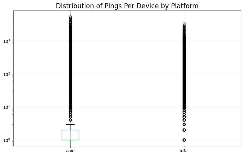
Fig. 3 Distribution of pings by operating system, based on a 1% sample of the total data. The chart illustrates the frequency of pings per device for each platform.#
Spatial consistency#
Temporal consistency#
Maintaining temporal consistency involves onsistent sampling intervals, and rigorous quality assurance measures to minimize biases and ensure the data accurately represents the dynamics of human mobility over time. This consistency is fundamental for developing effective policies and interventions that respond to real-world mobility challenges and trends.
Show code cell source
TEMPORAL_PROFILE = mobilkit.temporal.computeVolumeProfile(
ddf, what="both", normalized=False, freq="1d"
)
TEMPORAL_PROFILE.plot(title="Pings by User", logy=True);
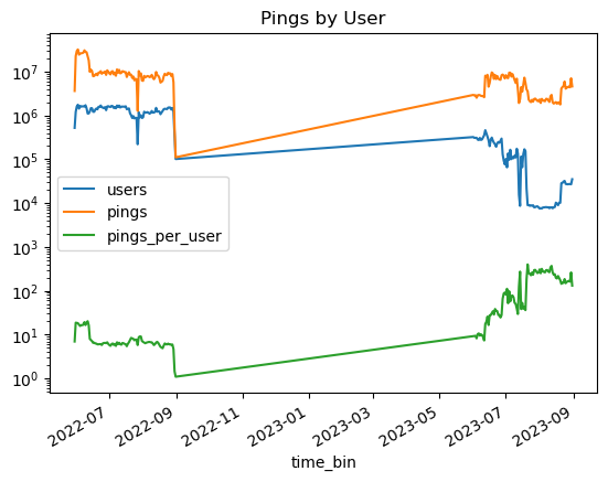
Next, in this section, we look at we look at the distribution of pings per user over time and time interval between pings per device, based on a 1% sample of the devices.
Show code cell source
from bokeh.io import output_file
from bokeh.models import ColumnDataSource, Whisker
from bokeh.plotting import figure, output_notebook, show
# Output to notebook or file
output_notebook() # For Jupyter notebooks
# output_file('median_iqr_plot.html') # For saving to an HTML file
# Prepare data for Bokeh
source = ColumnDataSource(
data=dict(
date=summary.index,
median=summary["median"],
q25=summary["q25"],
q75=summary["q75"],
iqr=summary["iqr"],
)
)
# Create figure
p = figure(
x_axis_type="datetime",
y_axis_type="log",
width=800,
height=400,
title="Median and IQR by Date",
)
# Add median points
p.circle(x="date", y="median", size=8, color="blue", source=source)
# Add IQR bars
whisker = Whisker(source=source, base="date", upper="q75", lower="q25")
p.add_layout(whisker, "center")
# Customize plot
p.xaxis.axis_label = "Date"
p.yaxis.axis_label = "Value"
p.xaxis.major_label_orientation = "vertical"
p.grid.grid_line_color = None
# Show plot
show(p)
Fig. 4 Time series boxplots illustrating the distribution of pings per device over time, based on a 1% sample of the devices. Each boxplot represents the spread of ping counts for each user within a given time period.#
Interval consistency#
In this session, we will assess interval consistency by determining the average ping interval within mobility data. This will be visualized using a box plot, which will display the distribution of ping intervals across the dataset. The box plot will provide insights into the typical time intervals between pings, highlighting any variations and outliers. By examining the median, quartiles, and potential outliers, we aim to understand the regularity and frequency of pings, and assess whether there are any consistent patterns or significant deviations in the ping intervals across different instances.
Note
In conclusion, the analysis of mobility data has revealed that the average number of pings per device falls below a representative threshold. This number is insufficient for achieving high accuracy in identifying significant locations. The limited volume of data points constrains the precision of location estimation and hinders the ability to detect meaningful patterns in user mobility. [] [].
Given these insights, it is evident that the current average number of pings per device is inadequate for achieving high accuracy in mobility studies. To enhance the precision of location identification, it is recommended to increase the frequency of data collection or employ supplementary methods to augment the existing dataset.
Data Representativeness#
Representativeness is crucial to ensure that the insights derived from the data accurately reflect the actual mobility patterns of the population under study. Our dataset includes GPS traces collected from various sources, capturing movement across different geographic regions and times.
To evaluate the representativeness, we examine the coverage of the data in terms of geographic distribution, demographic alignment, and temporal consistency.
Geographic Representativeness#
In this section, we evaluate the geographic representativeness of the GPS-based mobility data to ensure that it accurately reflects the movement patterns across different regions. Geographic representativeness is assessed by analyzing the spatial distribution of the collected GPS data, comparing it against the known geographic characteristics and population distribution of the area under study. We utilize various geospatial analysis techniques to map the coverage of the GPS traces and identify any gaps or biases in the data collection process.
We employ spatial aggregation and visualization methods, such as heat maps and choropleth maps, to visually inspect the density and coverage of the data across different regions.
Determine Spatial Density#
Note
To enhance the analysis, first calculate stop locations by identifying points where the data indicates frequent or prolonged stops, which suggest potential hotspot areas. Next, estimate home locations by analyzing these stop locations and patterns to pinpoint areas with extended or repeated stays, which are likely to be residential. Once these locations are determined, compare them with population density data to evaluate their alignment with actual population patterns. For instance, you can use population density data from WorldPop to perform this comparison. Ensure that the resolution of the population density data is compatible with the resolution of your location estimates for accurate and meaningful analysis.
Temporal Representativeness#
The extent to which the data reflects the temporal patterns of mobility.
mobilkit.stats.plotUsersHist(
users_stats_df, days="active", min_pings=10, min_days=MIN_DAYS, cmap="Purples"
);
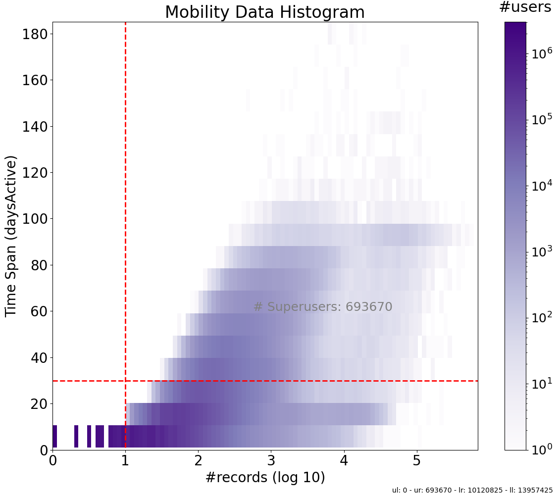
Fig. 5 2D histogram illustrating the distribution of active days versus the number of pings in mobility data. The color intensity represents the number of users, showing how user activity varies with the frequency of pings and the number of active days. Areas with higher intensity indicate more users with specific combinations of active days and ping counts.#
Definition of Superusers
Definition of Superusers
In the context of our mobility data analysis, “superusers” are defined as users who exhibit high levels of activity as measured by two specific criteria:
Number of Pings: Superusers must have a total number of GPS pings above a predefined threshold. This threshold ensures that the user has contributed a significant amount of data, indicating frequent and consistent movement.
Days Spanned: Superusers must have GPS data that spans across a minimum number of days. This ensures that the user’s activity is not only frequent but also sustained over a longer period, providing a more comprehensive picture of their mobility patterns.
By combining these two criteria, we can identify users who provide a more robust dataset, making them valuable for more reliable for modeling movement patterns and subsequent mobility analysis.
To assess the temporal representativeness, one may ask: “how often does the variable exceed a specific threshold?” This idea is encapsulated by the complementary cumulative distribution function, which is also referred to as the tail distribution or exceedance probability. Rather than concentrating on the entire distribution of the variable, the emphasis here is on analyzing the frequency of instances where the variable surpasses the defined threshold. This approach provides insight into how frequently extreme or significant events occur over time. In the plot below, , we examine how many devices remain present above a certain threshold of pings after a specified time period.
Show code cell source
SURVIVAL_FRAC = mobilkit.stats.computeSurvivalFracs(users_stats_df)
fig, ax = plt.subplots(1, 1, figsize=(8, 4))
ax = mobilkit.stats.plotSurvivalDays(SURVIVAL_FRAC, min_days=MIN_DAYS, ax=ax)
plt.tight_layout()
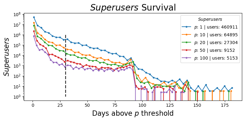
Fig. 6 Exceedance plot illustrating the number of devices exceeding a specified ping threshold over a given time period. The y-axis shows the count of devices with ping above each threshold level.#
References#
- 1
Enrico Ubaldi, Takahiro Yabe, Nicholas Jones, Maham Faisal Khan, Alessandra Feliciotti, Riccardo Di Clemente, Satish V. Ukkusuri, and Emanuele Strano. Mobilkit: a python toolkit for urban resilience and disaster risk management analytics. Journal of Open Source Software, 9(95):5201, 2024. URL: https://doi.org/10.21105/joss.05201, doi:10.21105/joss.05201.