Estimating Activity via Mobility Data#
Analyzing population movement can offer valuable insights for public policy and disaster response, especially during crises when reduced movement often indicates lower economic activity. Similar to initiatives such as the COVID-19 Community Mobility Reports, Facebook Population During Crisis, and Mapbox Movement Data, we have developed a set of crisis-relevant indicators.
By tracking changes in the density of GPS-enabled devices over time, we use device density as a proxy for activity levels. This allows us to infer shifts in population mobility and identify social or economic trends, particularly during crises. In this approach, the baseline density represents the typical or expected number of devices in a given area. Subsequent device densities are then compared against this baseline to assess changes in movement patterns. For instance, a drop in density might indicate fewer people are present, suggesting reduced economic activity, such as fewer shoppers, workers, or commuters.
However, this approach has inherent limitations, as outlined in Limitations. Notably, mobility data is collected through convenience sampling, meaning it captures only a subset of the population, rather than being based on controlled, randomized sampling methods.
Data#
In this section, we import data from various sources, either publicly available or obtained through data sharing agreements.
Area of Interest#
In this step, we import the area of interest created from geoBoundaries and shown below. This area covers the countries of Bosnia and Herzegovina, North Macedonia, Serbia and Türkiye.
Show code cell source
AOI = geopandas.read_file("../../data/final/areas/AOI.gpkg")
TESSELLATION = geopandas.read_file("../../data/final/areas/AOI_tessellation.gpkg")
AOI.explore(
style_kwds={"stroke": True, "fillOpacity": 0.5},
)
Fig. 7 Visualization of the area of interest. This area covers the countries of Bosnia and Herzegovina, North Macedonia, Serbia and Türkiye.#
Mobility Data#
This study used longitudinal human mobility data, which includes anonymized, timestamped geographical points from GPS-enabled devices. The mobility data has been provided by Veraset Movement and obtained through the Monitoring Near-Time Changes in Urban Space Usage after Climate Shocks: ECA Urban Resilience proposal of the Development Data Partnership. This dataset covers the countries of Bosnia and Herzegovina, North Macedonia, Serbia and Türkiye for the timeframe specified below.
ddf = dd.read_parquet(
f"../../data/final/panels/v1.1",
)
Note
Because of the large volume and daily updates of the data, versions of panel were computed from the raw mobility data on the cloud, i.e., using AWS SageMaker. The resulting dataset is available in the project’s folder.
First, we calculate the cardinality, which refers to the total number of unique devices in the dataset.
Show code cell source
len(ddf)
1426447505
Secondly, we look at the timeframe.
And visualize the spatial density of the mobility data panel.


Fig. 8 Visualization of the spatial distribution of the mobility data panel, which consists of 1.5 billion data points approximately. Source: Veraset Movement.#
Evaluating Data Quality and Representativeness#
The purpose of this section is to assess the quality and representativeness of mobility data. Accurate and representative data are essential for meaningful analyses and insights in various domains such as urban planning, transportation, and public health. In this notebook, we will explore methods to evaluate the quality of mobility data and ensure its representativeness. This code has been developed by Mindearth, the Global Facility for Disaster Reduction and Recovery (GFDRR) and Purdue University. `cite{ubaldi2021mobilkit}
Users Statistics#
It is fundamental to assess the quality and representiveness for the human mobility panel in question.
Show code cell source
count = (
ddf.groupby(["country"], observed=False)["uid"]
.count()
.compute()
.to_frame("count")
.reset_index()
)
fig = px.treemap(count, path=["country"], values="count", title="Distribution of Pings")
fig.update_layout(margin=dict(t=50, l=25, r=25, b=25))
fig.show()
Show code cell source
nunique = (
ddf.groupby(["country"], observed=False)["uid"]
.nunique()
.compute()
.to_frame("nunique")
.reset_index()
)
fig = px.treemap(
nunique, path=["country"], values="nunique", title="Distribution of Devices"
)
fig.update_layout(margin=dict(t=50, l=25, r=25, b=25))
fig.show()
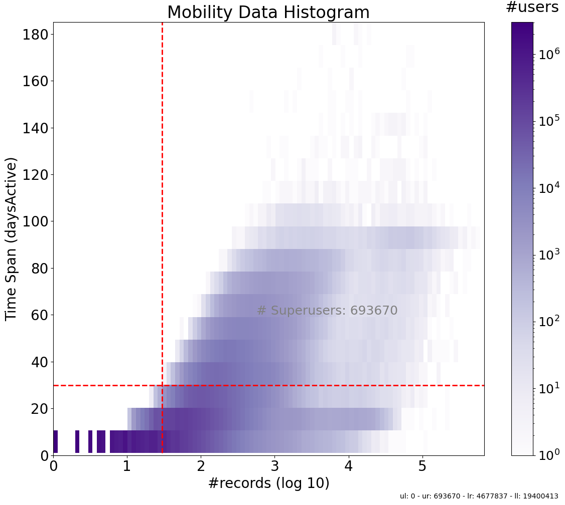
Let’s look at the histogram.
Show code cell source
users_stats_df = mobilkit.stats.userStats(ddf).compute()
mobilkit.stats.plotUsersHist(
users_stats_df, days="active", min_pings=30, min_days=30, cmap="Purples"
);
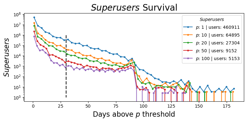
In some cases, it is valuable to consider the converse question: how frequently does a variable exceed a specified threshold? This concept is captured by the complementary cumulative distribution function (CCDF), also known as the tail distribution or exceedance. The focus in this context shifts towards examining the total occurrences beyond the given threshold.
Show code cell source
fig, ax = plt.subplots(1, 1, figsize=(8, 4))
ax = mobilkit.stats.plotSurvivalDays(SURVIVAL_FRAC, min_days=30, ax=ax)
# ax.set_ylim(1e-2, 1.0)
plt.tight_layout()
Methodology#
To estimate population activity during crises, we analyze mobility data by tracking changes in device density. Similar to initiatives like the COVID-19 Community Mobility Reports, Facebook Population During Crisis, and Mapbox Movement Data, this approach provides crisis-relevant indicators to assess population movement and its potential impact on economic and social activity.
Data Source and Collection#
The mobility data used in this analysis is collected from GPS-enabled devices and serves as a proxy for population movement. Devices are tracked over time, allowing us to detect changes in density within defined geographical areas. However, it’s important to note that this data is collected through convenience sampling, meaning it captures a non-random subset of the population. Devices in the data are from individuals who have location services enabled, which may not represent the broader population.
Device Density as a Proxy for Activity#
Device density is used as an indicator of activity levels, particularly during crisis periods when movement patterns may shift significantly. By comparing the number of devices present in a specific area over time, we can infer trends in population movement. In this framework, a baseline density is established, representing the typical number of devices in a given location before the crisis. This baseline serves as a reference point against which subsequent device counts are compared to detect changes in movement and activity.
Metrics for Quantifying Change#
To quantify the changes in activity, we use two primary metrics:
Percent change: This metric calculates the percentage difference between the current device density and the baseline, indicating whether activity has increased or decreased relative to typical levels.
Z-score: This statistic measures how much the current density deviates from the baseline average, helping to highlight significant outliers or unusual fluctuations and shifts in activity.
These metrics are applied to aggregated device counts within specific geographic tiles and time intervals, allowing for a granular analysis of how activity changes over space and time. This density of devices over space and time serves as a real-time signal of population behavior, enabling governments and organizations to respond effectively to crises or monitor recovery efforts.
Data Standards#
To capture localized patterns of movement, the device counts are aggregated across small geographical areas (tiles) and over defined time periods.
Population Sample#
The sampled population consists of GPS-enabled devices extracted from longitudinal mobility data. It is important to note that this sampling is based on convenience and only includes users who have enabled location tracking on their mobile devices. As a result, the mobility data panel represents only a subset of the total population in an area at any given time. Consequently, the metrics derived from this data do not reflect the overall population density.
Spatial Aggregation#
The indicators are aggregated spatially based on H3 resolution 7 tiles. Each tile represents an area of approximately 5 km², as illustrated below.
Fig. 9 Illustration of H3 (resolution 7). For further details on H3 resolution 7 and its specifications, please refer to the H3 documentation.#
Temporal Aggregation#
The indicators are aggregated daily on the localized date, for example, Europe/Belgrade (UTC+2) or in the Europe/Istanbul (UTC+3) timezones.
Implementation#
In this section, we loading the necessary libraries and data. After cleaning and organizing the dataset, we will proceed with calculating key metrics such as population density, device counts, and percent changes across different time periods.
Compute ACTIVITY, Percent Change and Z-Score#
In this section, we calculate ACTIVITY as a density metric by counting the total number of devices detected in each area of interest on a daily basis. Instead of using a spatial join, which only checks if a device was detected within an area of interest at least once, we aggregate based on H3 indexes (hex_id). We also define a baseline for the analysis, calculated for each tile and time period using specific spatial and temporal standards. This results in seven distinct baselines for each tile, with the mean device density computed for each day of the week (Mon-Sun).
In addition, we compute both the percent change and z-score metrics. Percent change quantifies the relative increase or decrease of a value compared to the baseline, making it an intuitive measure of change as a percentage. The z-score, on the other hand, indicates how far a specific data point deviates from the mean of the dataset, measured in standard deviations. This statistic is particularly useful for normalizing data and enabling comparisons across datasets. While z-scores provide insights into the degree of variation from the mean, accounting for variance, percent change offers a simpler, but less detailed, measure of change.
ACTIVITY = compute_activity(ddf, start="2022-01-01", end="2023-12-31")
Joining the “activity” metrics with the area of interest (i.e. tesssellation).
ACTIVITY = (
ACTIVITY.reset_index()
.merge(TESSELLATION, how="left", on="hex_id")
.drop(["geometry"], axis=1)
)
Let’s take a quick look at the result.
| hex_id | nunique | weekday | nunique.mean | nunique.std | z_score | n_baseline | n_difference | percent_change | shapeName | shapeISO | shapeGroup | shapeID | shapeType | |
|---|---|---|---|---|---|---|---|---|---|---|---|---|---|---|
| date | ||||||||||||||
| 2022-05-31 | 871e1a018ffffff | 1 | 1 | 1.000000 | NaN | 0.000000 | 1.000000 | 0.000000 | 0.000000 | Federation of Bosnia and Herzegovina | BA-BIH* | BIH | 54001226B17629474923252 | ADM1 |
| 2022-06-10 | 871e1a01affffff | 1 | 4 | 1.166667 | 0.408248 | -0.529999 | 1.166667 | -0.166667 | -14.285714 | Federation of Bosnia and Herzegovina | BA-BIH* | BIH | 54001226B17629474923252 | ADM1 |
| 2022-06-19 | 871e1a01affffff | 1 | 6 | 1.454545 | 0.522233 | -0.529999 | 1.454545 | -0.454545 | -31.250000 | Federation of Bosnia and Herzegovina | BA-BIH* | BIH | 54001226B17629474923252 | ADM1 |
| 2022-06-22 | 871e1a01affffff | 1 | 2 | 1.125000 | 0.353553 | -0.529999 | 1.125000 | -0.125000 | -11.111111 | Federation of Bosnia and Herzegovina | BA-BIH* | BIH | 54001226B17629474923252 | ADM1 |
| 2022-06-28 | 871e1a01affffff | 2 | 1 | 1.428571 | 0.786796 | 1.377997 | 1.428571 | 0.571429 | 40.000000 | Federation of Bosnia and Herzegovina | BA-BIH* | BIH | 54001226B17629474923252 | ADM1 |
| ... | ... | ... | ... | ... | ... | ... | ... | ... | ... | ... | ... | ... | ... | ... |
| 2023-08-31 | 873f6e6e8ffffff | 1 | 3 | 2.588235 | 2.319990 | -0.836963 | 2.588235 | -1.588235 | -61.363636 | Antalya | TR-07 | TUR | 25984515B97476213604692 | ADM1 |
| 2023-08-31 | 873f6e6eaffffff | 1 | 3 | 4.111111 | 3.817743 | -0.910138 | 4.111111 | -3.111111 | -75.675676 | Antalya | TR-07 | TUR | 25984515B97476213604692 | ADM1 |
| 2023-08-31 | 873f6e6ebffffff | 1 | 3 | 10.714286 | 11.726649 | -1.026057 | 10.714286 | -9.714286 | -90.666667 | Antalya | TR-07 | TUR | 25984515B97476213604692 | ADM1 |
| 2023-08-31 | 873f6eaccffffff | 1 | 3 | 4.500000 | 4.010855 | -0.781471 | 4.500000 | -3.500000 | -77.777778 | Antalya | TR-07 | TUR | 25984515B97476213604692 | ADM1 |
| 2023-08-31 | 873f6ecdaffffff | 1 | 3 | 1.000000 | 0.000000 | 0.000000 | 1.000000 | 0.000000 | 0.000000 | Muğla | TR-48 | TUR | 25984515B57226385500606 | ADM1 |
3725697 rows × 14 columns
Findings#
Reduced movement often indicates a decrease in economic activity. Movement “activity” indicators can be useful for tracking changes over time and examining their correlation with other factors. The results presented here (i.e., percent_change and z_score) are aggregated at the administrative division level. However, since the underlying data is based on hex_id, the results can be aggregated and presented at any geographic level compatible with the H3 resolution.
Percent Change#
In this section, we present visualizations of the aggregated percent_change for each division .
Z-Score#
Alternatively, we present a time series plot of the aggregated z_score for each division.
Show code cell source
show(plot_activity(ACTIVITY, variable="z_score"))