Chapter 3 Measuring the Statistical Performance of Countries: An Overview of the Statistical Performance Indicators and Index
The World Bank’s Statistical Capacity Index (SCI) has been widely employed to measure country statistical capacity since its inception two decades ago. We build on the existing advantages of the World Bank’s widely-used SCI, both conceptually and empirically, to offer a new Statistical Performance Index (SPI) that can better measure a country’s statistical performance. We present clearer conceptual motivations, employ a stronger mathematical foundation, and significantly expand the number of indicators and countries covered by this index. We also further provide empirical evidence that further illustrates the strong correlation of this new index with other commonly used development indicators regarding human capital, governance, poverty, and inequality. Our framework can accommodate future directions to further improve this index as the global data landscape evolves.
3.0.1 Technical Information
3.0.1.1 Handling Missing Data
For a full description of the methodology behind each specific indicator, please consult the technical documentation. However, we did follow an approach of handling missing values and lining up data, which will be describe in general terms below. For indicators where we had a value for a previous year (say a value in 2018 but not 2019), we would fill in from the previous value. For instance, the open data watch indicators on geo-spatial data was only released in 2018, not 2019, so we filled in the value for 2019 with the value from 2018 as our best estimate of that indicator.
For indicators where we had no data for any years, we chose not to impute a value. In that case, the value for that indicator is null and the country will not have a value for any pillars or dimensions where that value is used.
3.0.1.2 Process for Inquiring about and Validating the Data
The data for the Statistical Performance Indicators are collected from established public and open sources. The team makes every effort to ensure that the data presented in the Statistical Performance Indicators are accurate, but it is possible that the sources used to assign values for the indicators are occasionally not up to date or accurate despite these efforts. Countries and all other users have the opportunity to inquire about the values that make up the indicators through contacting the Bank directly or via data@worldbank.org.
3.0.1.3 Process for Updating Indicators
While the framework put forth in this note is designed to capture the contours of statistical systems around the world over the next decade and beyond, the indicators themselves are expected to improve over time. Changing indicators over time does come with a tradeoff: while it would improve the measurement of statistical performance, it would break the comparability with previous measures. Recognizing this trade-off, we plan to follow a 2- to 3-year cycle when, new indicators may be introduced and current indicators re-evaluated based on feedback from stakeholders and users, including national authorities. Whenever such a change takes place, the historical SPI series would need to be updated for comparability over time. In order to be completely transparent, all changes to methodology will be tracked through a publicly available github repository and all code and underlying data to produce the indicators will be published.
3.0.1.4 Links to Resources
The following resources are available to learn more about the project.
The SPI Project Website provides an overview of the project, allows users to quickly explore some of the SPI data, and offers a link to the World Development Report 2021: Data for Better Lives, the SPI World Bank policy research working paper, and a list of frequently asked questions.
The SPI Github repository contains the raw data used to produce our indicators, code to reproduce the values for all of our indicators and overall scores written in R, which is an open source statistical language, and a final data set available in CSV and Stata format. A detailed Readme file is available detailing how to use the code. The repository is licensed under the Creative Commons Attribution 4.0 International License, which means users are free to share or adapt any of the materials available, so long as appropriate credit is given to the SPI team. The github repository also contains the version control history, which documents every change in the data and code of the entire project dating back to July 2020 to build confidence and transparency.
The SPI Interactive Dashboard is available for a more detailed exploration of the data. In this application, it is possible to map any of the 51 Statistical Performance Indicators, to explore a country report for each of the 174 countries, and use a tool to see how the SPI overall scores change when alternative weights are applied to the dimensions and pillars.
3.0.2 SPI Index Methodology
An overall score is produced by combining the Statistical Performance Indicators to yield one single index. The statistical performance indicators have a nested structure, and the SPI overall score is formed by sequentially aggregating each level.
To begin we produce a score for each dimension, which, unless otherwise stated, is an unweighted average of the indicators within that dimension. For instance, the Standards and Methods dimension will be formed by taking the unweighted average of the indicators for the system of national accounts in use, national accounts base year, classification of national industry, CPI base year, classification of household consumption, etc.
\[ SPI.DIM_{ctpd} = \sum_{i=1}^{N_I} \frac{SPI.IND_{ctpdi}}{N_I} \]
where \(SPI.DIM_{ctpd}\) is pillar p, in dimension d, in time period t, and country c. \(SPI.IND_{ctpdi}\) is an indicator (e.g. population census score).
After computing a score for each dimension, a score for each pillar is computed, as either an unweighted or weighted average of the dimensions in that pillar. For pillars 1, 2, 4, and 5, the unweighted average of the dimensions within each pillar is taken. For pillar 3 on data products, we take a weighted average of the dimension scores, where the weights are based on the number of SDGs in each dimension (6 SDGs in dimension 3.1 on social statistics, 6 SDGs in dimension 3.2 on economic statistics, 2 in dimension 3.3 on environmental statistics, and 2 in dimension 3.4 on institutional statistics).2 This reflects a perspective that all SDGs are of equal importance, and therefore the dimensions are weighted accordingly. Additionally, for Pillar 4 on data sources, censuses and surveys are given separate weights, so that censuses, surveys, admin data, and geospatial data each receives a weight of 1/4. While censuses and surveys are in the same pillar in the framework, and therefore each would typically only receive a weight of 1/6 (for a total weight of 1/3) in this dimension, because of their importance in producing many indicators, they are given extra weight such that they each gets a weight of 1/4 (for a total weight of 1/2).
\[ SPI.PIL_{ctp} = \sum_{d=1}^{N_d} \frac{\omega_{pd} \times SPI.DIM_{ctpd}}{N_d} \]
\(\omega_{pd}\) is the weight for dimension d in pillar p.
After calculating the scores for each pillar, the SPI overall score is derived by taking the simple average across the 5 pillars.
The SPI overall score has a maximum score of 100 and a minimum of 0. A score of 100 would indicate that a country has every single element that we measure. A score of 0 indicates that none are in available. To be precise:
\[ SPI.INDEX_{ct} = \sum_{p=1}^{N_p} \frac{SPI.PIL_{ctp}}{N_p} \]
Where SPI.INDEX is the SPI overall score. SPI.PIL are the 5 SPI pillars listed above. In the notation, c is a country, t is the date, p is a pillar
The nested structure of our index and the summation methods used to build an overall score ensure the axiomatic properties outlined in [@cameron2021measuring].3 These properties include symmetry, monotonicity, and subgroup decomposability. Symmetry refers to property where if the values of two indicators in a nesting are switched, then the resulting index scores are unaffected. Monotonicity implies that if the value of an indicator improves, then the resulting index scores improve as well. Subgroup decomposability results from the fact that the scores are a weighted average of the subgroups (either indicators, dimensions, pillars) that make up that score and so can be written as a linear combination of those subgroups.
3.0.3 SPI Overall Scores
The purpose of the SPI is to help countries assess and improve the performance of their statistical systems. The presentation of SPI overall scores is designed to reflect that aim. Small differences between countries should not be highlighted since they can reflect imprecision arising from the currently available indicators rather than meaningful differences in performance. Instead, the presentation of overall SPI scores focuses on larger groupings of countries reflecting broad categories of performance as measured by the indicator framework. In total, there are 174 countries with sufficient data to compute an index value. This set of countries covers 99.2 percent of the world population.
The map is color coded based on the performance of countries on our index. Given the imprecision inherent in the calculations we recommend that the color coding provides the most detailed subdivisions of maturity. Finer distinctions are unlikely to provide meaningful differentiation between countries.
Countries are grouped into five categories as shown on the map in figure 6.1:
Top Quintile: Countries in the top 20% of the SPI overall score (shading in dark green).
4th Quintile: Countries in the 4th quintile, or those above the 60th percentile but below the 80th percentile (light green).
3rd Quintile: Countries in the 3rd quintile, or those between the 40th and 60th percentile (shading in yellow).
2nd Quintile: Countries in the 2nd quintile, or those above the 20th percentile but below the 40th percentile (shading in light orange).
Bottom 20%: Countries in the bottom 20% (shading in dark orange ).
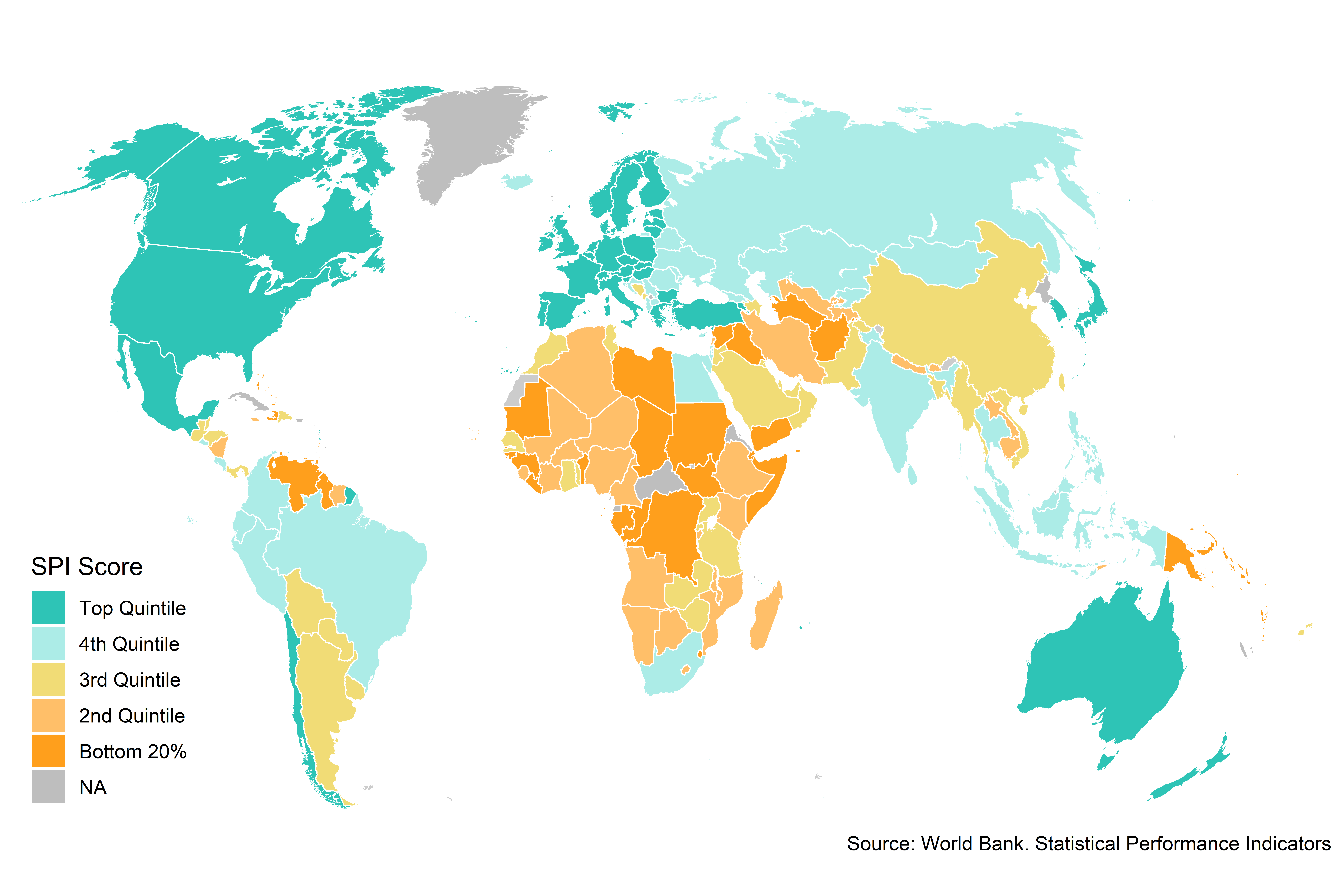
Figure 3.1:
The countries scoring in the top 20% have an average SPI overall score of 86.4. A maximum score of 100 would indicate that a country has every single element in place that is measured through the SPI. Meanwhile, countries in the bottom 20% score significantly worse, with average scores of 37.5. In Pillar 1, countries in the top quintile have a score of 98.9, while countries in the bottom quintile have scores of 53. One area where even top quintile countries are not doing as well as possible is on our data products pillar. Countries in the top quintile score only 72.3 points out of 100 in this area. Pillar 3 measures whether countries have a value in the past 5 years for each SDG indicator, meaning even the top quintile countries have only around 72.3% of indicators averaging over the SDGs.
Table 6.1: Table of SPI Overall and Pillar Scores by Quintile Group in 2019
Label | Top Quintile | 4th Quintile | 3rd Quintile | 2nd Quintile | Bottom 20% |
SPI Overall Score | 86 | 75 | 62 | 54 | 38 |
SPI.INDEX.PIL1 | 99 | 95 | 88 | 78 | 53 |
SPI.INDEX.PIL2 | 91 | 82 | 65 | 59 | 38 |
SPI.INDEX.PIL3 | 72 | 66 | 64 | 60 | 48 |
SPI.INDEX.PIL4 | 72 | 61 | 50 | 38 | 22 |
SPI.INDEX.PIL5 | 97 | 71 | 44 | 35 | 25 |
Source: World Bank. Statistical Performance Indicators. | |||||
To highlight a few specific indicators, countries in the top 20% on average get nearly perfect scores in terms of the debt reporting to the World Bank. The top 20% of countries in the SPI overall score have an average score on their debt reporting of 1, with a maximum score of 1 and minimum score of 0, while those in the bottom 20% on the SPI overall score have an average score of 0.7. To take another example, when looking at scores on whether a population census has been conducted recently, countries in the top 20% score on average 1 on our population census indicator, with a max score of 1 and minimum score of 0, while those in the bottom 20% on our SPI overall score receive 0.8 points on the population census indicator. The table below shows differences across maturity groups for a select set of indicators.
Table 6.2: Table of SPI Overall and Select SPI Indicators by Quintile Group in 2019
Label | Top Quintile | 4th Quintile | 3rd Quintile | 2nd Quintile | Bottom 20% |
SPI Overall Score | 86.4 | 75.1 | 62.2 | 54.0 | 37.5 |
Quality of Debt service data according to World Bank | 1.0 | 0.9 | 1.0 | 0.9 | 0.7 |
ODIN Open Data Openness score | 0.7 | 0.6 | 0.4 | 0.3 | 0.3 |
GOAL 1: No Poverty | 0.8 | 0.8 | 0.7 | 0.6 | 0.4 |
Population & Housing census (Availability score over 20 years) | 1.0 | 1.0 | 1.0 | 0.9 | 0.8 |
CPI base year | 0.9 | 0.6 | 0.3 | 0.2 | 0.1 |
Source: World Bank. Statistical Performance Indicators. | |||||
3.0.3.1 SPI Overall Score by Region and Income Group
There are large differences in the SPI overall score across World Bank regions and income groups. Overall, North America has the highest average overall SPI score, while the Sub-Saharan Africa region has the lowest average score.4 There is also a clear gradient with respect to income groups. Countries classified as low income have lower scores on average than countries classified as middle income. High income countries have the highest average SPI overall score.
Finally, when looking over time, since 2016 the SPI overall score values are relatively stable across regions. There has been some modest increase in the SPI overall score scores for middle income and high income countries, with little progress for low income countries.
Figure 6.2.A: SPI Overall Score by Region in 2019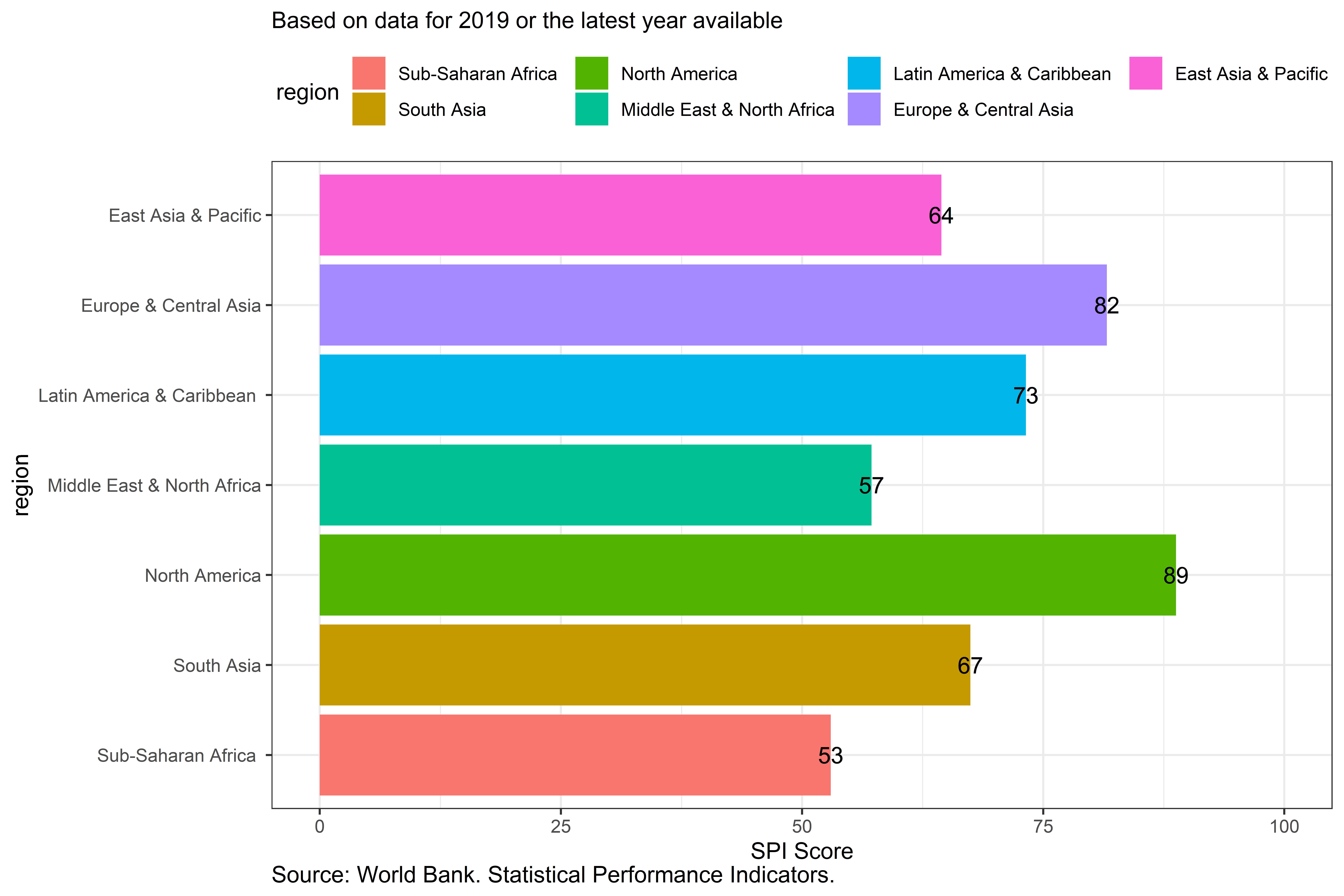
Figure 3.2:
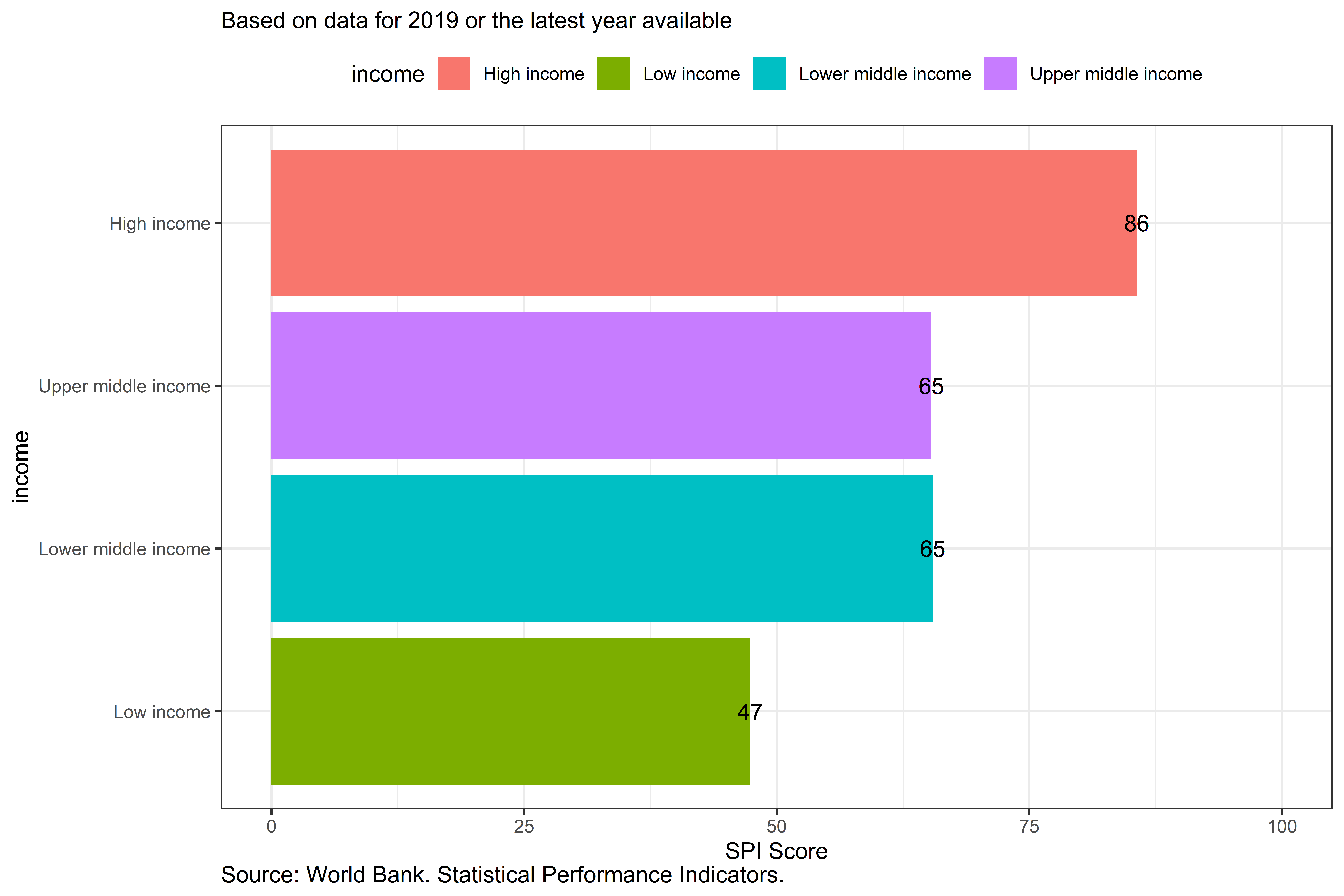
Figure 3.3:
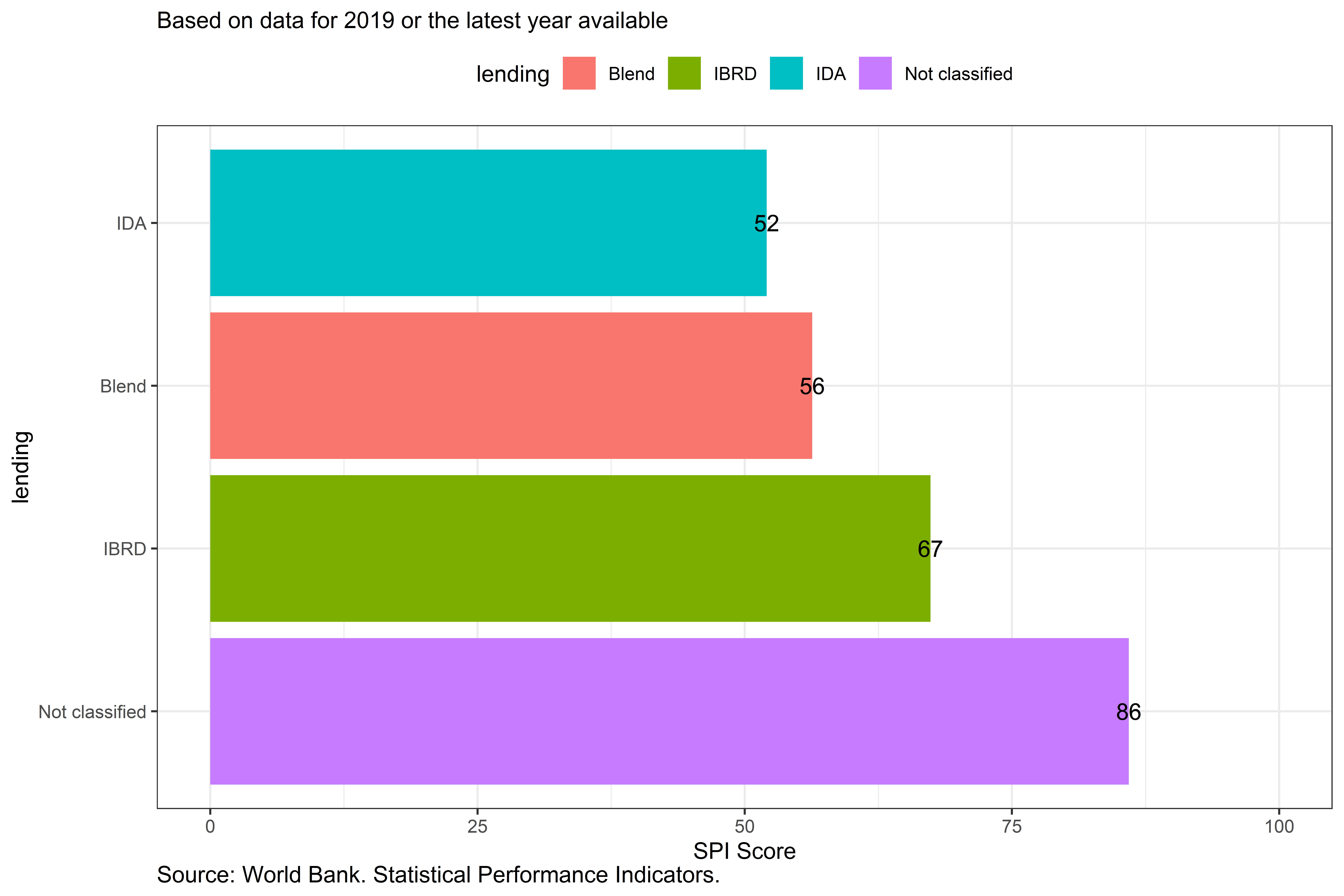
Figure 3.4:
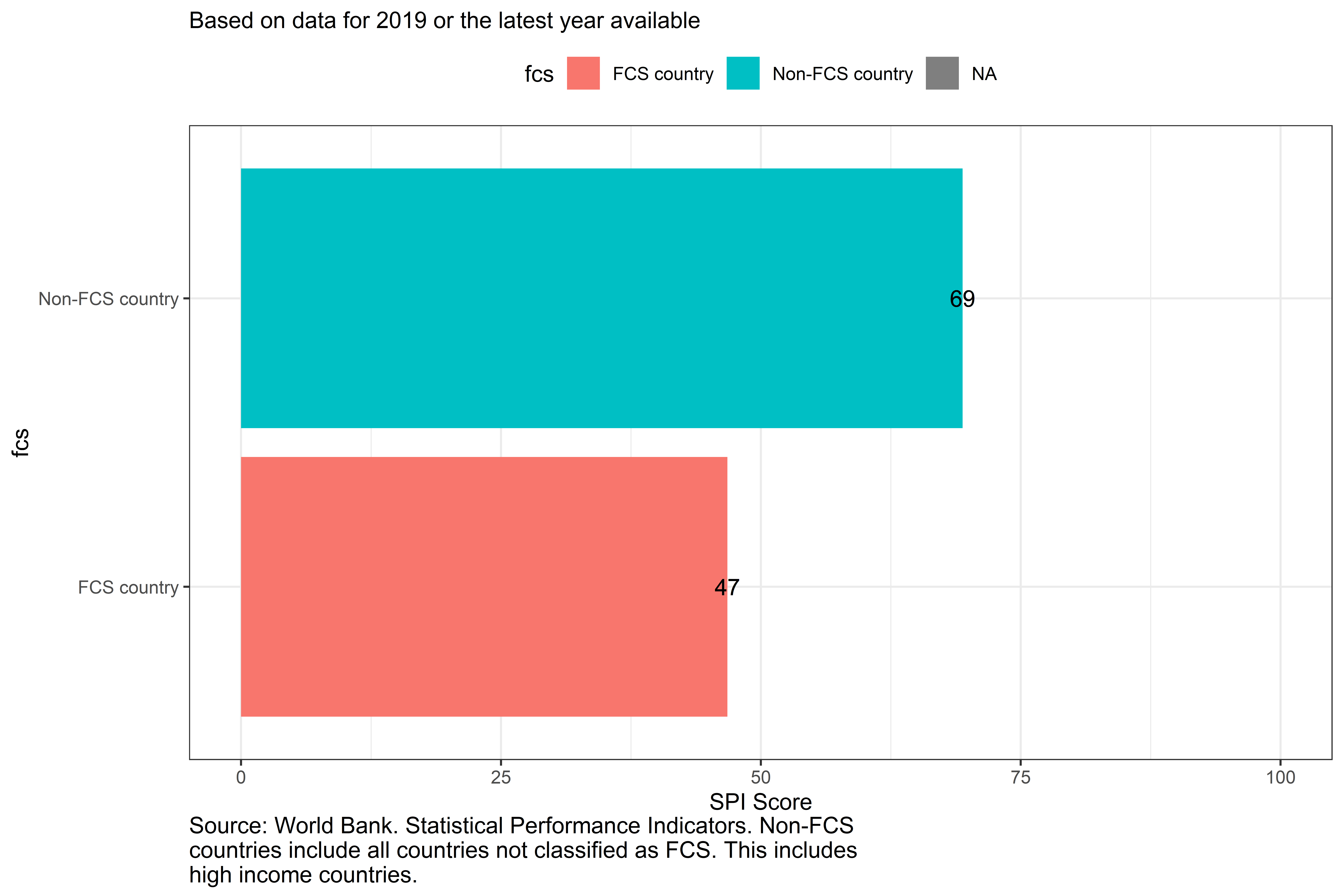
Figure 3.5:
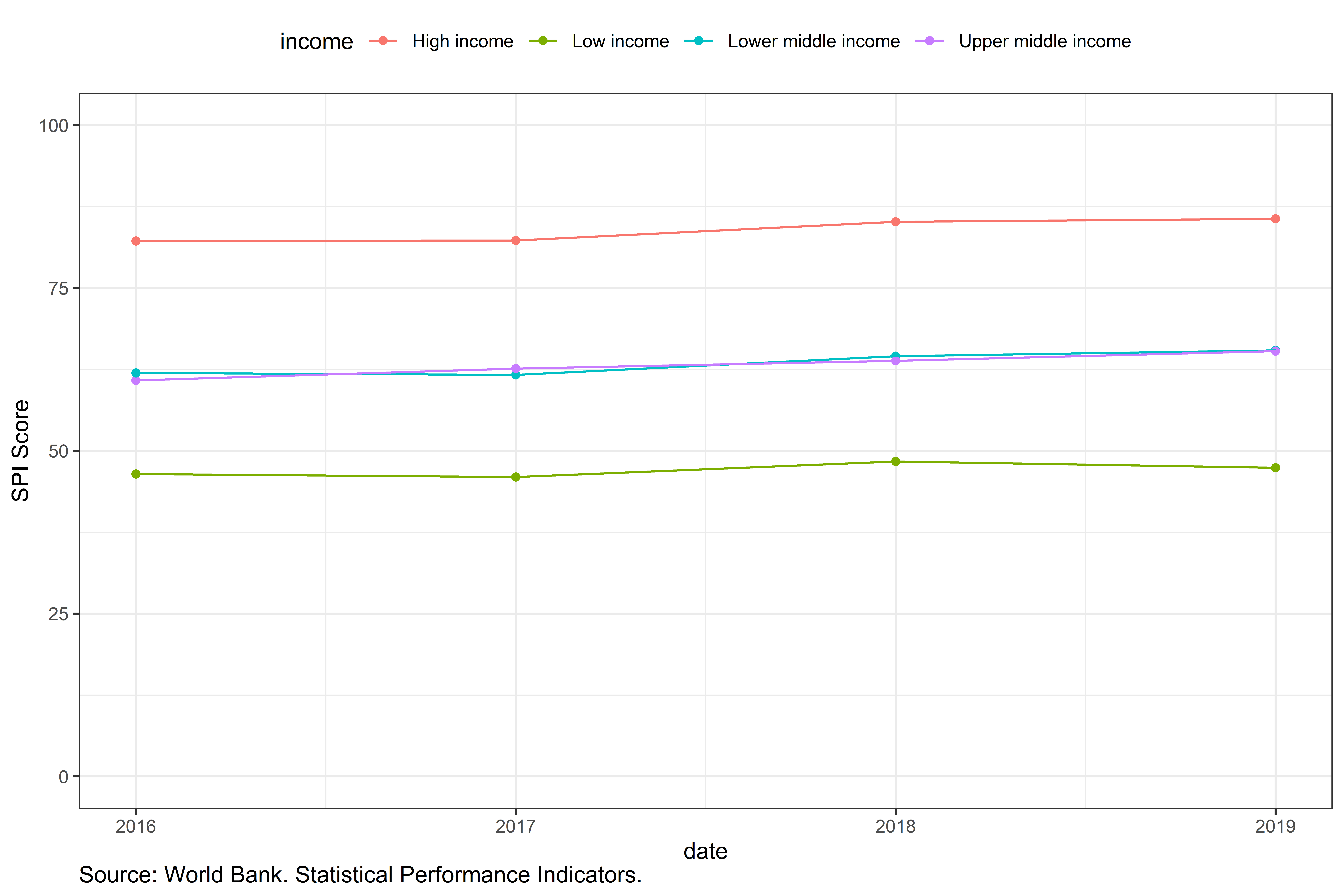
Figure 3.6:
As well as large differences across regions, there is significant variation in the SPI overall scores within regions. For instance, in the Latin America & Caribbean World Bank region, Mexico is the highest scoring country with a score of 87.5. However, Haiti, the lowest scoring country in the region, earns a substantially lower score of 37.5. In Sub-Saharan Africa, the highest scoring country is Mauritius with a score of 75.9, while the lowest scoring country is Somalia with a score of 19.6. In the East Asia and Pacific region, the top scoring country is Korea, Rep. with a score of 88.3, while the lowest scoring country is Marshall Islands with a score of 20.9.
Figure 6.3: SPI Overall Scores by Country and Region in 2019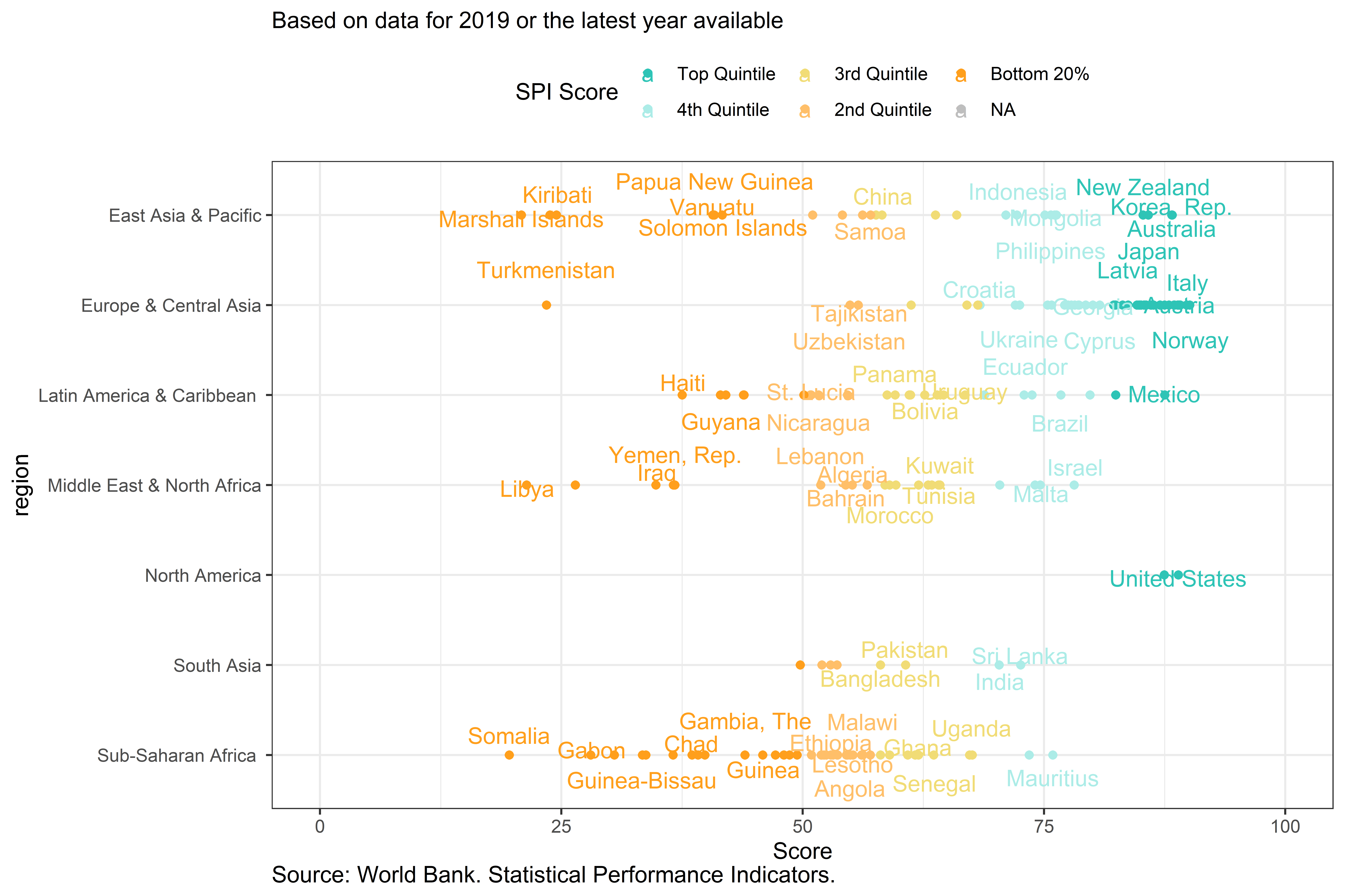
Figure 3.7:
3.0.3.2 SPI Scores by Pillar
By presenting scores for each of the pillars – data use, data services, data products, data sources, and data infrastructure – that compose the SPI overall score, it is possible to show where variation across countries is coming from and to assess the specific areas in which countries may be struggling
3.0.3.2.1 Pillar 1: Data Use
Figure 6.4 shows a world map displaying countries based on data use score quintiles Overall, the high income countries in North America and Europe tend to rate most highly along this dimension, whereas Sub Saharan African countries tend to lag.
Figure 6.4: Pillar 1: Data Use Scores by Quintile in 2019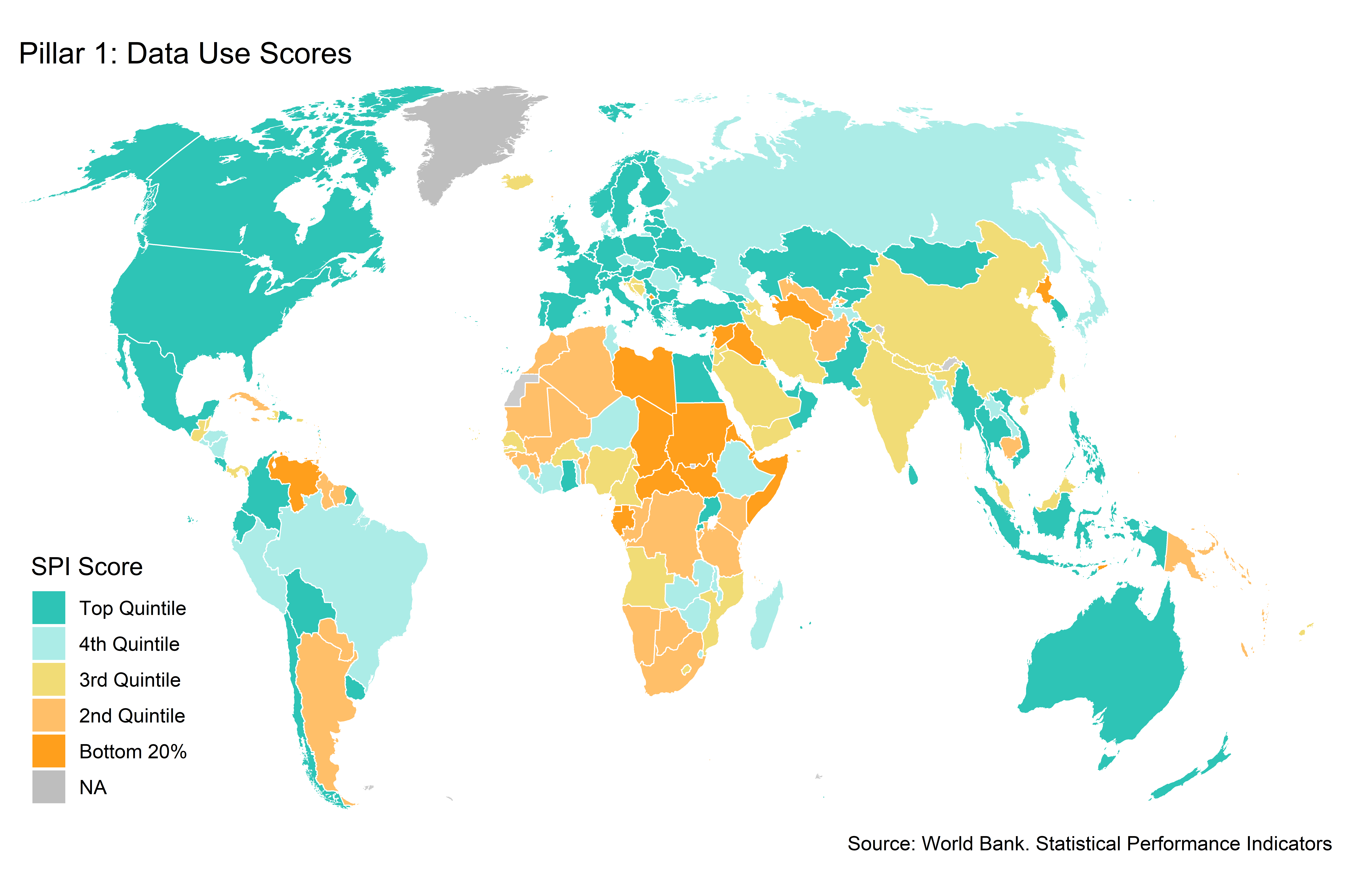
Figure 3.8:
Countries within region show significant dispersion in performance . It is worth noting that several countries such as the United States, Mexico, Finland, and Costa Rica, among others, receive the maximum possible score in this dimension of 100. Several countries score the minimum score as well, including the Syrian Arab Republic, South Sudan, Namibia, and Nauru, among others.
Figure 6.5: Pillar 1: Data Use Scores by Country and Region in 2019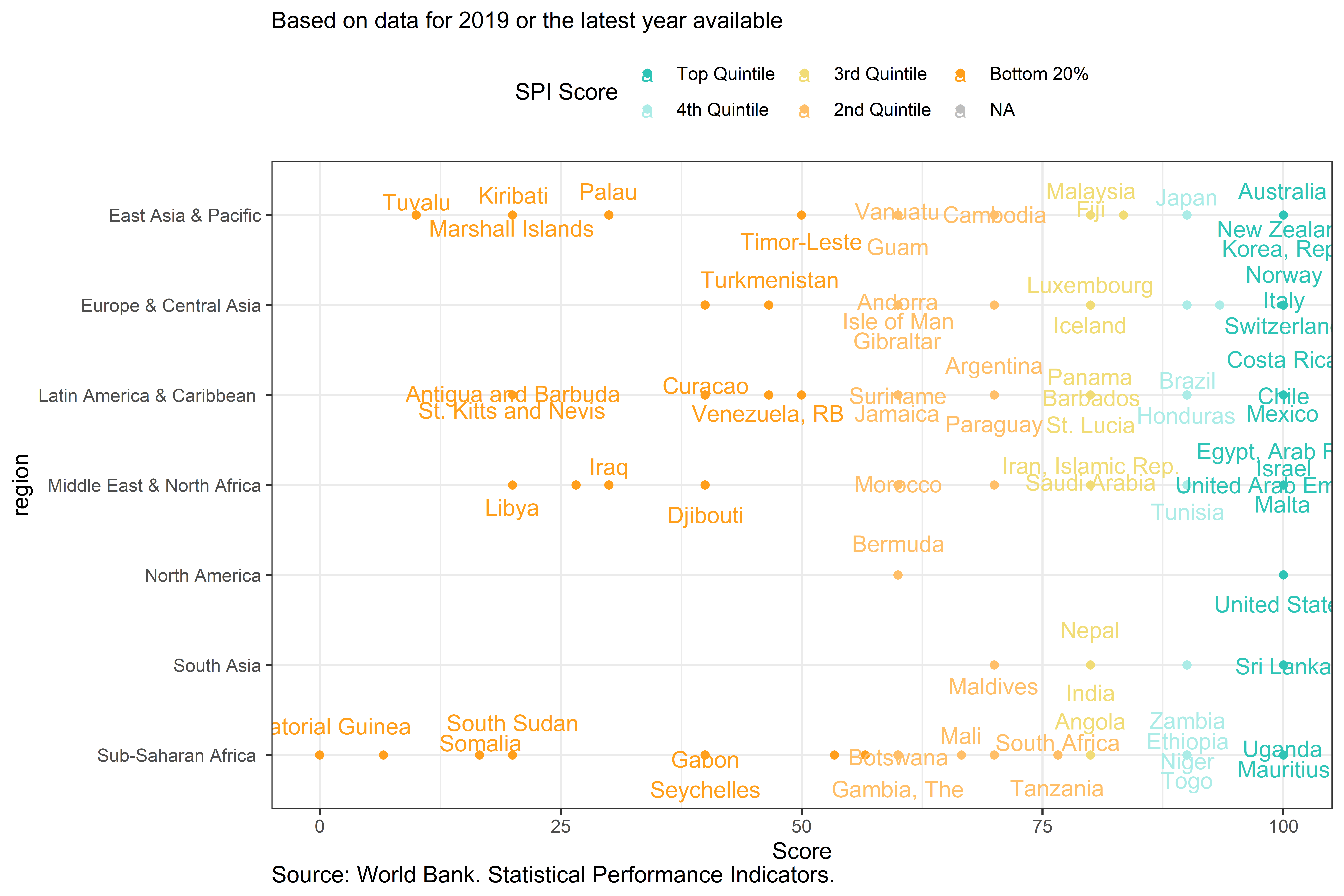
Figure 3.9:
The table below shows the average score on each indicator in pillar 1. Countries in the top 20% possess nearly all of the components in pillar 1, while countries in the bottom 20% are lacking in many areas. Countries in the bottom 20% have an average of 0.1 on the comparable poverty estimate indicator, an average of 0.6 on the availability of under 5 mortality data, and an average of 0.7 on debt reporting.
Table 6.3: Select Pillar 1 Indicator Scores by SPI Overall Score Quintile Group in 2019
Label | Top Quintile | 4th Quintile | 3rd Quintile | 2nd Quintile | Bottom 20% |
SPI.INDEX.PIL1 | 98.9 | 94.6 | 88.5 | 77.6 | 53.0 |
Availability of Comparable Poverty headcount ratio at $1.90 a day (5 year moving average) | 1.0 | 1.0 | 0.7 | 0.3 | 0.1 |
Availability of Mortality rate, under-5 (per 1,000 live births) data meeting quality standards according to UN IGME (5 year moving average) | 1.0 | 0.9 | 0.9 | 0.8 | 0.6 |
Quality of Debt service data according to World Bank | 1.0 | 0.9 | 1.0 | 0.9 | 0.7 |
Safely Managed Drinking Water | 0.9 | 1.0 | 1.0 | 1.0 | 0.9 |
Labor force participation rate by sex and age (%) | 1.0 | 1.0 | 1.0 | 0.9 | 0.2 |
Source: World Bank. Statistical Performance Indicators. | |||||
3.0.3.2.2 Pillar 2: Data Services
For pillar 2 on data services, high income countries tend to score highest along this pillar India, Morocco, and the Philippines scored highly as well in this pillar. This pillar contains four indicators on the quality of data releases, online accessibility, advisory and analytical services (not included due to lack of data), and the availability and use of data access services.
Figure 6.6: Pillar 2: Data Services Scores by Quintile in 2019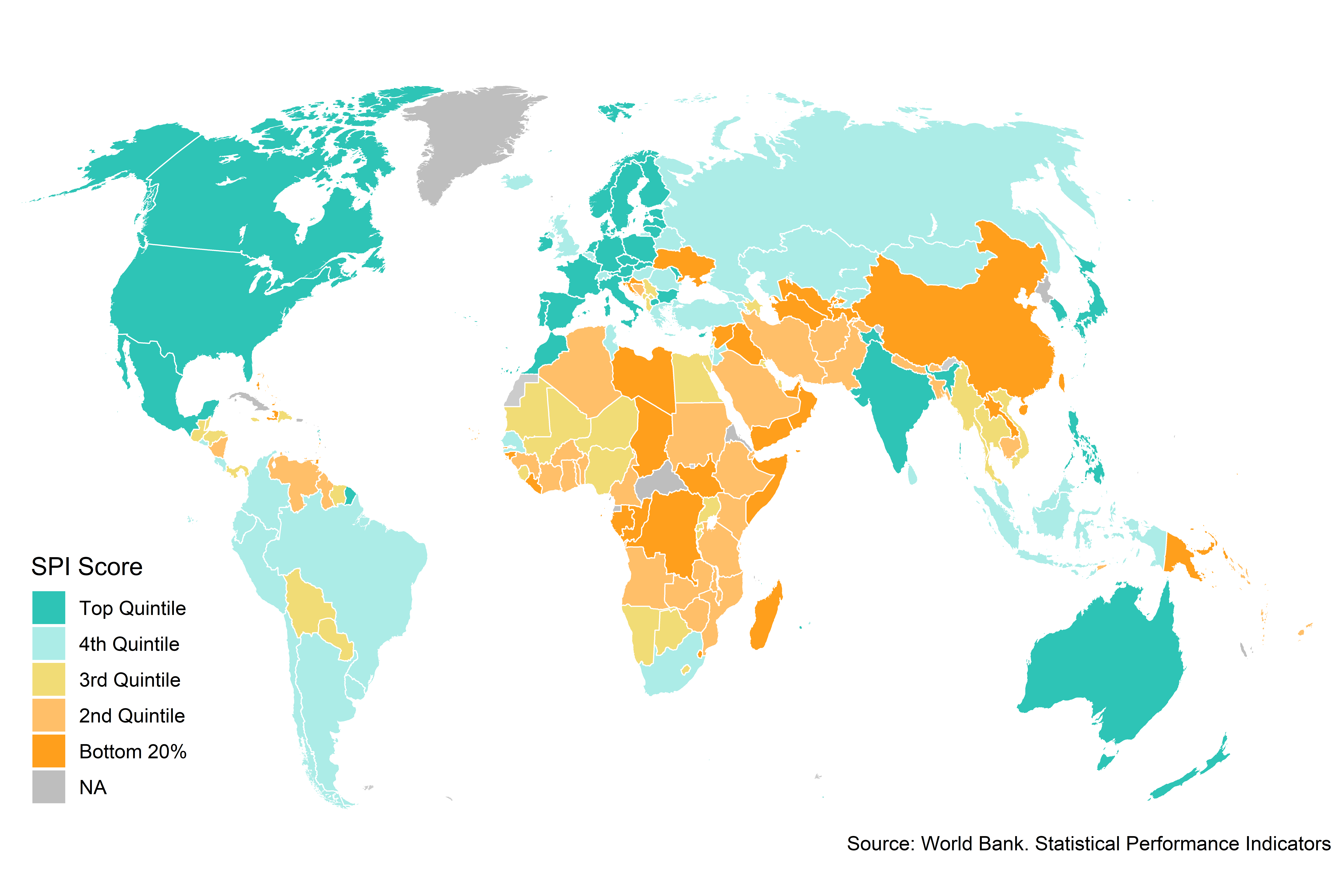
Figure 3.10:
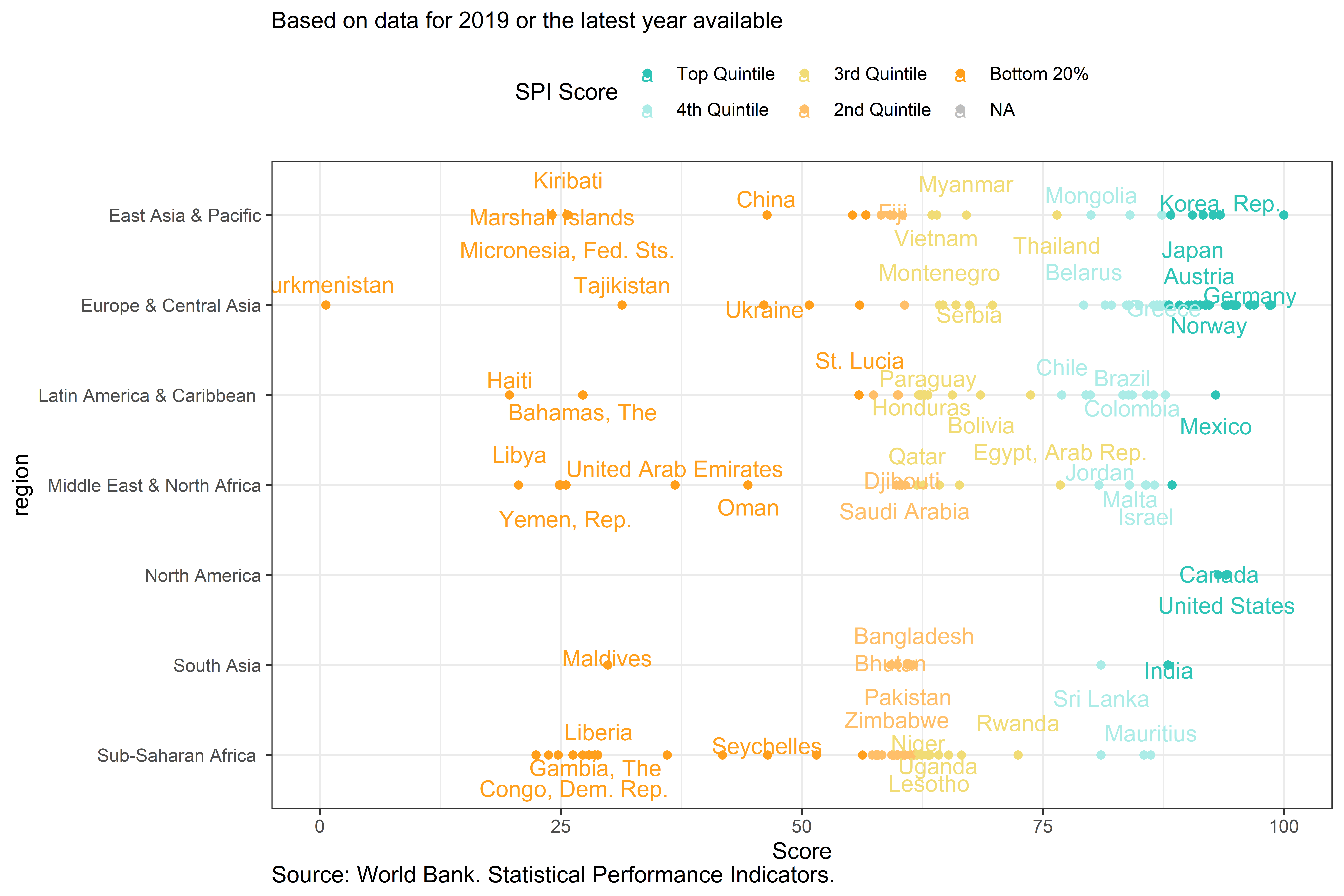
Figure 3.11:
In terms of specific indicators, the top 20% of countries receive an average score of 1 on the indicator measuring country adoption of the IMF’s data dissemination standards, while those in the bottom 20% receive an average score of 0.5. Countries in the bottom 20% receive an average data openness score, produced by Open Data Watch, of 0. This indicator is made up of several sub-indicators including whether data is available in machine readable format, a non-proprietary format, has download options, metadata available, and terms of use. For instance, in the bottom 20% of countries the score on whether data is available in a machine readable format is only 0.3 out of a maximum of 1. Additionally, countries in the bottom 20% only score an average of 0.4 on the measure of whether metadata meeting the standards of the Database Documentation Initiative (DDI) is available on surveys conducted.5
Table 6.4: Select Pillar 2 Indicator Scores by SPI Overall Score Quintile Group in 2019
Label | Top Quintile | 4th Quintile | 3rd Quintile | 2nd Quintile | Bottom 20% |
SPI.INDEX.PIL2 | 91.3 | 82.4 | 64.8 | 59.3 | 38.5 |
SDDS/e-GDDS subscription | 1.0 | 1.0 | 0.6 | 0.5 | 0.5 |
ODIN Open Data Openness score | 0.7 | 0.6 | 0.4 | 0.3 | 0.3 |
SPI.D2.2.Machine.readable | 0.9 | 0.6 | 0.4 | 0.2 | 0.2 |
SPI.D2.2.Non.proprietary | 0.8 | 0.8 | 0.7 | 0.7 | 0.5 |
SPI.D2.2.Download.options | 0.6 | 0.5 | 0.4 | 0.3 | 0.2 |
SPI.D2.2.Metadata.available | 0.7 | 0.6 | 0.5 | 0.4 | 0.3 |
SPI.D2.2.Terms.of.use | 0.6 | 0.4 | 0.1 | 0.1 | 0.0 |
NADA metadata | 1.0 | 0.9 | 0.9 | 0.9 | 0.4 |
Source: World Bank. Statistical Performance Indicators. | |||||
3.0.3.2.3 Pillar 3: Data Products
The data products pillar is based on whether countries are reporting data to monitor the SDGs. The SDG goals and targets provide a comprehensive, internationally agreed framework, encompassing indicators reflecting all domains of official statistics: economic, social, environmental and institutional which is relevant to all nations. For this pillar, indicators are produced using the UN Global SDG monitoring database. For each SDG indicator, a value is checked for availability within a five year window of a particular year. For instance, for 2019, is any indicator value available between the years 2015-2019.
For this indicator, there is a weaker relationship between a country’s income level and their performance in this pillar. No countries receive a maximum score of 100, which would indicate that they report on every SDG indicator at least once inside a 5 year window. Additionally, no country scores 0, which would indicate that they have reported no information for any of the SDG indicators.
The results for this pillar reflect two important aspects of the performance of a national statistical system, both of which need to be in place for a good score. First, do the SDG indicators required by the globally agreed framework exist for that country? And second, are those indicators available, in the agreed formats, on the UN Global SDG monitoring database? It is likely that some countries are producing more indicators but are not making them available through an internationally comparable database. For OECD countries, we supplemented the UN SDG database with comparable data submitted to the OECD following the methodology in [@oecdsdg]. The UN Global SDG monitoring database has been supplemented using this OECD database, because a clear methodology had been established to do so. Even with this supplemental data from the OECD included, there is considerable room for improvement in reporting on the SDGs.
Indicator values that are either country reported, country adjusted, estimated, or is included as global monitoring data are included. Values that were produced by an international organization through modeling are excluded. These classifications are based on the UN SDG metadata, where for each value of the indicator, the responsible international agency has been requested to indicate whether the national data were adjusted, estimated, modeled or are the result of a harmonized global monitoring exercise. The “nature” of the data classification in the SDG database is determined as follows:
Country data (C): Produced and disseminated by the country (including data adjusted by the country to meet international standards);
Country data adjusted (CA): Produced and provided by the country, but adjusted by the international agency for international comparability to comply with internationally agreed standards, definitions and classifications;
Estimated (E): Estimated based on national data, such as surveys or administrative records, or other sources but on the same variable being estimated, produced by the international agency when country data for some year(s) is not available, when multiple sources exist, or when there are data quality issues;
Modeled (M): Modeled by the agency on the basis of other covariates when there is a complete lack of data on the variable being estimated;
Global monitoring data (G): Produced on a regular basis by the designated agency for global monitoring, based on country data. There is no corresponding figure at the country level.
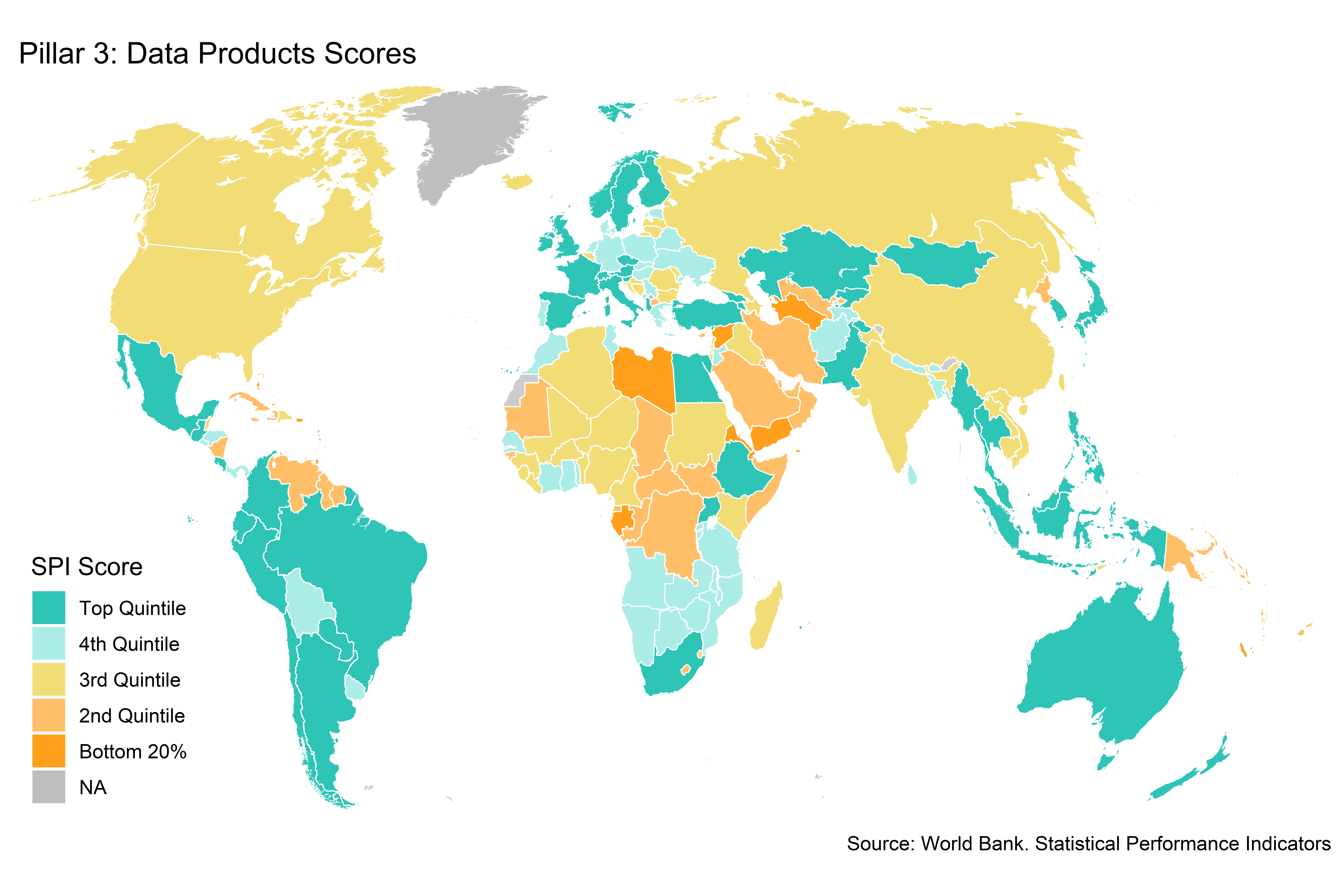
Figure 3.12:
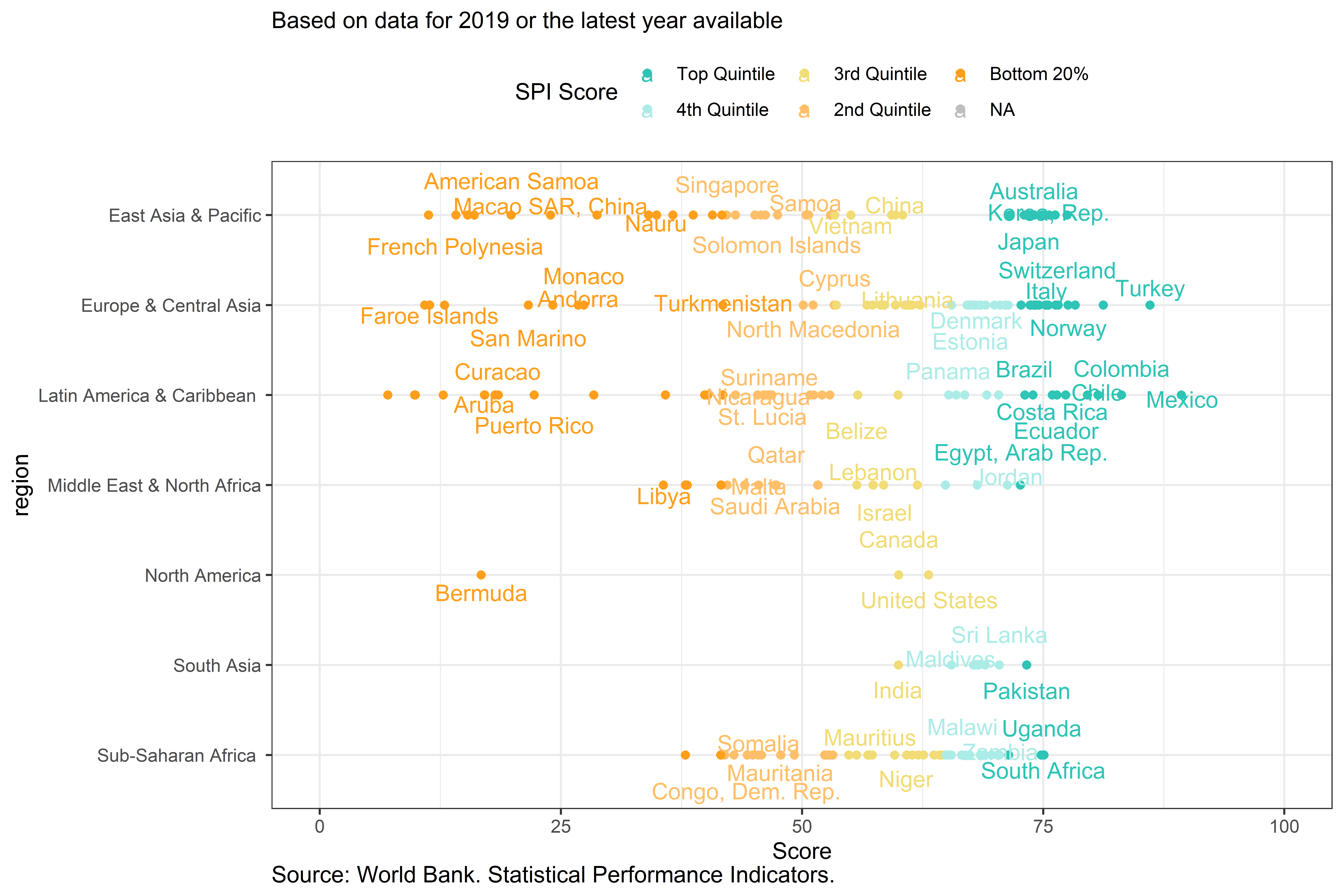
Figure 3.13:
Even countries in the top quintile have significant room for improvement in reporting on the SDGs. The average score for the top 20% of countries is 72.3, while for the bottom 20% it is 48. For a specific goal, such as for SDG 1 on poverty, the top 20% receives an average of 0.8 out of a maximum of 1. This means that the top performing countries are only reporting on 80 percent of the SDG indicators between 2015-19. The bottom 20% receive an average score of 0.4. The table below shows the full set of breakdowns by SDGs, suggesting reporting on SDG 5 on Gender lags other goals.
Table 6.5: Select Pillar 3 Indicator Scores by SPI Overall Score Quintile Group in 2019
Label | Top Quintile | 4th Quintile | 3rd Quintile | 2nd Quintile | Bottom 20% |
SPI.INDEX.PIL3 | 72.3 | 66.4 | 64.0 | 59.6 | 48.0 |
GOAL 1: No Poverty | 0.8 | 0.8 | 0.7 | 0.6 | 0.4 |
GOAL 2: Zero Hunger | 0.8 | 0.7 | 0.7 | 0.6 | 0.5 |
GOAL 3: Good Health and Well-being | 0.9 | 0.8 | 0.8 | 0.7 | 0.7 |
GOAL 4: Quality Education | 0.5 | 0.5 | 0.5 | 0.4 | 0.3 |
GOAL 5: Gender Equality | 0.4 | 0.4 | 0.4 | 0.3 | 0.2 |
GOAL 6: Clean Water and Sanitation | 0.8 | 0.9 | 0.9 | 0.8 | 0.7 |
GOAL 7: Affordable and Clean Energy | 0.8 | 0.8 | 0.8 | 0.8 | 0.8 |
GOAL 8: Decent Work and Economic Growth | 0.7 | 0.6 | 0.5 | 0.4 | 0.3 |
GOAL 9: Industry, Innovation and Infrastructure | 0.9 | 0.7 | 0.6 | 0.5 | 0.3 |
GOAL 10: Reduced Inequality | 0.5 | 0.5 | 0.5 | 0.4 | 0.3 |
GOAL 11: Sustainable Cities and Communities | 0.8 | 0.6 | 0.6 | 0.6 | 0.4 |
GOAL 12: Responsible Consumption and Production | 0.8 | 0.6 | 0.6 | 0.6 | 0.5 |
GOAL 13: Climate Action | 0.8 | 0.7 | 0.6 | 0.6 | 0.3 |
GOAL 15: Life on Land | 1.0 | 0.8 | 0.8 | 0.9 | 0.8 |
GOAL 16: Peace and Justice Strong Institutions | 0.6 | 0.6 | 0.6 | 0.6 | 0.4 |
GOAL 17: Partnerships to achieve the Goal | 0.5 | 0.6 | 0.6 | 0.6 | 0.5 |
Source: World Bank. Statistical Performance Indicators. | |||||
3.0.3.2.4 Pillar 4: Data Sources
Pillar 4 examines whether countries have the data sources available that are necessary to produce statistics for public use. It includes three aspects of data sources: censuses and surveys, administrative data, and geospatial data. Private and citizen generated data is an important area that is at present not incorporated due to the lack of an established source. For censuses and surveys the score reflects both whether a data source exists and how recently the source was produced, as both are needed for accurate reporting of current conditions. For administrative data and geospatial data, proxies regarding the state of these data systems are used.
Figure 6.10: Pillar 4: Data Sources Scores by Quintile in 2019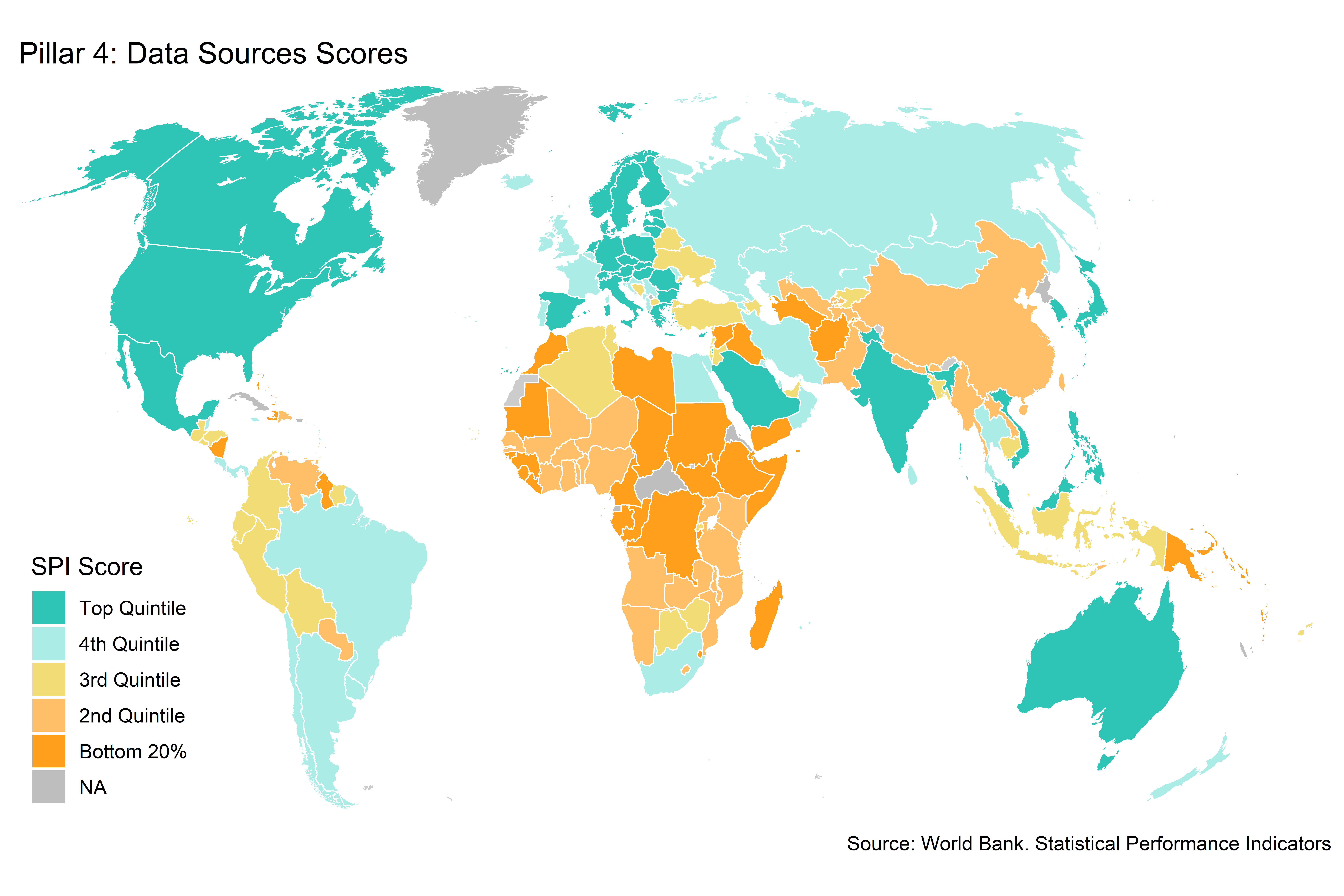
Figure 3.14:
When looking at the country chart, again there is significant variability across countries. No country receives the maximum score of 100, with many countries falling short particularly on our geospatial indicator. Somalia is the only country that receives a score of 0.
Figure 6.11: Pillar 4: Data Sources Scores by Country and Region in 2019
Figure 3.15:
Countries in the top 20% have an average score of 72.5, while countries in the bottom 20% have an average score of 22.3. The gap between the top 20% and bottom 20% for the population and housing census indicator is 0.2 points on a scale from 0 to 1. The gap for countries conducting a business/establishment survey is 0.9. The scores on the geospatial indicator are low. The average score for the top 20% is 0.3, while it is 0.1 for the bottom 20%.
Table 6.6: Select Pillar 4 Indicator Scores by SPI Overall Score Quintile Group in 2019
Label | Top Quintile | 4th Quintile | 3rd Quintile | 2nd Quintile | Bottom 20% |
SPI.INDEX.PIL4 | 72.5 | 60.6 | 49.8 | 38.4 | 22.3 |
Population & Housing census (Availability score over 20 years) | 1.0 | 1.0 | 1.0 | 0.9 | 0.8 |
Agriculture census (Availability score over 20 years) | 0.9 | 0.8 | 0.6 | 0.6 | 0.2 |
Business/establishment census (Availability score over 20 years) | 0.2 | 0.3 | 0.3 | 0.2 | 0.0 |
Household Survey on income, etc (Availability score over 10 years) | 1.0 | 1.0 | 0.9 | 0.8 | 0.6 |
Agriculture survey (Availability score over 10 years) | 0.8 | 0.4 | 0.3 | 0.1 | 0.0 |
Labor Force Survey (Availability score over 10 years) | 1.0 | 0.9 | 0.9 | 0.6 | 0.3 |
Health/Demographic survey (Availability score over 10 years) | 0.6 | 0.7 | 0.8 | 0.7 | 0.7 |
Business/establishment survey (Availability score over 10 years) | 0.9 | 0.5 | 0.3 | 0.2 | 0.0 |
Civil Registration and Vital Statistics (CRVS) system | 1.0 | 0.9 | 0.5 | 0.3 | 0.1 |
Geospatial data available at 1st Admin Level | 0.3 | 0.2 | 0.2 | 0.2 | 0.1 |
Source: World Bank. Statistical Performance Indicators. | |||||
3.0.3.2.5 Pillar 5: Data Infrastructure
The fifth pillar measures whether countries have the hard and soft infrastructure to produce the data sources, data products, and data services to produce useful data. For the pillar 5 sub-score, the only usable data is on a set of ten methods, standards, and classifications. Internationally accepted and recommended methodology, classifications and standards provide the basis for national statistical offices (NSOs) on data integration, facilitating data exchange and providing the foundation for the preparation of relevant statistical indicators. The following methods and standards are considered: System of national accounts in use, National Accounts base year, Classification of national industry, CPI base year, Classification of household consumption, Classification of status of employment, Central government accounting status, Compilation of government finance statistics, Compilation of monetary and financial statistics, and Business process. Data has also been collected on statistical legislation and governance, as well as on finance, but these indicators currently lack adequate country coverage to include in the index.
Countries scoring in the top 20% tend to be concentrated among the high income countries. These top scoring countries have an average score for pillar 5 of 97.1, which is near the maximum score of 100. Countries in the bottom 20% have an average score fo 25.4.
Figure 6.12: Pillar 5: Data Infrastructure Scores by Quintile in 2019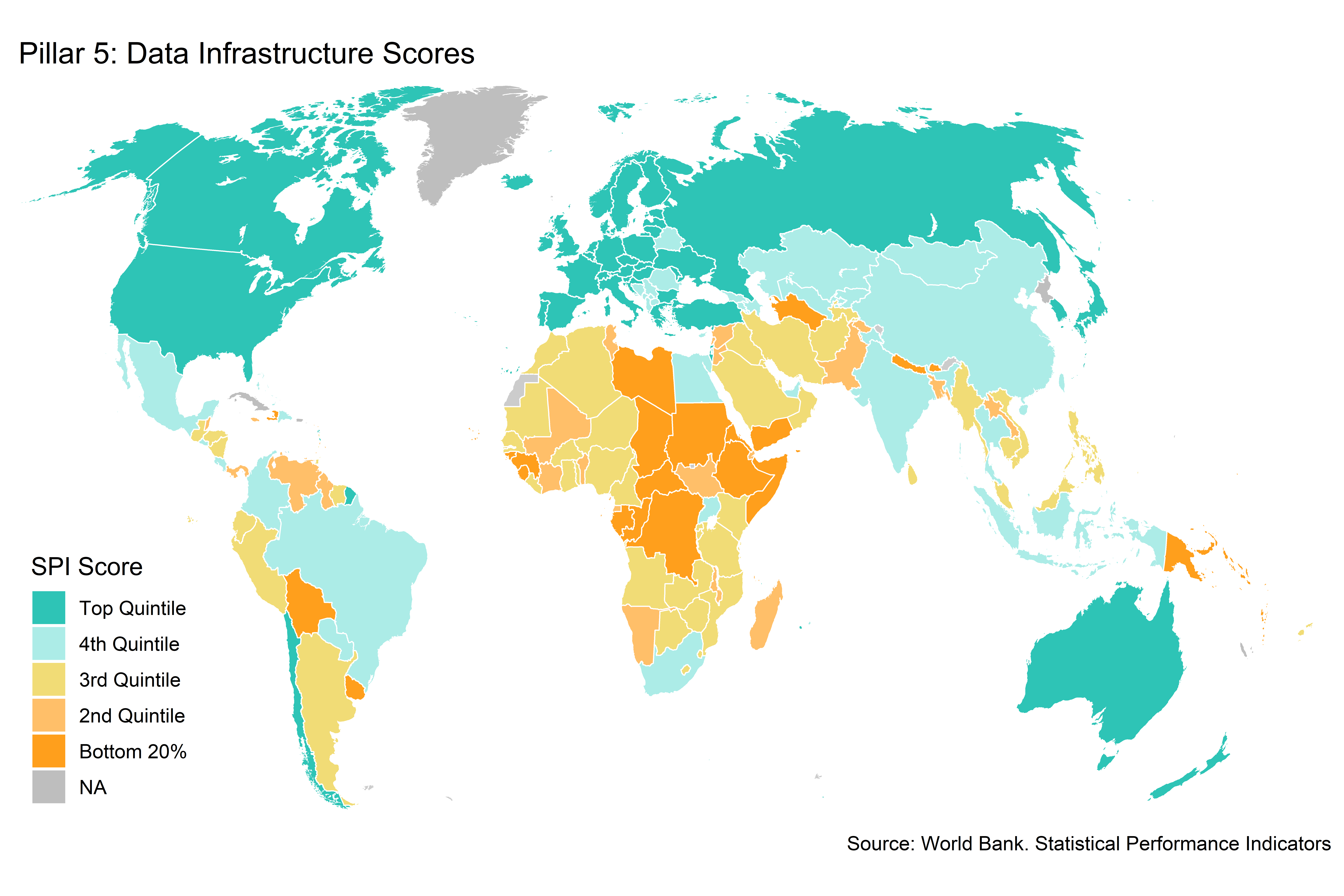
Figure 3.16:
Several countries score the maximum of 100 in the data infrastructure pillar One country, Somalia, scores 0 points in this pillar.
Figure 6.13: Pillar 5: Data Infrastructure Scores by Country and Region in 2019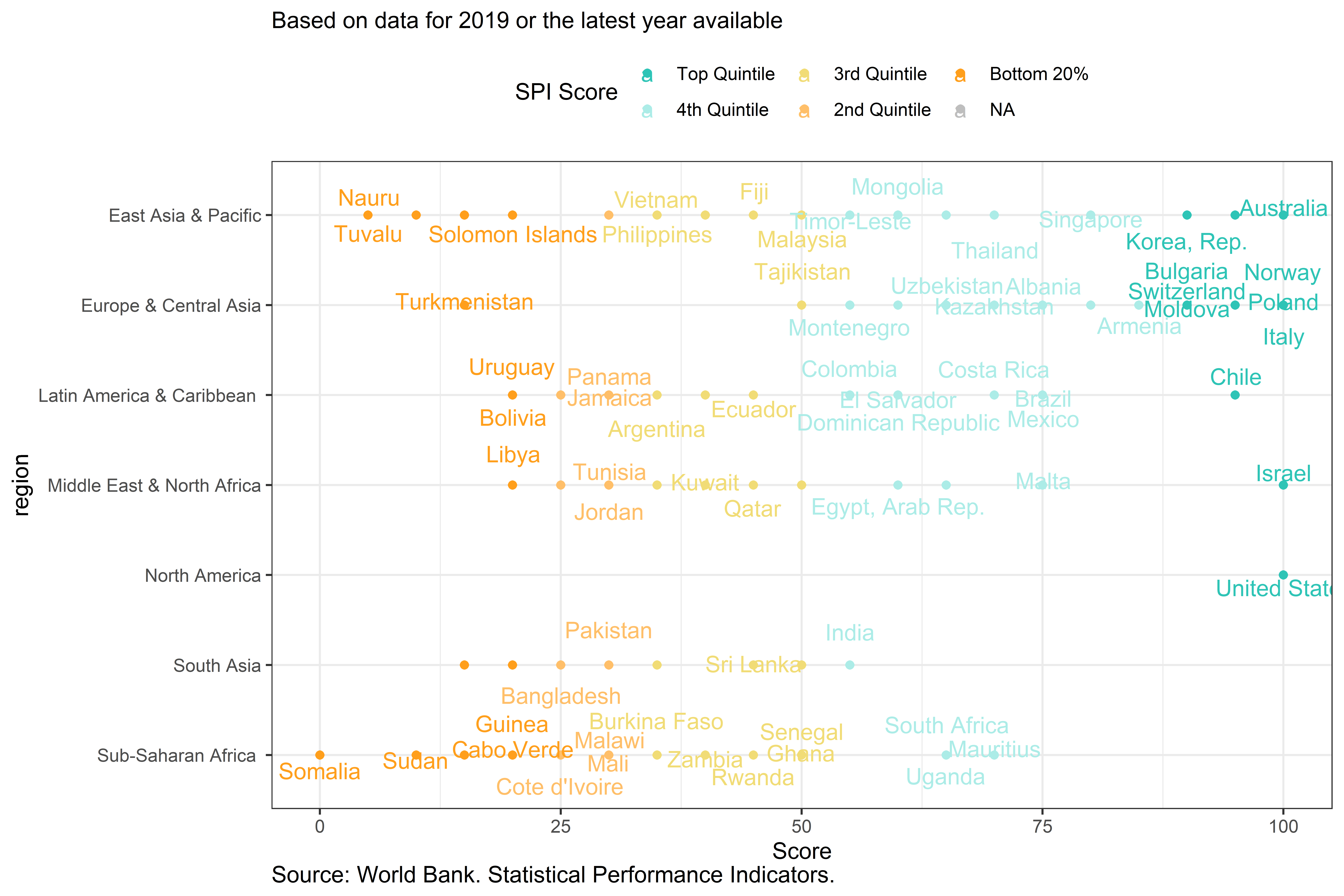
Figure 3.17:
Among countries in the top 20%, the average score is near 100 across all the indicators of pillar 5. In the bottom 20%, countries on average score close to zero points for the CPI base year, classification of status of employment, central government accounting status, compilation of government finance statistics, and business process indicators. Bottom 20% countries, score above 0.5 points on the system of national accounts in use and compilation of monetary and financial statistics indicators.
Table 6.8: Select Pillar 5 Indicator Scores by SPI Overall Score Quintile Group in 2019
Label | Top Quintile | 4th Quintile | 3rd Quintile | 2nd Quintile | Bottom 20% |
SPI.INDEX.PIL5 | 97.1 | 71.4 | 43.8 | 34.9 | 25.4 |
System of national accounts in use | 1.0 | 0.9 | 0.7 | 0.6 | 0.5 |
National Accounts base year | 1.0 | 0.7 | 0.5 | 0.3 | 0.2 |
Classification of national industry | 1.0 | 0.9 | 0.7 | 0.5 | 0.3 |
CPI base year | 0.9 | 0.6 | 0.3 | 0.2 | 0.1 |
Classification of household consumption | 1.0 | 0.9 | 0.7 | 0.6 | 0.5 |
Classification of status of employment | 1.0 | 0.4 | 0.1 | 0.0 | 0.0 |
Central government accounting status | 1.0 | 0.6 | 0.3 | 0.1 | 0.1 |
Compilation of government finance statistics | 1.0 | 0.6 | 0.2 | 0.2 | 0.1 |
Compilation of monetary and financial statistics | 0.9 | 1.0 | 0.9 | 0.9 | 0.8 |
Business process | 1.0 | 0.6 | 0.0 | 0.0 | 0.0 |
Source: World Bank. Statistical Performance Indicators. | |||||
3.0.3.2.6 Correlations between SPI pillars
In the following chart, correlations between the SPI overall score and the individual SPI pillar scores are shown. All pillars are positively correlated with one another. At the same time, no dimension is perfectly correlated with any of the other dimensions, which would indicate that a dimension was not providing any additional information on the statistical performance of countries. The pillar with the single highest correlation with the overall measure is pillar 1 on data use; pillar 3 on data products has the lowest overall correlation.
Figure 6.14: Correlation Between SPI pillars in 2019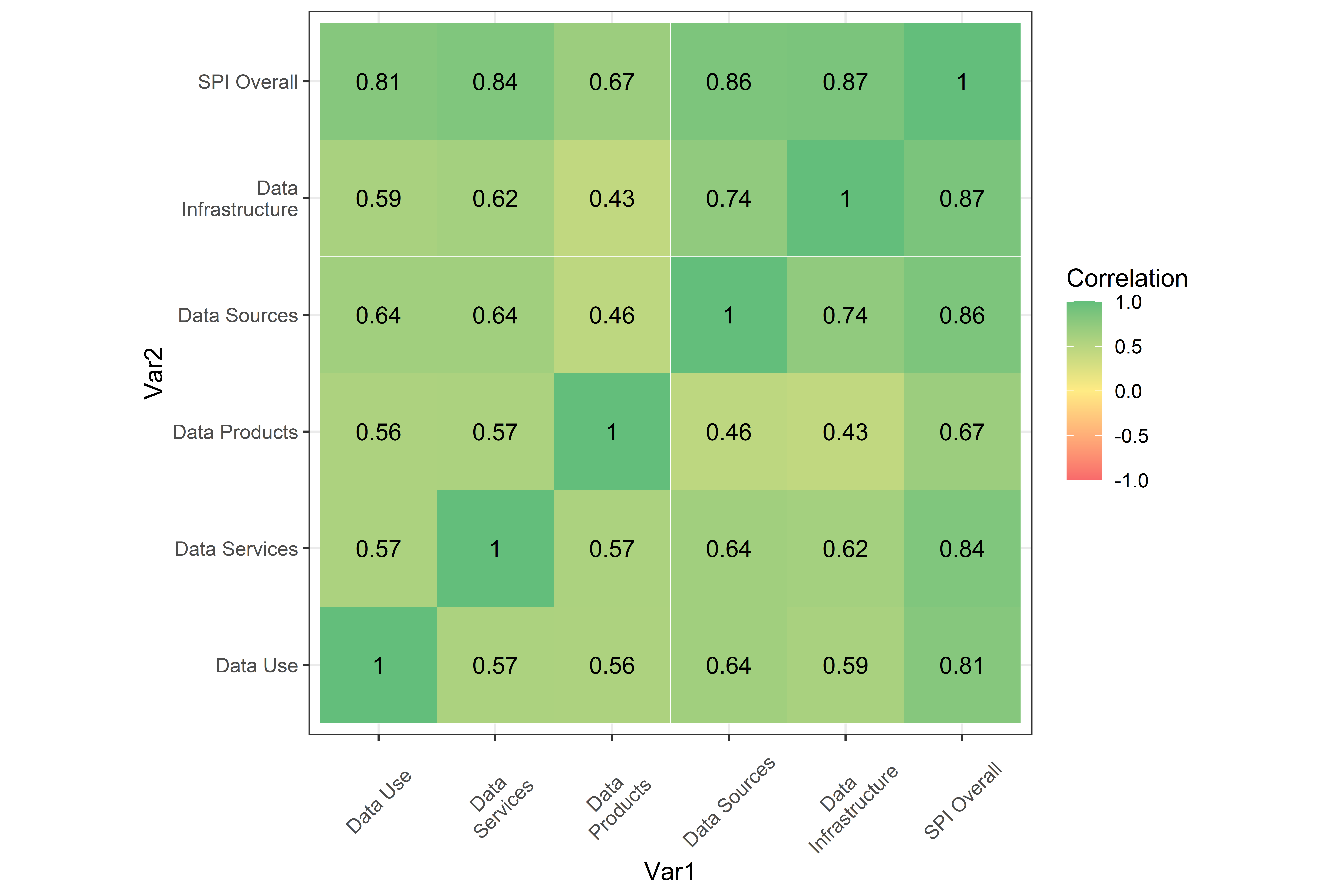
Figure 3.18:
3.0.3.3 SPI Scores by Dimension and Indicator
While there are large differences across regions, income groups, and countries in the SPI overall score, there are also differences across indicators in the strengths and weaknesses of countries that have the same final score. For instance, some countries may reach a final score by excelling in the area of data sources, while others may reach a final score by excelling in data infrastructure. There are many paths that countries may take to reach an SPI overall score and only by studying the pillars and indicators for a particular country in detail can you understand why a country gets a particular score. To help interpret the scores, it is possible to analyze which of the pillars and indicators are most responsible for differences between countries.
In order to do so, a leave-out approach to calculating the SPI overall scores has been taken, which can help to understand which pillars and indicators are most impactful. The leave-out approach is similar in spirit to a jackknife approach (see [@miller1974jackknife] for an introduction), which has been used in a variety of situations to examine the sensitivity of estimates to leaving out specific observations. Specifically for this case, the leave-out approach consists of sequentially deleting indicators one at a time and recalculating the SPI overall scores. By sequentially omitting indicators, the total difference between the SPI overall score incorporating all indicators and an alternative SPI score that is calculated by omitting a single indicator can be computed.The pillars and indicators can then be ranked, based on which produce the greatest total difference between the SPI overall score and the alternative score.
Specifically, the approach is as follows:
Calculate the SPI overall score for each country using all dimensions and indicators, \(SPI.INDEX_{c}\).
For each indicator \(j=1,...,J\) do:
Generate an alternative SPI score omitting indicator \(j\), \(SPI.INDEX^{-j}_{c}\).
Calculate difference between the original score and the alternative score for each country in a year \(t\), \(e_{c}^{-j}=SPI.INDEX_{c}-SPI.INDEX^{-j}_{c}\)
Calculate the mean absolute difference across all countries, \(E^{-j}=\sum_{c=1}^{N_c} |e_{c}^{-j}|/C\)
- Sort indicators based on \(E^{-j}\).
Figure 6.15: SPI Indicator Importance for Top 10 and Bottom 10 Indicators in 2019
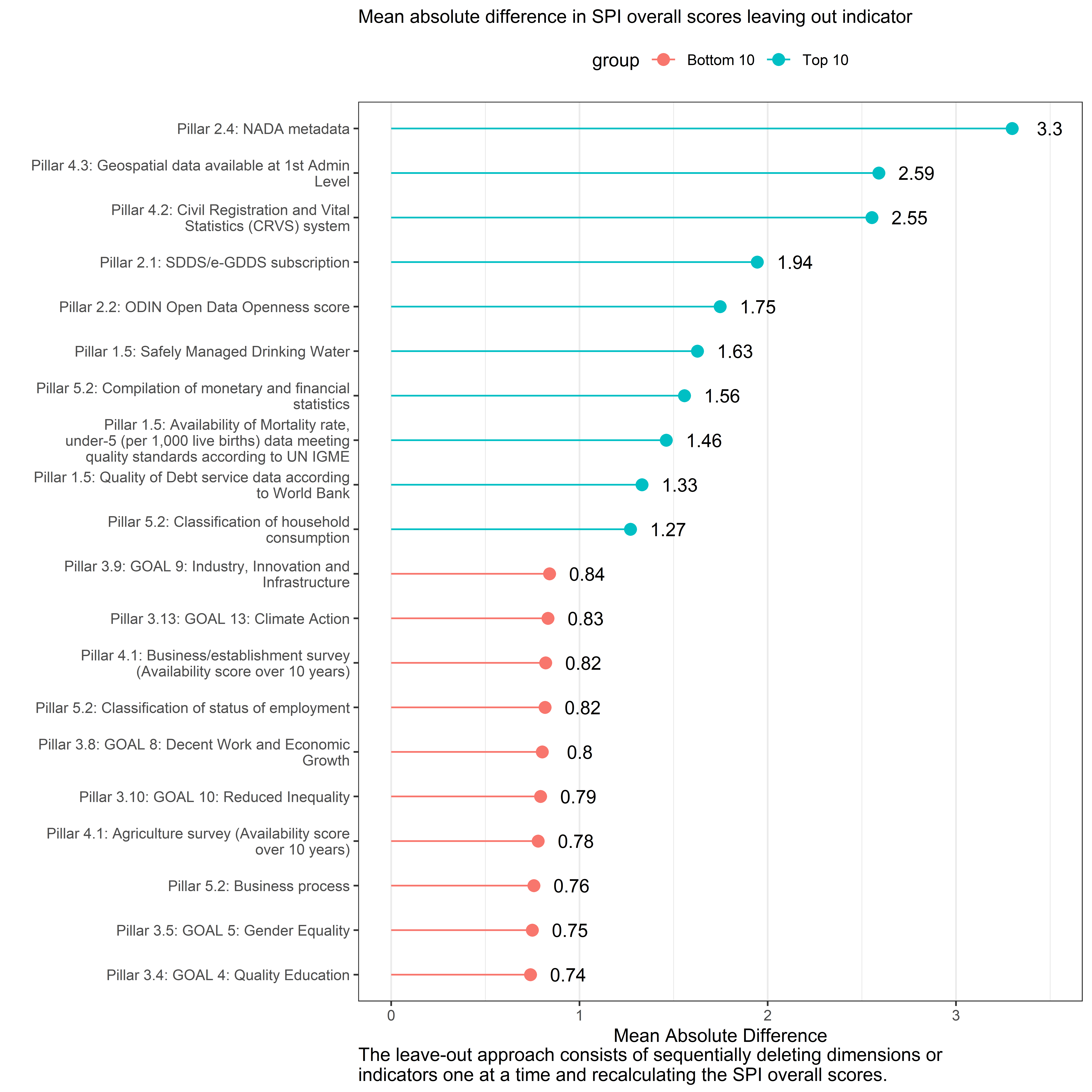
Figure 3.19:
The indicator that drives the single largest difference between the SPI overall score and an alternative score omitting the indicator is the NADA metadata availability indicator in dimension 2.4 on data access services. This is closely followed by the indicator on whether geospatial information is available and whether a complete civil registration and vital statistics system (CRVS) is available. The indicators creating the smallest difference when omitted tend to the be the individual indicators in pillar 3 on data products. The indicator with the single smallest difference is in Pillar 3:4 on SDG 4
3.0.4 Analysis
3.0.4.1 Unique Values
As a check of the data, the number of unique scores for the SPI overall score is calculated. If the SPI overall score produces a large number of tied scores, for instance, then the index will be less able to distinguish between the statistical performance of countries. When calculating the number of unique values for 2019, it is found that there are 174 unique scores for 174 countries. This means there are 0 tied values.
When looking at each specific pillar, there are only 18 unique scores for pillar on data use. The data use indicator is coming solely from dimension 1.5 on data use by international organizations. For pillar, there are 163 unique scores. For pillar 3, there are 173 unique scores. There are 173 unique scores for pillar 4, and there are 20 unique scores for pillar 5.
3.0.4.2 Relationship to GDP Per Capita and the Human Capital Index
The correlation between the SPI overall score and and the log of GDP per capita and the World Bank’s Human Capital Index ((Bank 2020)) provide a face validity check between the SPI index and other outcomes. This analysis is not meant to assert a causal relationship, only to assess whether the SPI index is correlated with other outcomes in ways that might be expected. The source for GDP per capita comes from the World Bank’s World Development Indicators (WDI) database (NY.GDP.PCAP.KD). The GDP per capita numbers are in constant 2010 US$.
It would be expected that a strong positive relationship between GDP per capita of countries and their statistical system, as higher income countries would tend to have more resources available for statistical production. In fact, there is a strong relationship between the two. The correlation in 2019 between log GDP per capita and the SPI overall score is 0.66.6
Another measure of a country’s development is the Human Capital Index (HCI) developed by the World Bank ([@hci2019]). The Human Capital Index is designed to capture the amount of human capital a child born today can expect to attain by age 18 in a country. The index combines a country’s child mortality, learning adjusted years of schooling, adult survival rates & stunting into one index.7. Again, a strong positive relationship between a country’s HCI value and their Statistical Performance Indicators index might be expected, as countries with a more developed human capital stock are likely to have greater capacity to produce statistics. Again, this is what is seen. The correlation between the 2018 value of the HCI (the latest value available at the time of this writing) and the 2018 value of the SPI overall score is 0.79.
The scatter plot of the relationship between log GDP per capita, the HCI, and our SPI overall score for the years 2016-2019 is shown below. In general, countries with higher per capita income and higher levels of human capital tend to have better performing statistical systems according to the SPI measure.
Figure 7.1: Plot of SPI overall score on Human Capital Index and GDP per capita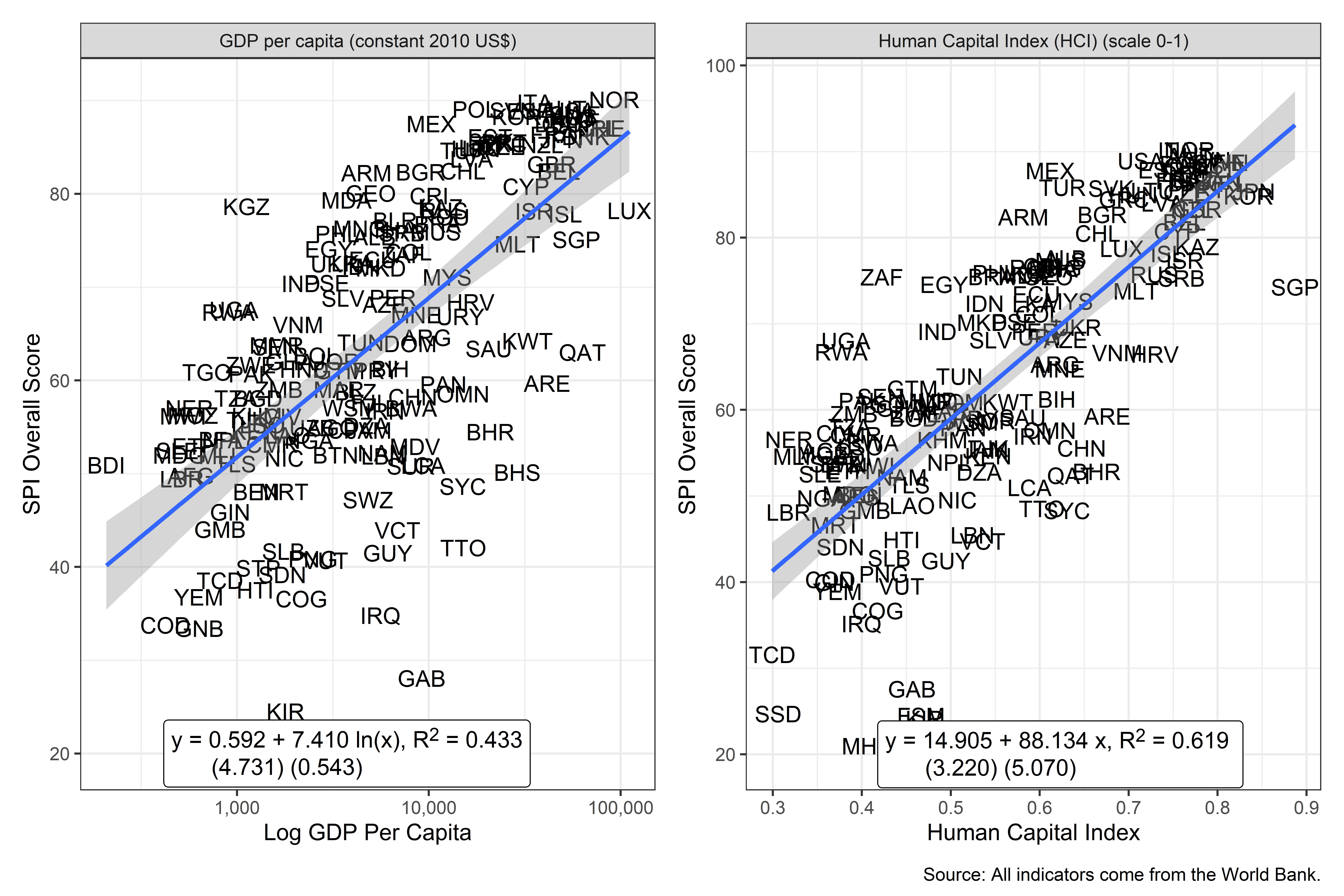
Figure 3.20:
So as to highlight countries where this relationships do not hold as well, the next figure shows the 15 countries that most over-perform and the 15 countries that most under-perform on the SPI Index compared to their levels of GDP per capita and the Human Capital Index. A perfect fit between the SPI overall score and GDP per capita and the Human Capital Index is not to be expected, as countries differ in the resources put into their statistical system, even conditional on their levels of development. Highlighting outliers can sometimes be a useful exercise for determining whether a measure is identifying on the ground realities.
In order to produce this figure, an OLS regression of the SPI overall score in 2019 on log GDP per capita has been estimated.The residual, which can be interpreted as the difference between the country’s SPI overall score value and the expected index value based on their GDP per capita has then been calculated. Countries with values of the residual greater than zero are over-performing based on their GDP per capita and countries with residuals less than zero are under-performing. The corresponding figure for the Human Capital Index is calculated similarly.
This figure identifies some countries that appear to have better performing statistical systems than might be expected (Rwanda, Uganda, Egypt, Mexico, Philippines, Armenia and Turkey appear in green on both charts). There are also countries that appear to have poorer performing statistical systems than expected: there are several small island states for example that appear red on both charts.
Figure 7.2: Top 15 Over/Under-Performers on SPI overall score compared to GDP per capita and Human Capital Index in 2019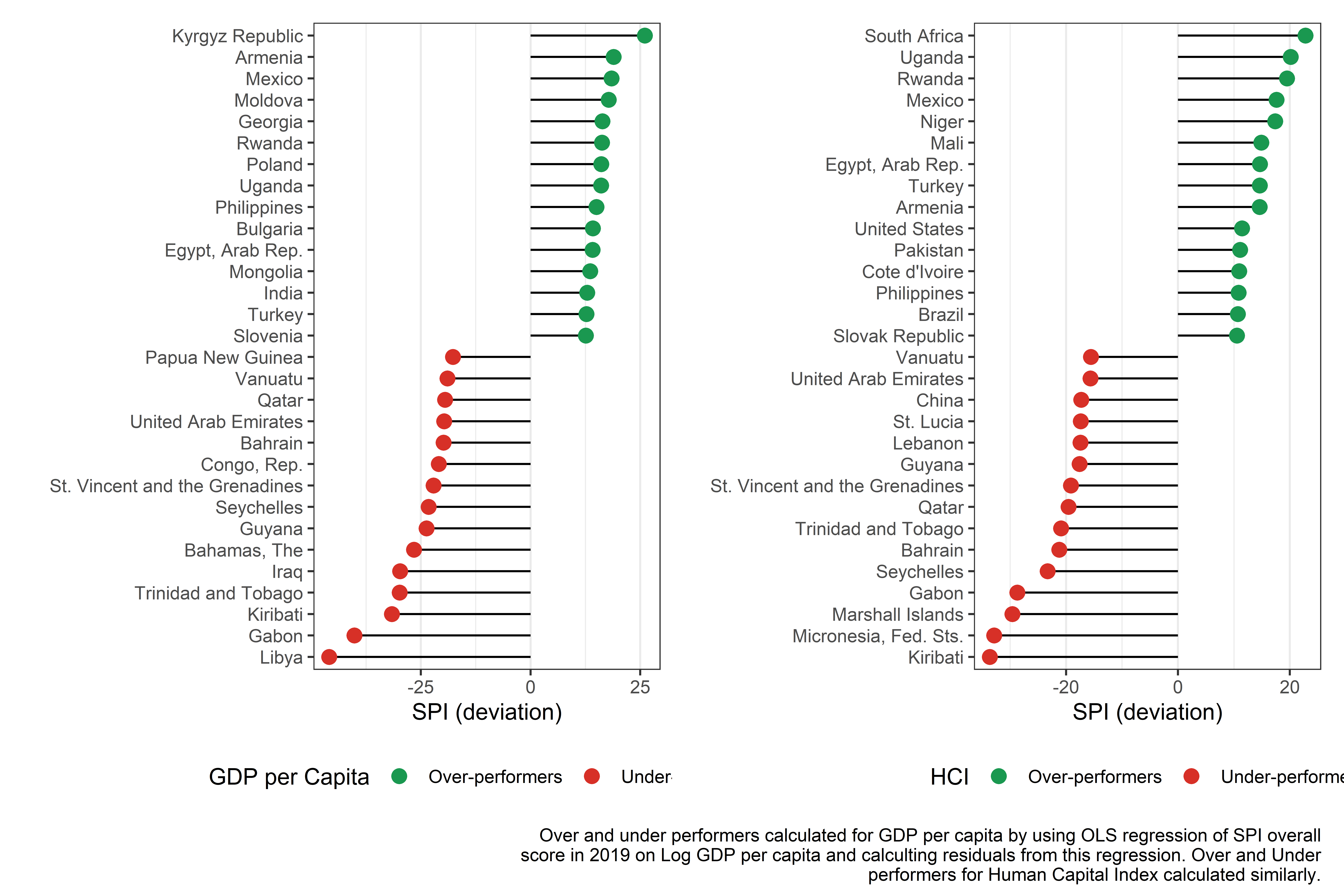
Figure 3.21:
3.0.4.3 Relationship to Government Effectiveness
A common justification for improving statistical systems is that doing so can lead to better governance. Without good statistics, countries may be flying blind on where to target resources to improve the public welfare. Also, good statistics can help hold public officials accountable for progress toward reaching a country’s goals. In this next section, it is shown that the relationship between our SPI overall score and an estimate of government effectiveness produced by the Worldwide Governance Indicators (WGI) is analyzed. A strong relationship between the SPI measure of statistical performance and the WGI measure of governmental effectiveness is found.
[@kraay2010worldwide] produce a set of Worldwide Governance Indicators, including a measure of government effectiveness. According to the WGI metadata, the government effectiveness indicator captures perceptions of the quality of public services, the quality of the civil service and the degree of its independence from political pressures, the quality of policy formulation and implementation, and the credibility of the government’s commitment to such policies. The estimate gives the country’s score on the aggregate indicator, in units of a standard normal distribution, i.e. ranging from approximately -2.5 to 2.5.8. The government effectiveness indicator is available from 1996 to 2019.
There is a strong relationship between the SPI overall score and the government effectiveness indicator. The correlation between the two in 2019 is 0.77. The scatterplot below shows the relationship between the SPI overall score and the government effectiveness indicator.
Figure 7.3: Plot of SPI overall score on Government Effectiveness in 2019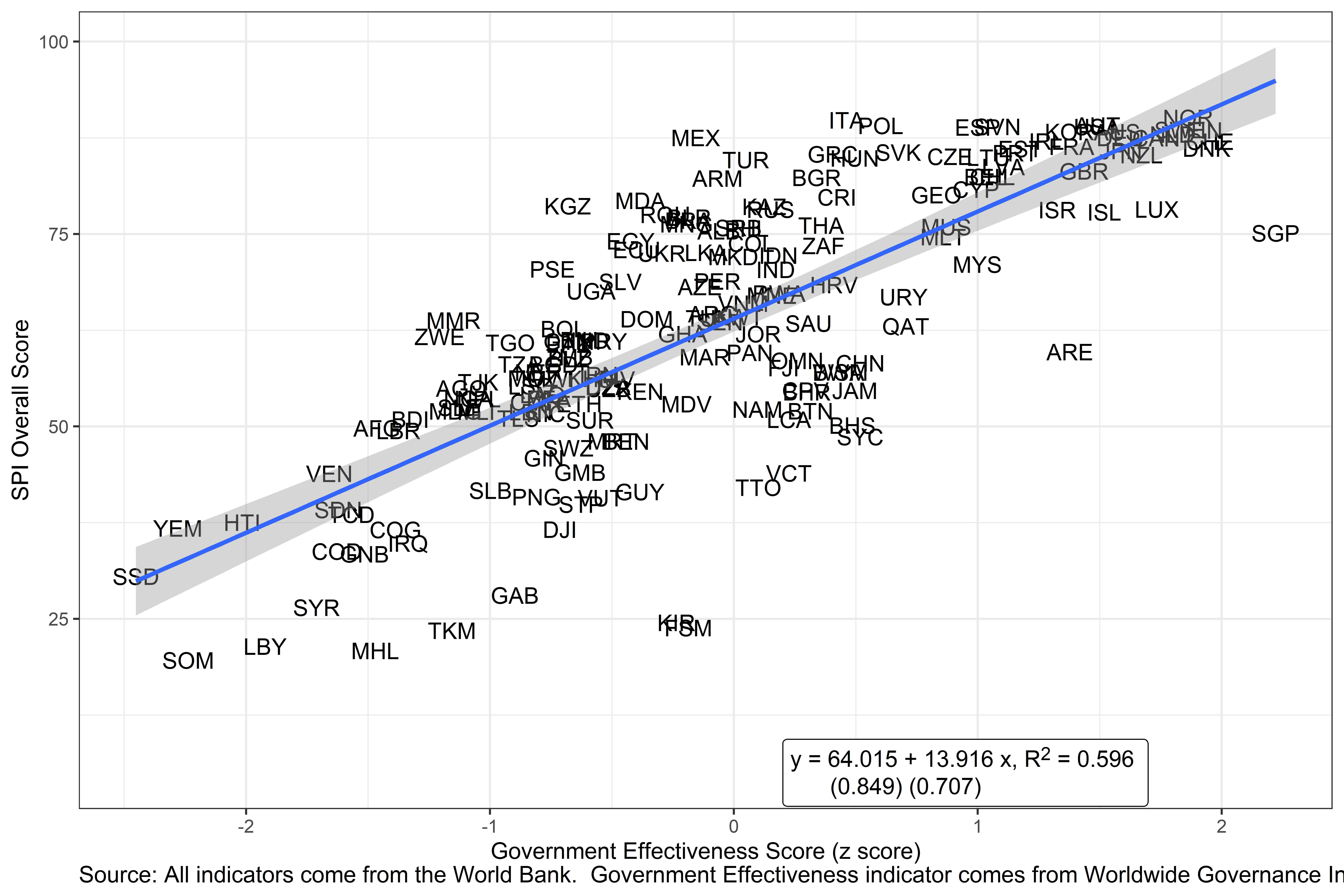
Figure 3.22:
To tease out to what extent the relationship between the government effectiveness indicator and the SPI is due to other factors such as income or regional characteristics, the results from an OLS regression are presented below. While it is acknowledged that a more detailed study could be conducted to better understand the processes relating the two, a relationship is found between government effectiveness and statistical performance after accounting for income and regional characteristics of a country.
The regression model used takes the following form:
\[ G_{ctr} = \alpha_t + \gamma_r + \beta SPI.INDEX_{ctr} + \theta X_{ctr} + \epsilon_{ctr} \]
where \(Y_{ctri}\) is the government effectiveness estimate for country i, in time period t, and region r. \(SPI.INDEX_{ctri}\) is the SPI overall score. \(X_{ctri}\) is a set of control variables in the regression. This includes log GDP per capita from the World Bank WDI. \(\epsilon_{ctri}\) is the error term. \(\alpha_t\) is an indicator variable for each year and \(\gamma_r\) is a regional indicator variable.
The table below shows the estimate of \(\beta\), the effect of the statistical performance measure on government effectiveness. Full results from this regression are shown in a table in the appendix. The estimated coefficient is statistically significant at the 0.1% level, and implies that a 10 point increase in the SPI overall score is associated with a 0.2 standard deviation increase in government effectiveness. For context, this 10 point jump in the SPI would roughly take a country from roughly the median in terms of government effectiveness to roughly the 58th percentile.
Table 7.1: Linear Regressions of Government Effectiveness Score on SPI Overall Score from 2016-19
Government Effectiveness | |
SPI Overall Score | 0.020 *** |
(0.002) | |
N | 668 |
R2 | 0.844 |
*** p < 0.001; ** p < 0.01; * p < 0.05. | |
Source: World Bank. Statistical Performance Indicators. | |
3.0.4.4 Country Changes in the Index
In order to assess how stable the index values are over time, comparisons have been made between the index values in 2016 and the 2019 values. Overall, the SPI overall score is quite stable over time. The correlation between the 2016 value and the 2019 value is 0.96.
Figure 7.4: Scatterplot of 2019 SPI overall score & 2016 SPI overall score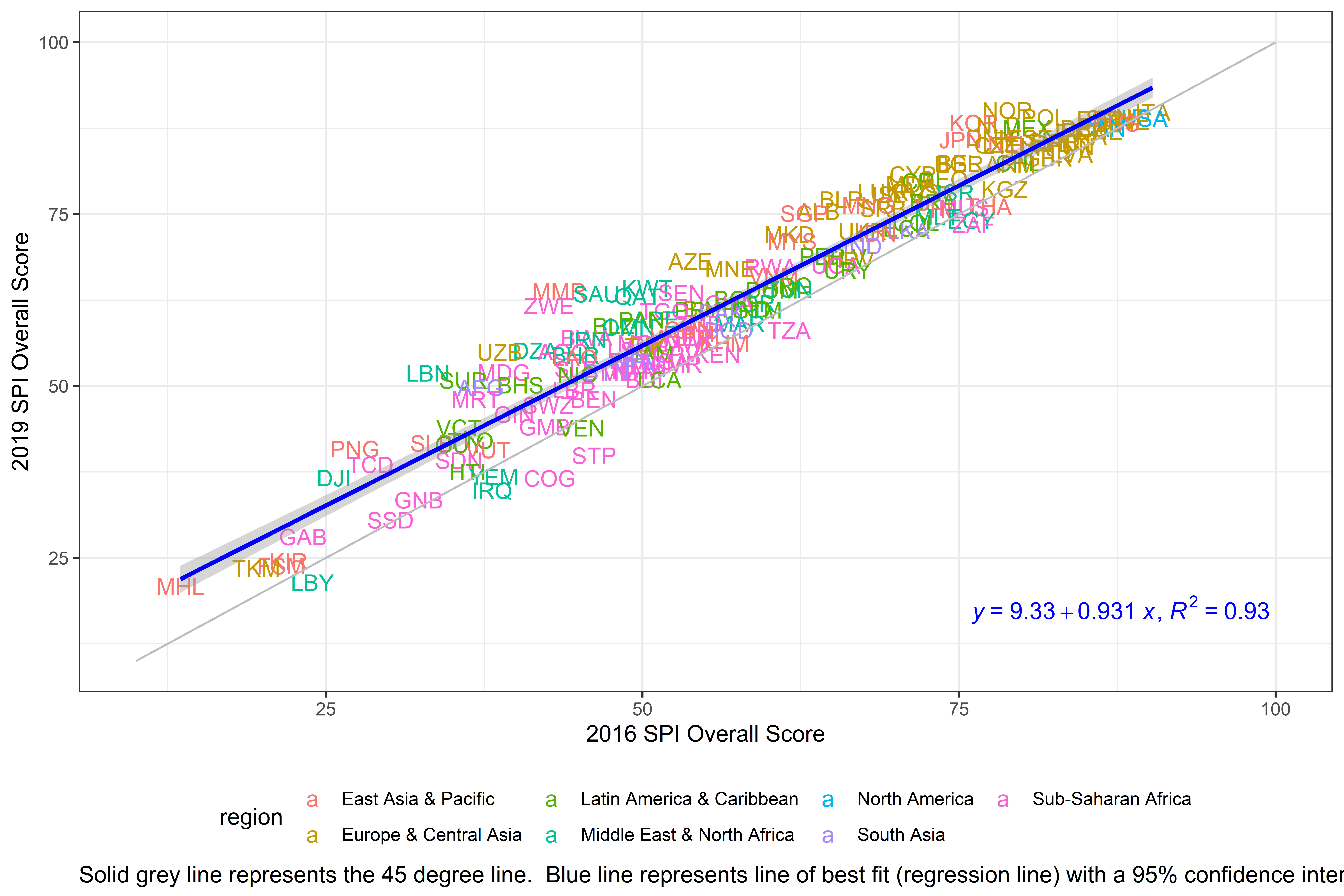
Figure 3.23:
While the scores were relatively stable over time, some countries did see large improvements in their score from 2016-2019. The country that improved most on the index from 2016 to 2019 was Myanmar. Myanmar improved by 20.3 points out of 100. The table below shows the changes in the SPI overall score for the top 10 largest improvers.
Table 7.2: Top 10 Countries with Largest Changes from 2016-2019.
Country | SPI Overall Score 2019 | SPI Overall Score 2016 | Difference |
Myanmar | 64 | 43 | 20 |
Zimbabwe | 62 | 43 | 19 |
Lebanon | 52 | 33 | 19 |
Saudi Arabia | 63 | 46 | 17 |
Uzbekistan | 55 | 39 | 16 |
Suriname | 51 | 36 | 15 |
Azerbaijan | 68 | 54 | 14 |
Kuwait | 64 | 50 | 14 |
Algeria | 55 | 42 | 14 |
Papua New Guinea | 41 | 27 | 14 |
Source: World Bank. Statistical Performance Indicators. | |||
3.0.4.5 Density Plots
As another check, the distribution of scores across countries for each year has been presented and compared to a normal distribution. This exercise checks for whether the distribution of the SPI overall scores contains significant skew or fat tails. There is some indication of a bunching of scores near the top of the distribution of SPI scores. This is due to a large number of OECD countries possessing similar scores. This is not unexpected as OECD requires member countries to adhere to several methodological standards and to regularly report on a large set of indicators. These countries also are composed of several of the highest income countries that tend to be on the frontier of statistical production.
Figure 7.5: Distribution of SPI overall score across Countries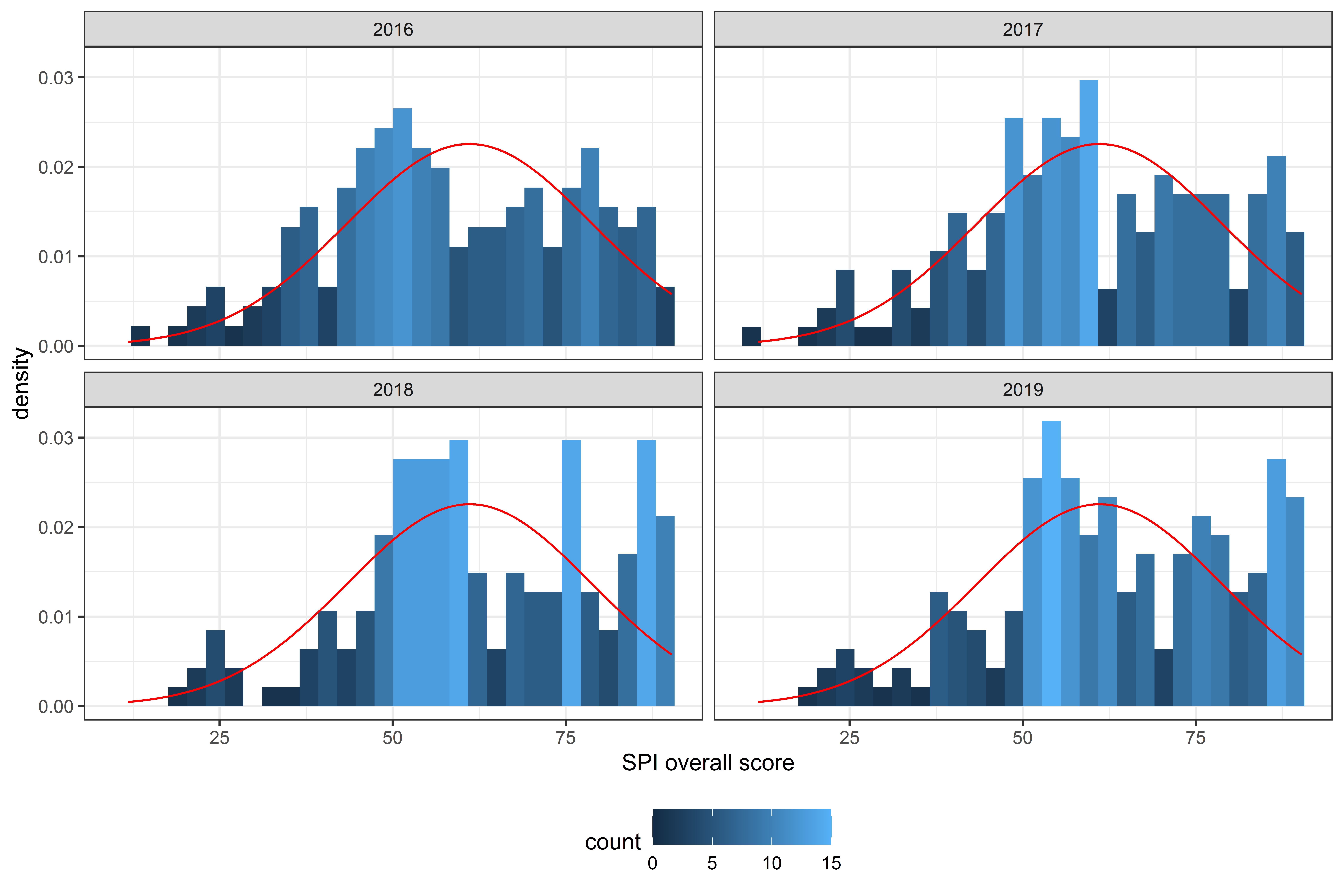
Figure 3.24:
3.0.5 Conclusion
The new Statistical Performance Indicators (SPI) will replace the Statistical Capacity Index (SCI), which the World Bank has regularly published since 2004. Although the goals are the same, to offer a better tool to measure the statistical systems of countries, the new SPI framework has expanded into new areas including in the areas of data use, administrative data, geospatial data, data services, and data infrastructure. The SPI provides a framework that can help countries measure where they stand in several dimensions and offers an ambitious measurement agenda for the international community.
The goal of the SPI is to offer a framework that is forward looking, measures less mature statistical systems as well as advanced systems, covers the broader national statistical system beyond the National Statistical Office (NSO), and gives countries incentives to build a modern statistical system. The project uses open data and open code to build confidence in the work. The data will also be updated on a yearly basis to track progress over time.
More research and data collection is, however, needed to improve measurement. Several of the dimensions of the SPI do not have measurable indicators yet. One of the functions of the dashboard is to motivate action on the part of the international community to help improve the collection of data so we can better measure these areas.
Countries and international organizations need to know the current capabilities of national statistical systems, and the new SPI is meant to provide insights into this. Through the SPI, there is the potential for countries and donors to create mechanisms for learning from their peers to develop a virtuous cycle of investment, effectiveness, innovation, value added, and impact.
3.0.6 Appendix
3.0.6.1 Country SPI overall scores
Below, the full list of countries by their SPI overall score in 2019 is presented. The first column is the country name and the following columns are the overall SPI overall score, and then the sub-scores for pillars 1,2,3,4 and 5.
The purpose of the SPI is to help countries assess and improve the performance of their statistical systems. The presentation of SPI overall scores is designed to reflect that aim. Small differences between countries should not be highlighted since they are likely to reflect imprecision arising from the methodology rather than meaningful differences in performance. Instead, presentation of overall SPI scores focuses on larger groupings of countries reflecting broad categories of performance as measured by the indicator framework.
Countries shaded in dark orange are the lowest performing, countries in dark green are the highest performing. Countries are grouped into five groups:
- Top Quintile: Countries in the Top quintile are classified in this group. Shading in dark green.
- 4th Quintile: Countries in the 4th quintile, or those above the 60th percentile but below the 80th percentile are in this group. Shading in light green.
- 3rd Quintile: Countries in the 3rd quintile, or those between the 40th and 60th percentile, are classified in this group. Shading in yellow.
- 2nd Quintile: Countries in the 2nd quintile, or those above the 20th percentile but below the 40th percentile, are in this group. Shading in light orange.
- Bottom 20%: Countries in the bottom 20% are classified in this group. Shading in dark orange .
Table A.1: SPI overall score in 2019 and Pillar Scores
Country | SPI overall score | Pillar 1: Data Use | Pillar 2: Data Services | Pillar 3: Data Products | Pillar 4: Data Sources | Pillar 5: Data Infrastructure |
Norway | 90 | 100.0 | 92.2 | 77.6 | 81 | 100 |
Italy | 90 | 100.0 | 91.9 | 75.3 | 82 | 100 |
Austria | 89 | 100.0 | 91.3 | 74.6 | 80 | 100 |
Poland | 89 | 100.0 | 95.1 | 70.5 | 80 | 100 |
Slovenia | 89 | 100.0 | 96.9 | 76.3 | 71 | 100 |
United States | 89 | 100.0 | 94.0 | 63.1 | 88 | 100 |
Spain | 89 | 100.0 | 90.9 | 75.5 | 78 | 100 |
Sweden | 88 | 100.0 | 94.9 | 75.2 | 72 | 100 |
Finland | 88 | 100.0 | 94.9 | 75.2 | 72 | 100 |
Korea, Rep. | 88 | 100.0 | 93.4 | 75.6 | 82 | 90 |
Australia | 88 | 100.0 | 92.7 | 74.1 | 74 | 100 |
Netherlands | 88 | 100.0 | 98.5 | 71.4 | 70 | 100 |
Mexico | 88 | 100.0 | 92.9 | 89.3 | 80 | 75 |
Germany | 88 | 100.0 | 96.5 | 71.1 | 75 | 95 |
Canada | 88 | 100.0 | 93.2 | 60.0 | 84 | 100 |
Ireland | 87 | 100.0 | 94.7 | 74.1 | 66 | 100 |
Switzerland | 87 | 100.0 | 87.7 | 76.6 | 81 | 90 |
France | 86 | 100.0 | 90.8 | 74.3 | 67 | 100 |
Denmark | 86 | 90.0 | 98.7 | 68.0 | 74 | 100 |
Estonia | 86 | 100.0 | 93.9 | 67.5 | 69 | 100 |
Japan | 86 | 90.0 | 90.5 | 73.5 | 80 | 95 |
Slovak Republic | 86 | 90.0 | 94.9 | 70.0 | 73 | 100 |
Portugal | 86 | 100.0 | 90.8 | 71.0 | 66 | 100 |
Greece | 85 | 100.0 | 87.5 | 68.5 | 71 | 100 |
New Zealand | 85 | 100.0 | 91.6 | 71.5 | 63 | 100 |
Czech Republic | 85 | 90.0 | 90.1 | 74.6 | 76 | 95 |
Lithuania | 85 | 100.0 | 91.8 | 61.0 | 72 | 100 |
Hungary | 85 | 100.0 | 86.9 | 69.0 | 68 | 100 |
Turkey | 85 | 100.0 | 84.0 | 86.1 | 53 | 100 |
Latvia | 84 | 100.0 | 89.2 | 61.4 | 68 | 100 |
United Kingdom | 83 | 100.0 | 86.8 | 74.0 | 65 | 90 |
Chile | 82 | 100.0 | 77.0 | 80.7 | 60 | 95 |
Belgium | 82 | 100.0 | 83.9 | 62.2 | 66 | 100 |
Bulgaria | 82 | 100.0 | 90.1 | 60.7 | 71 | 90 |
Armenia | 82 | 100.0 | 85.0 | 81.2 | 60 | 85 |
Cyprus | 81 | 100.0 | 92.3 | 53.3 | 73 | 85 |
Georgia | 80 | 100.0 | 86.5 | 73.7 | 60 | 80 |
Costa Rica | 80 | 100.0 | 86.5 | 76.0 | 66 | 70 |
Moldova | 79 | 100.0 | 94.2 | 53.6 | 59 | 90 |
Kyrgyz Republic | 79 | 100.0 | 81.5 | 73.6 | 53 | 85 |
Kazakhstan | 79 | 100.0 | 82.1 | 78.3 | 62 | 70 |
Luxembourg | 78 | 80.0 | 90.4 | 61.3 | 59 | 100 |
Russian Federation | 78 | 93.4 | 83.7 | 58.5 | 65 | 90 |
Israel | 78 | 100.0 | 85.7 | 58.5 | 46 | 100 |
Iceland | 78 | 80.0 | 87.8 | 59.7 | 62 | 100 |
Romania | 78 | 90.0 | 87.2 | 56.7 | 74 | 80 |
Belarus | 77 | 100.0 | 79.2 | 67.9 | 54 | 85 |
Brazil | 77 | 90.0 | 83.3 | 73.1 | 62 | 75 |
Mongolia | 76 | 100.0 | 80.0 | 77.5 | 64 | 60 |
Thailand | 76 | 100.0 | 76.5 | 76.2 | 58 | 70 |
Mauritius | 76 | 100.0 | 86.2 | 57.0 | 66 | 70 |
Serbia | 76 | 100.0 | 67.4 | 68.4 | 63 | 80 |
Philippines | 76 | 100.0 | 88.3 | 75.2 | 80 | 35 |
Albania | 75 | 100.0 | 69.8 | 72.7 | 59 | 75 |
Singapore | 75 | 100.0 | 100.0 | 42.2 | 53 | 80 |
Malta | 75 | 100.0 | 84.0 | 45.5 | 69 | 75 |
Egypt, Arab Rep. | 74 | 100.0 | 76.8 | 72.6 | 61 | 60 |
Colombia | 74 | 100.0 | 84.3 | 83.1 | 46 | 55 |
South Africa | 74 | 76.6 | 85.5 | 75.1 | 65 | 65 |
Ecuador | 73 | 100.0 | 87.7 | 76.4 | 56 | 45 |
Sri Lanka | 73 | 100.0 | 81.0 | 70.5 | 66 | 45 |
Ukraine | 72 | 100.0 | 46.1 | 67.3 | 49 | 100 |
Indonesia | 72 | 100.0 | 87.3 | 74.9 | 44 | 55 |
North Macedonia | 72 | 100.0 | 88.1 | 51.1 | 56 | 65 |
Malaysia | 71 | 80.0 | 84.0 | 73.0 | 68 | 50 |
West Bank and Gaza | 70 | 80.0 | 86.6 | 55.7 | 70 | 60 |
India | 70 | 80.0 | 88.0 | 60.0 | 69 | 55 |
Peru | 69 | 90.0 | 85.8 | 77.3 | 51 | 40 |
El Salvador | 69 | 90.0 | 79.9 | 69.1 | 45 | 60 |
Croatia | 68 | 80.0 | 50.8 | 57.3 | 64 | 90 |
Azerbaijan | 68 | 80.0 | 64.6 | 61.0 | 55 | 80 |
Uganda | 68 | 100.0 | 64.2 | 74.8 | 34 | 65 |
Rwanda | 67 | 100.0 | 72.4 | 69.6 | 49 | 45 |
Montenegro | 67 | 90.0 | 64.3 | 67.1 | 59 | 55 |
Uruguay | 67 | 100.0 | 83.9 | 66.0 | 64 | 20 |
Vietnam | 66 | 100.0 | 64.0 | 55.1 | 76 | 35 |
Argentina | 65 | 70.0 | 79.5 | 79.6 | 59 | 35 |
Kuwait | 64 | 100.0 | 66.3 | 51.7 | 63 | 40 |
Tunisia | 64 | 90.0 | 85.7 | 64.9 | 50 | 30 |
Dominican Republic | 64 | 100.0 | 65.6 | 60.0 | 34 | 60 |
Myanmar | 64 | 100.0 | 67.1 | 73.8 | 43 | 35 |
Senegal | 64 | 80.0 | 81.0 | 66.9 | 40 | 50 |
Saudi Arabia | 63 | 80.0 | 60.7 | 47.2 | 79 | 50 |
Qatar | 63 | 100.0 | 62.0 | 47.3 | 61 | 45 |
Bolivia | 63 | 100.0 | 68.5 | 70.4 | 54 | 20 |
Jordan | 62 | 80.0 | 80.8 | 71.3 | 48 | 30 |
Ghana | 62 | 100.0 | 61.3 | 65.1 | 34 | 50 |
Zimbabwe | 62 | 90.0 | 59.9 | 70.2 | 43 | 45 |
Bosnia and Herzegovina | 61 | 80.0 | 60.7 | 58.1 | 47 | 60 |
Honduras | 61 | 90.0 | 62.4 | 66.9 | 47 | 40 |
Paraguay | 61 | 70.0 | 63.1 | 76.4 | 41 | 55 |
Guatemala | 61 | 80.0 | 62.1 | 73.9 | 54 | 35 |
Togo | 61 | 90.0 | 59.8 | 68.5 | 41 | 45 |
Pakistan | 61 | 100.0 | 61.0 | 73.3 | 39 | 30 |
United Arab Emirates | 60 | 100.0 | 36.9 | 42.2 | 54 | 65 |
Panama | 60 | 80.0 | 62.8 | 65.2 | 60 | 30 |
Morocco | 59 | 60.0 | 88.4 | 68.2 | 28 | 50 |
Zambia | 59 | 90.0 | 57.8 | 70.5 | 37 | 40 |
Belize | 59 | 80.0 | 62.3 | 55.8 | 66 | 30 |
Oman | 58 | 100.0 | 44.4 | 44.1 | 64 | 40 |
China | 58 | 83.4 | 46.4 | 59.7 | 37 | 65 |
Tanzania | 58 | 76.6 | 60.7 | 68.8 | 39 | 45 |
Bangladesh | 58 | 90.0 | 61.6 | 69.0 | 45 | 25 |
Fiji | 58 | 80.0 | 59.5 | 52.9 | 51 | 45 |
Samoa | 57 | 90.0 | 63.5 | 50.4 | 36 | 45 |
Botswana | 57 | 60.0 | 66.6 | 65.4 | 53 | 40 |
Niger | 57 | 90.0 | 62.0 | 60.8 | 37 | 35 |
Iran, Islamic Rep. | 57 | 80.0 | 59.8 | 51.6 | 57 | 35 |
Mozambique | 56 | 80.0 | 57.6 | 67.4 | 36 | 40 |
Cambodia | 56 | 70.0 | 59.2 | 60.4 | 46 | 45 |
Malawi | 56 | 90.0 | 61.2 | 66.5 | 33 | 30 |
Cote d'Ivoire | 56 | 90.0 | 59.9 | 68.5 | 37 | 25 |
Tajikistan | 56 | 90.0 | 31.4 | 65.5 | 42 | 50 |
Lesotho | 55 | 80.0 | 63.3 | 53.2 | 40 | 40 |
Algeria | 55 | 70.0 | 60.1 | 57.4 | 48 | 40 |
Angola | 55 | 80.0 | 57.3 | 68.6 | 29 | 40 |
Uzbekistan | 55 | 70.0 | 56.0 | 50.1 | 33 | 65 |
Cabo Verde | 55 | 80.0 | 59.3 | 59.6 | 54 | 20 |
Jamaica | 55 | 60.0 | 73.7 | 52.9 | 57 | 30 |
Kenya | 54 | 70.0 | 60.5 | 61.4 | 36 | 45 |
Bahrain | 54 | 90.0 | 64.3 | 41.6 | 46 | 30 |
Lao PDR | 54 | 90.0 | 56.6 | 53.4 | 40 | 30 |
Burkina Faso | 54 | 80.0 | 59.6 | 62.0 | 32 | 35 |
Nigeria | 54 | 80.0 | 62.4 | 54.8 | 31 | 40 |
Nepal | 54 | 80.0 | 61.3 | 68.0 | 38 | 20 |
Cameroon | 53 | 80.0 | 61.6 | 64.5 | 25 | 35 |
Ethiopia | 53 | 90.0 | 60.0 | 71.4 | 28 | 15 |
Maldives | 53 | 70.0 | 29.9 | 65.5 | 49 | 50 |
Sierra Leone | 52 | 90.0 | 65.2 | 62.0 | 25 | 20 |
Namibia | 52 | 70.0 | 63.1 | 65.5 | 32 | 30 |
Bhutan | 52 | 80.0 | 59.2 | 67.8 | 38 | 15 |
Madagascar | 52 | 90.0 | 56.3 | 62.6 | 21 | 30 |
Mali | 52 | 66.6 | 63.1 | 64.2 | 36 | 30 |
Lebanon | 52 | 60.0 | 62.6 | 57.4 | 49 | 30 |
Nicaragua | 52 | 90.0 | 60.0 | 45.4 | 28 | 35 |
Timor-Leste | 51 | 50.0 | 58.2 | 59.3 | 33 | 55 |
Burundi | 51 | 70.0 | 61.7 | 68.9 | 19 | 35 |
St. Lucia | 51 | 80.0 | 55.9 | 46.0 | 48 | 25 |
Suriname | 51 | 60.0 | 62.4 | 46.6 | 50 | 35 |
Bahamas, The | 50 | 100.0 | 27.3 | 35.8 | 28 | 60 |
Afghanistan | 50 | 70.0 | 59.9 | 68.3 | 16 | 35 |
Liberia | 49 | 90.0 | 28.8 | 56.8 | 26 | 45 |
Seychelles | 49 | 40.0 | 46.5 | 52.8 | 54 | 50 |
Mauritania | 48 | 70.0 | 62.5 | 47.8 | 25 | 35 |
Benin | 48 | 70.0 | 58.3 | 57.3 | 30 | 25 |
Eswatini | 47 | 90.0 | 22.4 | 63.7 | 20 | 40 |
Guinea | 46 | 70.0 | 61.4 | 57.1 | 21 | 20 |
Gambia, The | 44 | 60.0 | 28.5 | 64.9 | 32 | 35 |
St. Vincent and the Grenadines | 44 | 40.0 | 62.7 | 41.8 | 40 | 35 |
Venezuela, RB | 44 | 46.6 | 59.9 | 52.1 | 36 | 25 |
Trinidad and Tobago | 42 | 60.0 | 27.3 | 40.2 | 43 | 40 |
Solomon Islands | 42 | 60.0 | 60.4 | 47.5 | 20 | 20 |
Guyana | 42 | 60.0 | 57.4 | 46.1 | 19 | 25 |
Papua New Guinea | 41 | 60.0 | 55.3 | 50.7 | 18 | 20 |
Vanuatu | 41 | 60.0 | 59.1 | 45.7 | 24 | 15 |
Sao Tome and Principe | 40 | 60.0 | 24.7 | 42.9 | 42 | 30 |
Sudan | 39 | 53.4 | 57.9 | 55.7 | 19 | 10 |
Chad | 38 | 56.6 | 51.5 | 52.4 | 17 | 15 |
Haiti | 38 | 80.0 | 19.7 | 51.2 | 17 | 20 |
Yemen, Rep. | 37 | 80.0 | 25.5 | 37.9 | 20 | 20 |
Djibouti | 37 | 40.0 | 60.4 | 41.6 | 16 | 25 |
Congo, Rep. | 37 | 60.0 | 27.9 | 47.8 | 27 | 20 |
Iraq | 35 | 30.0 | 25.0 | 62.0 | 22 | 35 |
Congo, Dem. Rep. | 34 | 60.0 | 26.3 | 44.3 | 18 | 20 |
Guinea-Bissau | 33 | 60.0 | 27.3 | 42.0 | 18 | 20 |
South Sudan | 30 | 20.0 | 41.8 | 45.8 | 15 | 30 |
Gabon | 28 | 40.0 | 23.7 | 41.6 | 15 | 20 |
Syrian Arab Republic | 26 | 26.6 | 24.8 | 38.1 | 18 | 25 |
Kiribati | 24 | 20.0 | 25.8 | 46.2 | 16 | 15 |
Micronesia, Fed. Sts. | 24 | 20.0 | 25.6 | 41.7 | 17 | 15 |
Turkmenistan | 24 | 46.6 | 0.6 | 41.8 | 13 | 15 |
Libya | 21 | 20.0 | 20.6 | 35.6 | 11 | 20 |
Marshall Islands | 21 | 20.0 | 24.1 | 38.7 | 12 | 10 |
Somalia | 20 | 16.6 | 36.0 | 45.5 | 0 | 0 |
American Samoa | 30.0 | 19.9 | ||||
Andorra | 60.0 | 26.8 | ||||
Antigua and Barbuda | 20.0 | 46.4 | 25 | |||
Aruba | 60.0 | 17.1 | ||||
Barbados | 80.0 | 50.8 | 30 | |||
Bermuda | 60.0 | 16.7 | ||||
British Virgin Islands | 40.0 | 18.2 | ||||
Brunei Darussalam | 100.0 | 40.7 | 45 | |||
Cayman Islands | 40.0 | 17.1 | ||||
Central African Republic | 20.0 | 49.2 | 20 | |||
Channel Islands | 60.0 | |||||
Comoros | 60.0 | 52.7 | 30 | |||
Cuba | 70.0 | 46.9 | ||||
Curacao | 40.0 | 18.5 | ||||
Dominica | 20.0 | 39.9 | 35 | |||
Equatorial Guinea | 0.0 | 44.9 | 25 | |||
Eritrea | 6.6 | 37.9 | 10 | |||
Faroe Islands | 60.0 | 11.4 | ||||
French Polynesia | 60.0 | 14.1 | ||||
Gibraltar | 60.0 | 12.9 | ||||
Greenland | 50.0 | 12.5 | ||||
Grenada | 50.0 | 43.1 | 25 | |||
Guam | 60.0 | 15.3 | ||||
Hong Kong SAR, China | 80.0 | 28.7 | ||||
Isle of Man | 60.0 | 10.9 | ||||
Korea, Dem. People’s Rep. | 20.0 | 43.1 | ||||
Kosovo | 40.0 | 66.0 | 60 | |||
Liechtenstein | 60.0 | 24.2 | ||||
Macao SAR, China | 80.0 | 23.9 | ||||
Monaco | 60.0 | 27.4 | ||||
Nauru | 20.0 | 34.9 | 5 | |||
New Caledonia | 70.0 | 16.0 | ||||
Northern Mariana Islands | 60.0 | 11.3 | ||||
Palau | 30.0 | 34.1 | 40 | |||
Puerto Rico | 80.0 | 22.2 | ||||
San Marino | 60.0 | 21.6 | 60 | |||
Sint Maarten (Dutch part) | 40.0 | 9.8 | ||||
St. Kitts and Nevis | 20.0 | 28.4 | 25 | |||
St. Martin (French part) | 40.0 | 7.1 | ||||
Taiwan, China | 60.0 | |||||
Tonga | 90.0 | 45.1 | 35 | |||
Turks and Caicos Islands | 60.0 | 12.8 | ||||
Tuvalu | 10.0 | 36.6 | 5 | |||
Virgin Islands (U.S.) | 60.0 | 9.9 | ||||
Source: World Bank. Statistical Performance Indicators. | ||||||
3.0.6.2 Country SPI overall scores over time
Table A.2: SPI overall scores over time
Country | 2019 | 2018 | 2017 | 2016 |
Norway | 90 | 90 | 83 | 79 |
Italy | 90 | 90 | 90 | 90 |
Austria | 89 | 90 | 88 | 88 |
Poland | 89 | 89 | 83 | 82 |
Slovenia | 89 | 89 | 88 | 87 |
United States | 89 | 89 | 87 | 90 |
Spain | 89 | 88 | 87 | 86 |
Sweden | 88 | 89 | 89 | 88 |
Finland | 88 | 89 | 88 | 88 |
Korea, Rep. | 88 | 85 | 78 | 76 |
Australia | 88 | 88 | 89 | 87 |
Netherlands | 88 | 88 | 80 | 78 |
Mexico | 88 | 88 | 89 | 80 |
Germany | 88 | 87 | 86 | 85 |
Canada | 88 | 87 | 86 | 86 |
Ireland | 87 | 86 | 86 | 84 |
Switzerland | 87 | 88 | 87 | 86 |
France | 86 | 87 | 86 | 85 |
Denmark | 86 | 86 | 79 | 77 |
Estonia | 86 | 87 | 80 | 81 |
Japan | 86 | 85 | 77 | 75 |
Slovak Republic | 86 | 86 | 86 | 82 |
Portugal | 86 | 86 | 86 | 84 |
Greece | 85 | 84 | 84 | 82 |
New Zealand | 85 | 83 | 84 | 79 |
Czech Republic | 85 | 85 | 78 | 78 |
Lithuania | 85 | 85 | 79 | 79 |
Hungary | 85 | 85 | 84 | 84 |
Turkey | 85 | 86 | 85 | 80 |
Latvia | 84 | 84 | 84 | 84 |
United Kingdom | 83 | 83 | 83 | 82 |
Chile | 82 | 80 | 79 | 80 |
Belgium | 82 | 82 | 76 | 75 |
Bulgaria | 82 | 83 | 77 | 75 |
Armenia | 82 | 82 | 81 | 79 |
Cyprus | 81 | 81 | 72 | 71 |
Georgia | 80 | 75 | 77 | 74 |
Costa Rica | 80 | 77 | 78 | 72 |
Moldova | 79 | 76 | 69 | 71 |
Kyrgyz Republic | 79 | 76 | 78 | 79 |
Kazakhstan | 79 | 79 | 72 | 71 |
Luxembourg | 78 | 79 | 71 | 69 |
Russian Federation | 78 | 76 | 74 | 72 |
Israel | 78 | 77 | 77 | 75 |
Iceland | 78 | 78 | 72 | 69 |
Romania | 78 | 76 | 70 | |
Belarus | 77 | 76 | 65 | 66 |
Brazil | 77 | 75 | 72 | 73 |
Mongolia | 76 | 76 | 74 | 68 |
Thailand | 76 | 76 | 76 | 77 |
Mauritius | 76 | 77 | 76 | 75 |
Serbia | 76 | 75 | 74 | 69 |
Philippines | 76 | 76 | 74 | 73 |
Albania | 75 | 78 | 68 | 64 |
Singapore | 75 | 74 | 65 | 63 |
Malta | 75 | 74 | 73 | 73 |
Egypt, Arab Rep. | 74 | 74 | 74 | 76 |
Colombia | 74 | 71 | 72 | 72 |
South Africa | 74 | 75 | 76 | 76 |
Ecuador | 73 | 73 | 72 | 71 |
Sri Lanka | 73 | 72 | 72 | 71 |
Ukraine | 72 | 70 | 68 | 67 |
Indonesia | 72 | 72 | 70 | 69 |
North Macedonia | 72 | 70 | 65 | 62 |
Malaysia | 71 | 73 | 65 | 62 |
West Bank and Gaza | 70 | 70 | 61 | |
India | 70 | 69 | 65 | 67 |
Peru | 69 | 69 | 68 | 64 |
El Salvador | 69 | 68 | 67 | 66 |
Croatia | 68 | 66 | 61 | 66 |
Azerbaijan | 68 | 68 | 60 | 54 |
Uganda | 68 | 68 | 69 | 65 |
Rwanda | 67 | 67 | 67 | 60 |
Montenegro | 67 | 65 | 60 | 57 |
Uruguay | 67 | 68 | 69 | 66 |
Vietnam | 66 | 67 | 64 | 60 |
Argentina | 65 | 65 | 65 | 62 |
Kuwait | 64 | 61 | 55 | 50 |
Tunisia | 64 | 64 | 60 | 62 |
Dominican Republic | 64 | 61 | 63 | 60 |
Myanmar | 64 | 61 | 54 | 43 |
Senegal | 64 | 62 | 58 | 53 |
Saudi Arabia | 63 | 59 | 51 | 46 |
Qatar | 63 | 52 | 52 | 50 |
Bolivia | 63 | 62 | 61 | 57 |
Jordan | 62 | 59 | 58 | 59 |
Ghana | 62 | 60 | 60 | 57 |
Zimbabwe | 62 | 60 | 50 | 43 |
Bosnia and Herzegovina | 61 | 61 | 55 | 55 |
Honduras | 61 | 61 | 60 | 58 |
Paraguay | 61 | 59 | 57 | 54 |
Guatemala | 61 | 62 | 62 | 59 |
Togo | 61 | 61 | 58 | 52 |
Pakistan | 61 | 61 | 58 | 56 |
United Arab Emirates | 60 | 59 | 59 | 51 |
Panama | 60 | 58 | 53 | 50 |
Morocco | 59 | 60 | 57 | 58 |
Zambia | 59 | 60 | 59 | 54 |
Belize | 59 | 58 | 52 | 48 |
Oman | 58 | 58 | 57 | 49 |
China | 58 | 56 | 55 | 54 |
Tanzania | 58 | 58 | 65 | 62 |
Bangladesh | 58 | 59 | 59 | 57 |
Fiji | 58 | 58 | 59 | 54 |
Samoa | 57 | 59 | 58 | 53 |
Botswana | 57 | 56 | 56 | 46 |
Niger | 57 | 56 | 56 | 54 |
Iran, Islamic Rep. | 57 | 57 | 49 | 46 |
Mozambique | 56 | 55 | 55 | 50 |
Cambodia | 56 | 56 | 58 | 56 |
Malawi | 56 | 54 | 56 | 54 |
Cote d'Ivoire | 56 | 57 | 56 | 50 |
Tajikistan | 56 | 56 | 55 | 50 |
Lesotho | 55 | 56 | 54 | 49 |
Algeria | 55 | 53 | 46 | 42 |
Angola | 55 | 55 | 47 | 44 |
Uzbekistan | 55 | 51 | 45 | 39 |
Cabo Verde | 55 | 55 | 55 | 53 |
Jamaica | 55 | 55 | 50 | 51 |
Kenya | 54 | 55 | 57 | 56 |
Bahrain | 54 | 53 | 47 | 45 |
Lao PDR | 54 | 49 | 48 | 45 |
Burkina Faso | 54 | 54 | 51 | 49 |
Nigeria | 54 | 50 | 49 | 52 |
Nepal | 54 | 54 | 55 | 49 |
Cameroon | 53 | 57 | 57 | 53 |
Ethiopia | 53 | 53 | 55 | 50 |
Maldives | 53 | 51 | 50 | 50 |
Sierra Leone | 52 | 52 | 49 | 45 |
Namibia | 52 | 52 | 53 | 50 |
Bhutan | 52 | 52 | 52 | 47 |
Madagascar | 52 | 50 | 42 | 39 |
Mali | 52 | 55 | 52 | 48 |
Lebanon | 52 | 45 | 38 | 33 |
Nicaragua | 52 | 50 | 46 | 45 |
Timor-Leste | 51 | 51 | 45 | |
Burundi | 51 | 54 | 54 | 50 |
St. Lucia | 51 | 51 | 48 | 51 |
Suriname | 51 | 53 | 42 | 36 |
Bahamas, The | 50 | 53 | 42 | 40 |
Afghanistan | 50 | 50 | 43 | 37 |
Liberia | 49 | 48 | 48 | 45 |
Seychelles | 49 | 48 | 48 | |
Mauritania | 48 | 47 | 41 | 37 |
Benin | 48 | 50 | 49 | 46 |
Eswatini | 47 | 54 | 46 | 42 |
Guinea | 46 | 40 | 42 | 40 |
Gambia, The | 44 | 48 | 47 | 42 |
St. Vincent and the Grenadines | 44 | 45 | 38 | 36 |
Venezuela, RB | 44 | 45 | 48 | 45 |
Trinidad and Tobago | 42 | 48 | 41 | 36 |
Solomon Islands | 42 | 43 | 37 | 33 |
Guyana | 42 | 42 | 33 | 36 |
Papua New Guinea | 41 | 41 | 33 | 27 |
Vanuatu | 41 | 40 | 40 | 38 |
Sao Tome and Principe | 40 | 50 | 49 | 46 |
Sudan | 39 | 44 | 36 | 36 |
Chad | 38 | 32 | 32 | 28 |
Haiti | 38 | 45 | 38 | 36 |
Yemen, Rep. | 37 | 39 | 42 | 38 |
Djibouti | 37 | 37 | 30 | 26 |
Congo, Rep. | 37 | 37 | 38 | 43 |
Iraq | 35 | 35 | 36 | 38 |
Congo, Dem. Rep. | 34 | 40 | 33 | |
Guinea-Bissau | 33 | 42 | 41 | 32 |
South Sudan | 30 | 25 | 23 | 30 |
Gabon | 28 | 28 | 28 | 23 |
Syrian Arab Republic | 26 | 26 | 22 | |
Kiribati | 24 | 24 | 24 | 22 |
Micronesia, Fed. Sts. | 24 | 24 | 24 | 22 |
Turkmenistan | 24 | 21 | 23 | 20 |
Libya | 21 | 23 | 23 | 24 |
Marshall Islands | 21 | 21 | 20 | 14 |
Somalia | 20 | 20 | 12 | |
Source: World Bank. Statistical Performance Indicators. | ||||
3.0.6.3 SPI Overall and Pillar Scores by Region, Income, & Lending
Table A.3: Table of SPI Overall and Pillar Scores by Region in 2019
Label | East Asia & Pacific | Europe & Central Asia | Latin America & Caribbean | Middle East & North Africa | North America | South Asia | Sub-Saharan Africa |
SPI Overall Score | 60 | 79 | 61 | 56 | 88 | 59 | 51 |
SPI.INDEX.PIL1 | 70 | 88 | 70 | 76 | 87 | 84 | 70 |
SPI.INDEX.PIL2 | 67 | 82 | 66 | 60 | 94 | 63 | 55 |
SPI.INDEX.PIL3 | 49 | 60 | 50 | 52 | 47 | 68 | 59 |
SPI.INDEX.PIL4 | 47 | 64 | 48 | 47 | 86 | 45 | 32 |
SPI.INDEX.PIL5 | 45 | 87 | 41 | 43 | 100 | 34 | 33 |
Source: World Bank. Statistical Performance Indicators. | |||||||
Table A.4: Table of SPI Overall and Pillar Scores by Income Group in 2019
Label | High income | Low income | Lower middle income | Upper middle income |
SPI Overall Score | 78 | 47 | 57 | 62 |
SPI.INDEX.PIL1 | 80 | 66 | 79 | 73 |
SPI.INDEX.PIL2 | 82 | 49 | 62 | 66 |
SPI.INDEX.PIL3 | 48 | 57 | 61 | 60 |
SPI.INDEX.PIL4 | 68 | 26 | 41 | 49 |
SPI.INDEX.PIL5 | 78 | 29 | 40 | 49 |
Source: World Bank. Statistical Performance Indicators. | ||||
Table A.5: Table of SPI Overall and Pillar Scores by Lending Group in 2019
Label | Blend | IBRD | IDA | Not classified |
SPI Overall Score | 53 | 68 | 46 | 81 |
SPI.INDEX.PIL1 | 72 | 83 | 64 | 85 |
SPI.INDEX.PIL2 | 58 | 71 | 50 | 86 |
SPI.INDEX.PIL3 | 57 | 63 | 54 | 52 |
SPI.INDEX.PIL4 | 35 | 55 | 31 | 70 |
SPI.INDEX.PIL5 | 43 | 60 | 31 | 87 |
Source: World Bank. Statistical Performance Indicators. | ||||
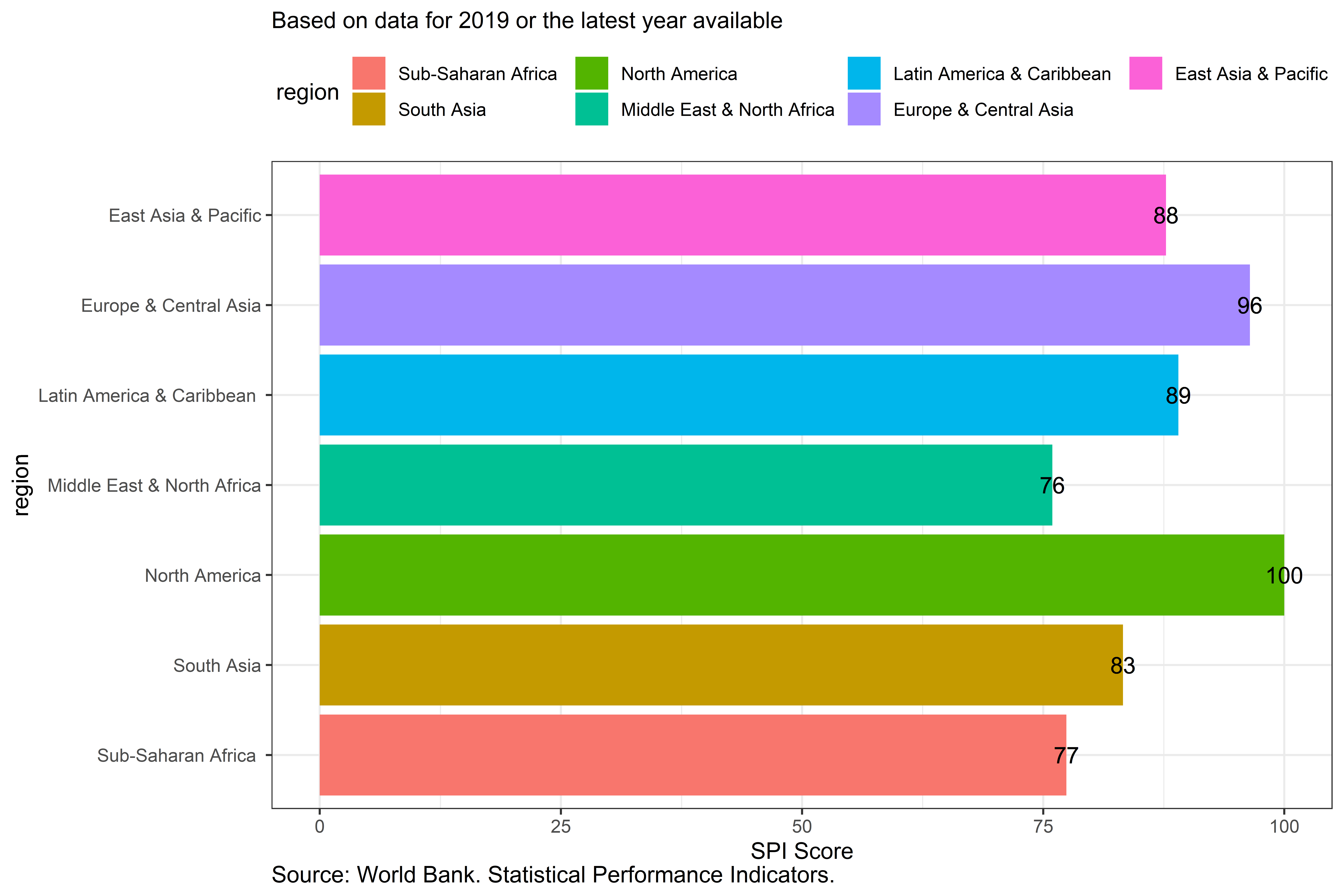
Figure 3.25:
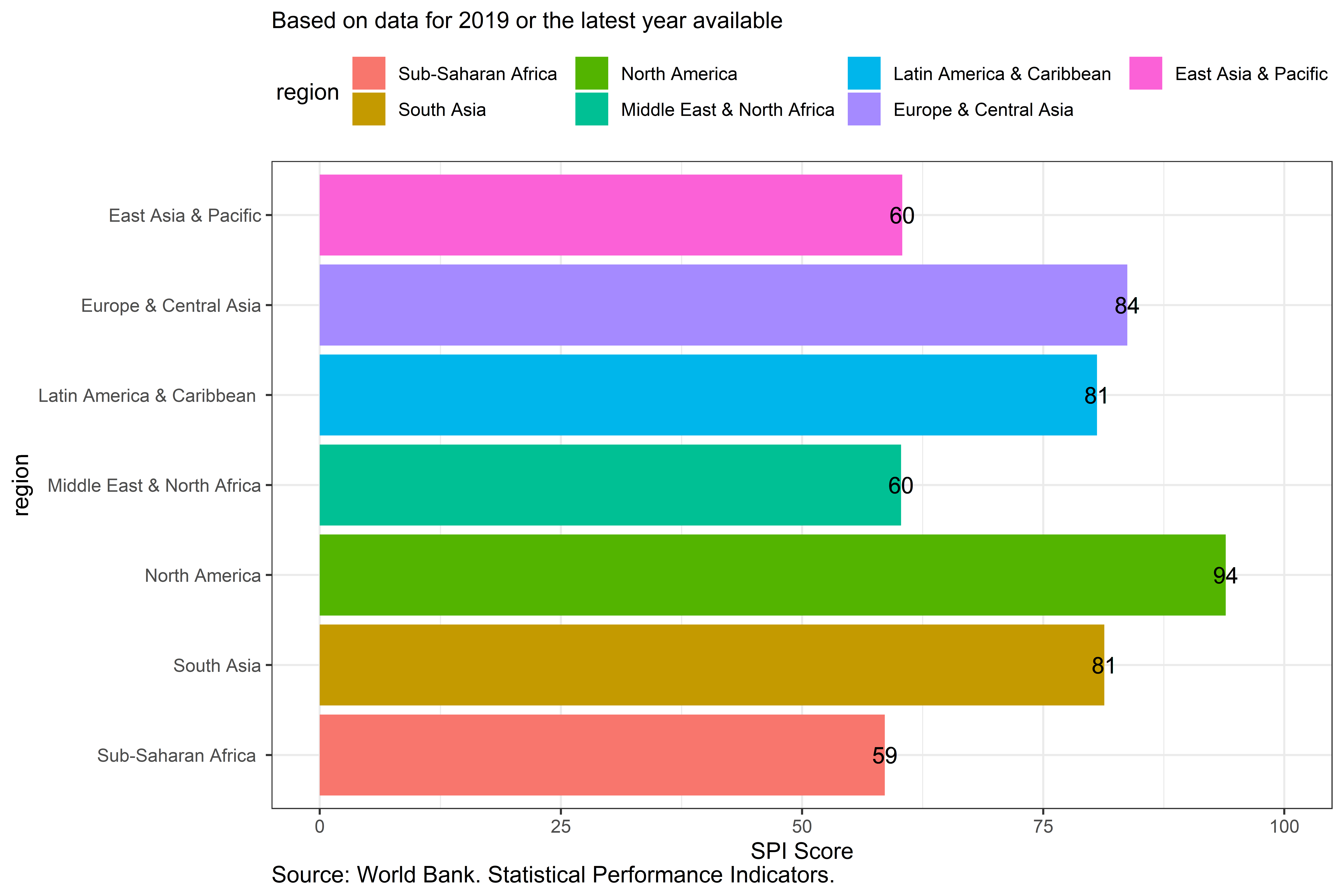
Figure 3.26:
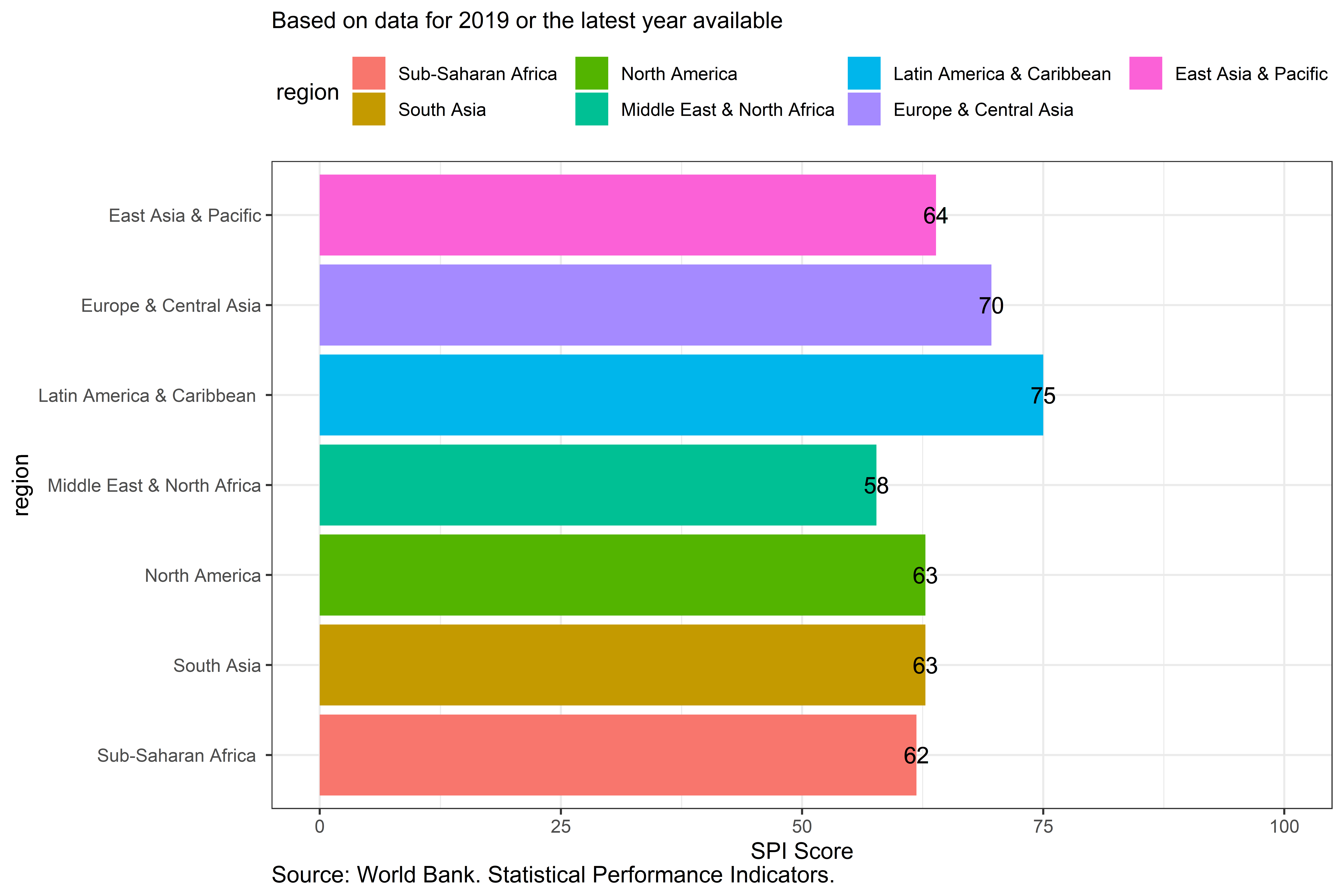
Figure 3.27:
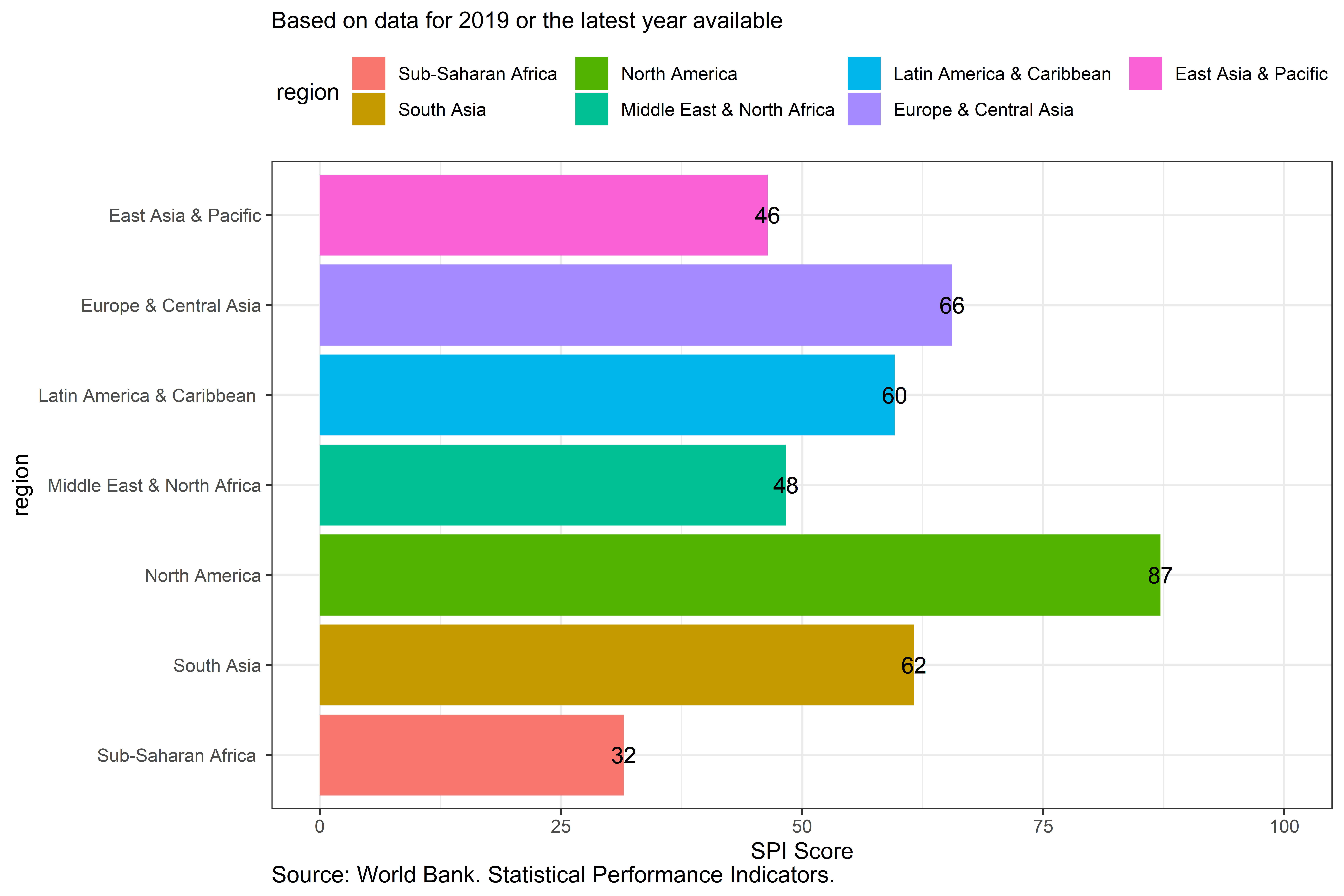
Figure 3.28:
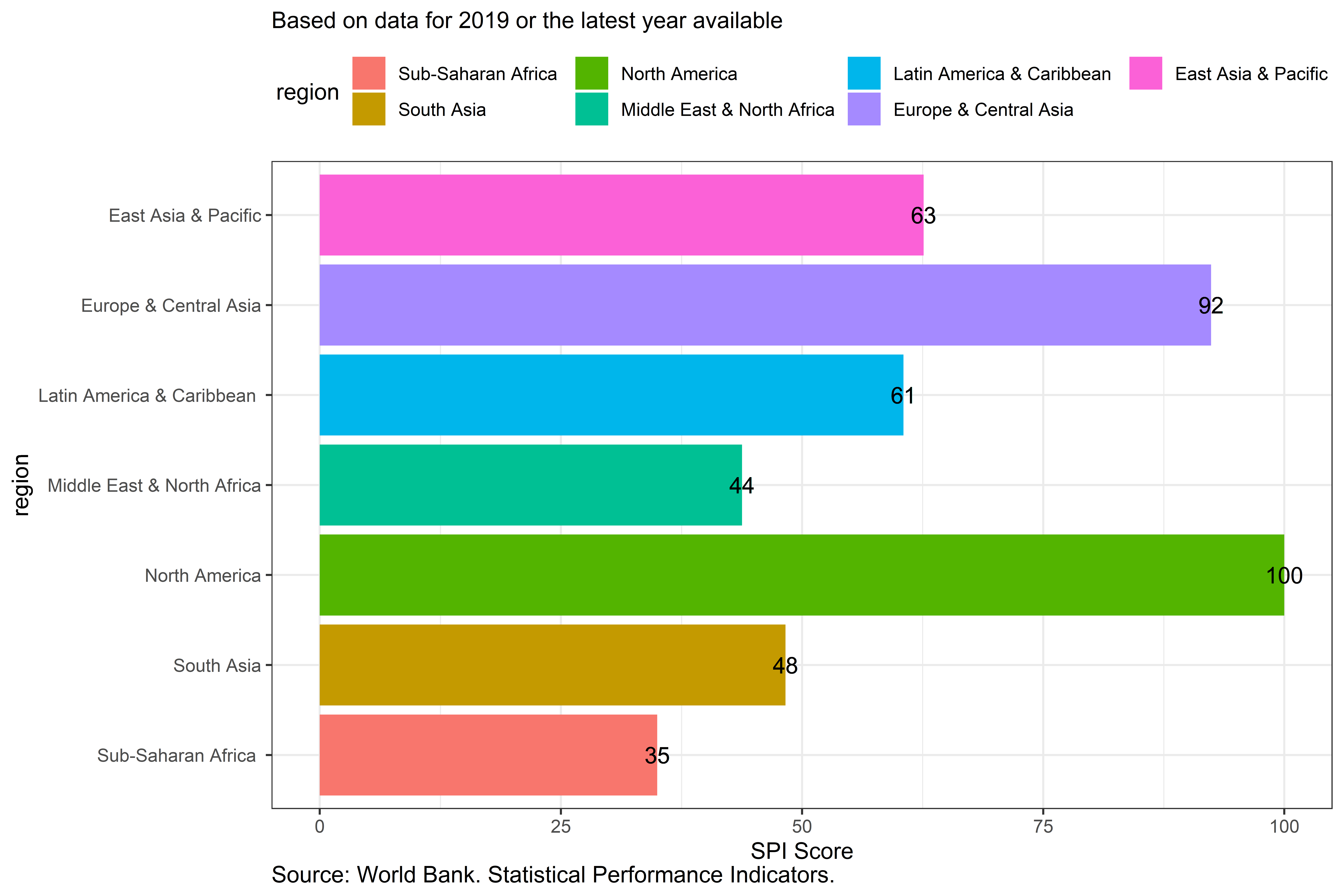
Figure 3.29:
3.0.6.4 Comparison to other measures of statistical performance
Next, the SPI is compared with several other indices of statistical performance that have been created. This provides a sense of how rankings differ across measures, how they correlate with other outcomes, and how the distributions of scores compare. These are the SCI, the Open Data Watch index (ODIN), and version 0 of the SPI overall score that was produced in [@cameron2019measuring]
We first compare the SPI overall score to the older World Bank Statistical Capacity Index. The correlation between the SPI overall score and the SCI is 0.765.
Figure A.6: Scatterplot of Statistical Capacity Index (SCI) and SPI Overall Score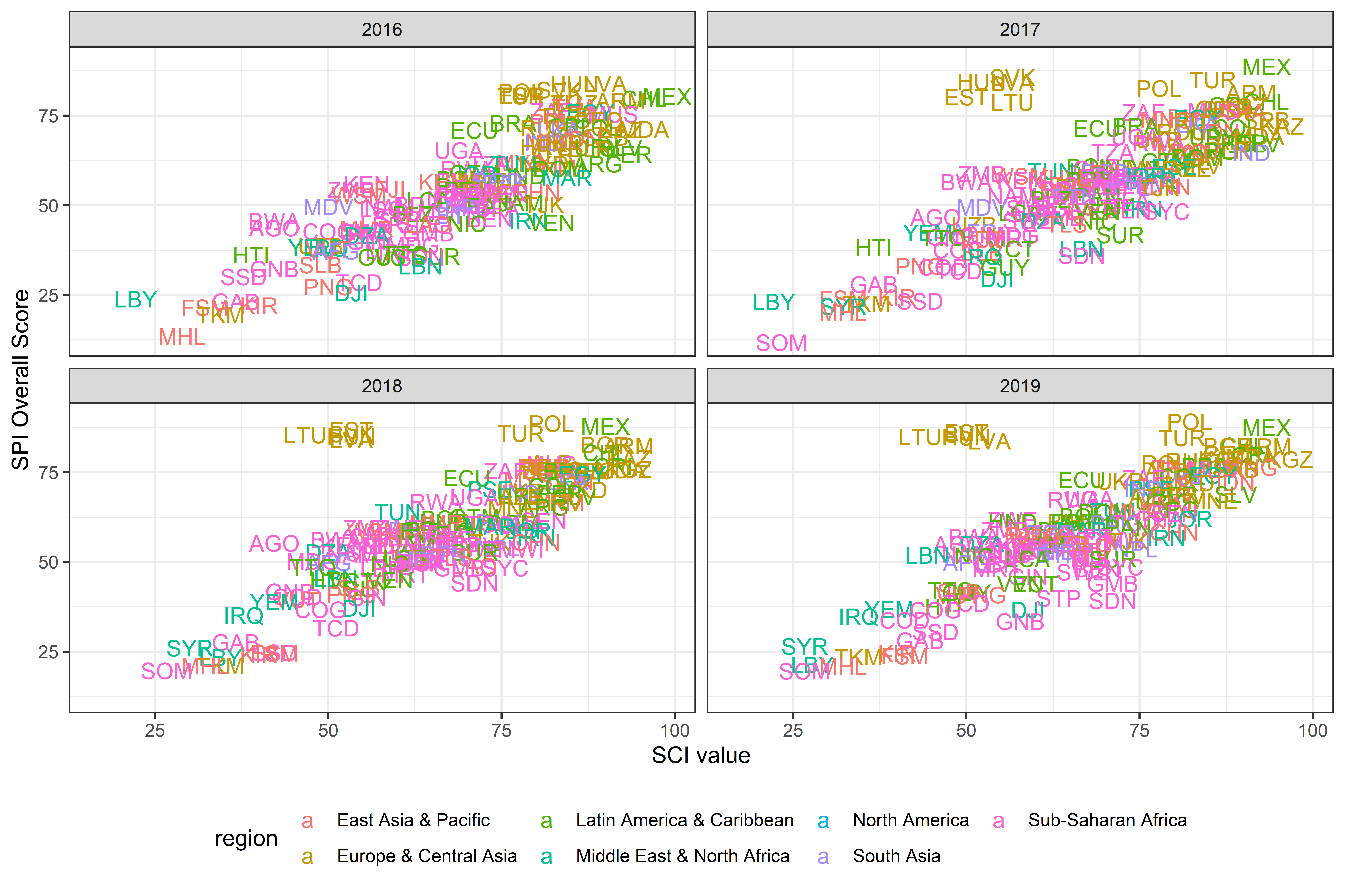
Figure 3.30:
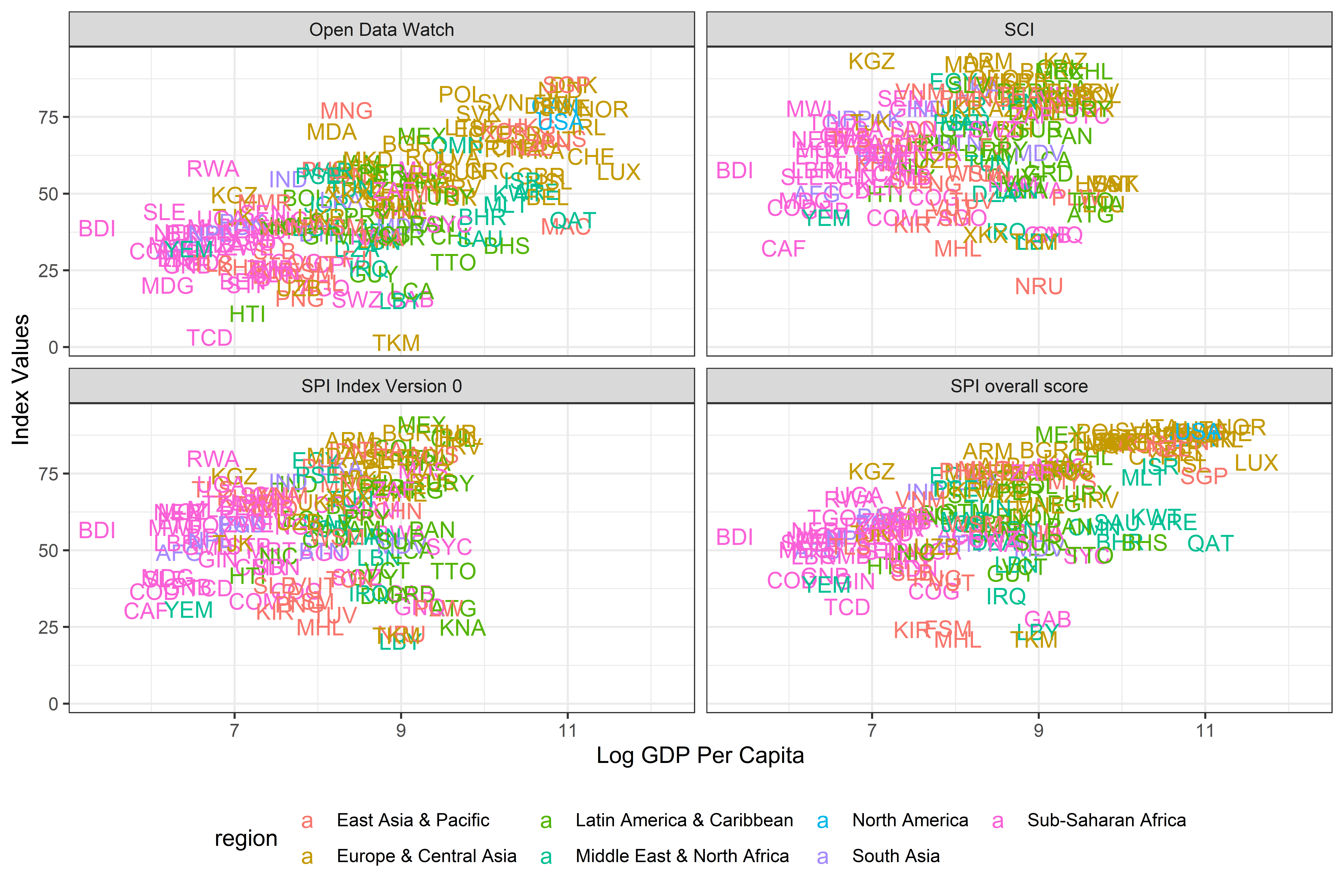
Next, the relationship is shown between Log GDP per capita, the SCI and the SPI overall score using linear regression. The Open Data Watch ODIN score and the version of the Statistical Performance Index developed in [@cameron2019measuring] are also included. While showing a strong relationship between an index and log GDP per capita does not mean the index is necessarily correct, and is certainly not necessarily causal, it does provide a face validity check of the index. Heteroskedasticity robust standard errors are shown in the table.
Overall, the new SPI overall score has the strongest relationship to GDP per capita. The linear regression estimates indicate that a 1% increase in GDP per capita is associated with a 0.1 point increase in the SPI overall score. The r-squared from this regression is 0.38.
Table A.6: Relationship between Statical Performance Measures and GDP per capita.
SPI overall score | SCI | Open Data Watch | SPI Version 0 | |
Log GDP per Capita | 7.10 *** | 2.71 *** | 7.31 *** | 3.84 *** |
(0.30) | (0.58) | (0.34) | (0.77) | |
Year: 2017 | 2.18 | -1.40 | 0.53 | -0.06 |
(1.55) | (1.90) | (1.43) | (1.90) | |
Year: 2018 | 4.73 ** | -2.67 | 4.64 ** | 4.48 * |
(1.51) | (1.85) | (1.48) | (1.94) | |
Year: 2019 | 5.57 *** | -2.40 | 5.09 *** |
|
(1.47) | (1.85) | (1.46) |
| |
Intercept | -2.33 | 45.79 *** | -22.18 *** | 23.02 *** |
(2.76) | (4.73) | (3.00) | (6.07) | |
N | 668 | 572 | 686 | 417 |
R2 | 0.38 | 0.04 | 0.39 | 0.07 |
*** p < 0.001; ** p < 0.01; * p < 0.05. Heteroskedasticity Robust Std Errors in Parenthesis | ||||
Source: World Bank. Statistical Performance Indicators. | ||||
(\#fig:scispiregtab)
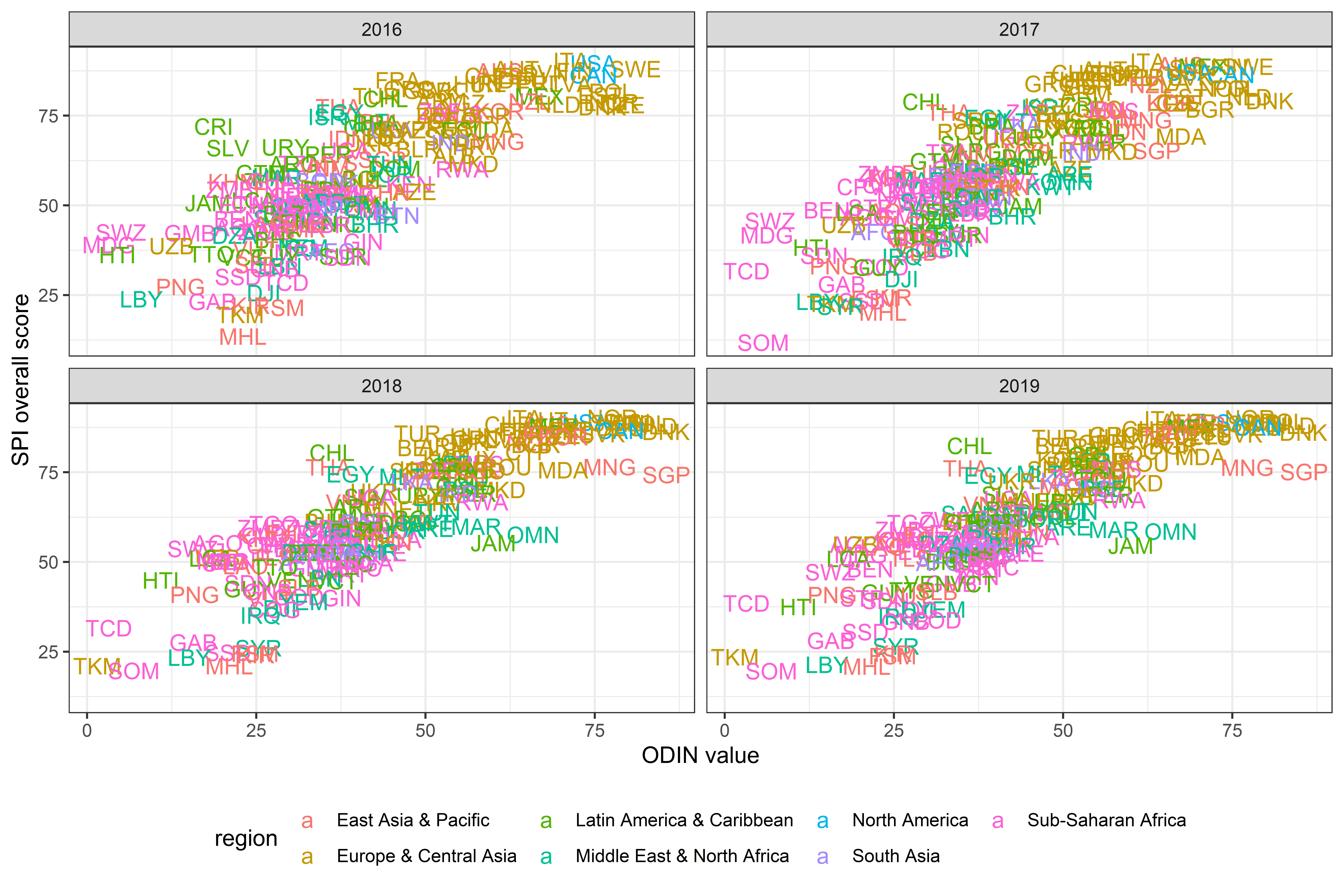
(\#fig:odin)
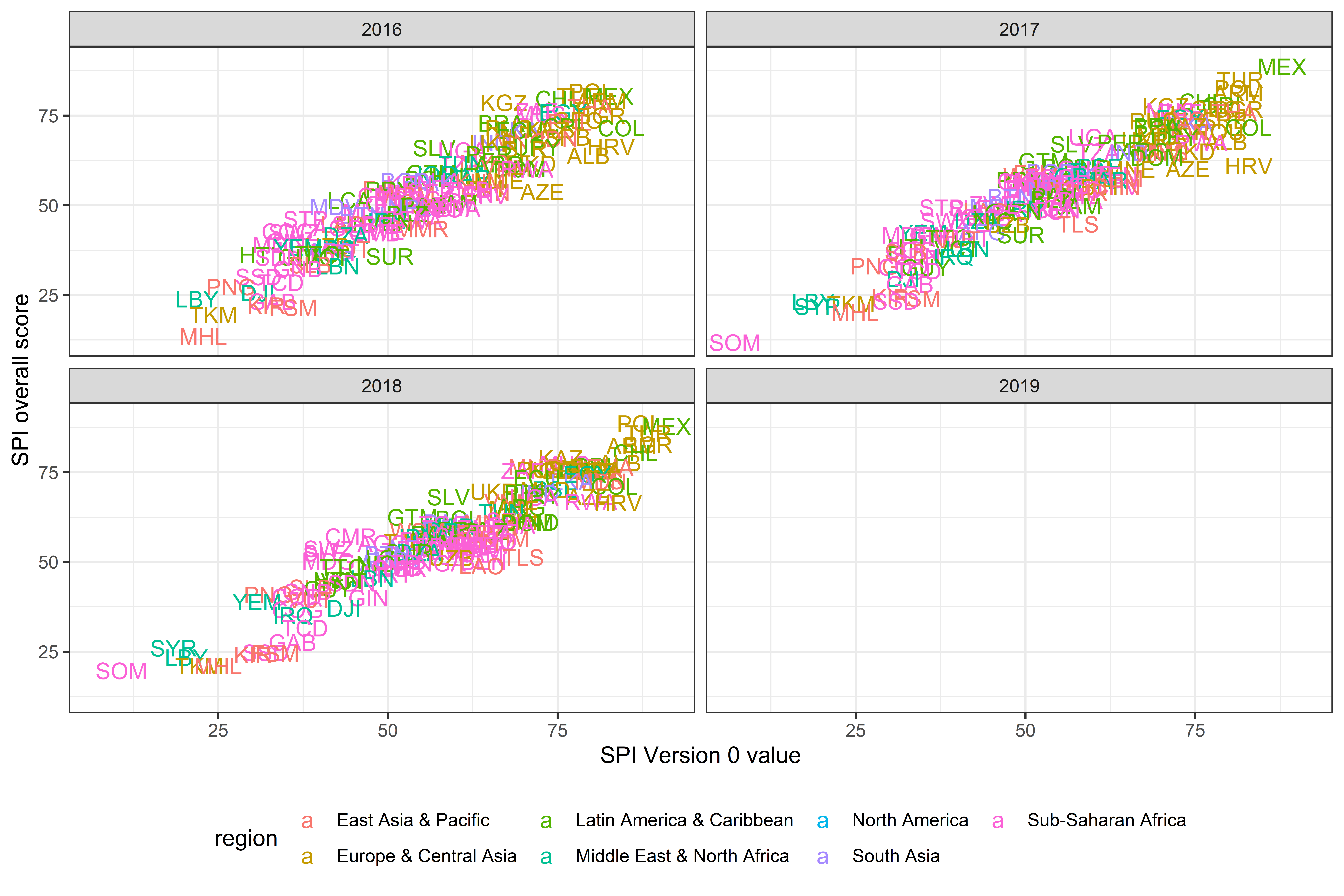
(\#fig:spiv0)
Goverment Effectiveness | |
SPI Overall Score | 0.020 *** |
(0.002) | |
Log GDP per Capita | 0.502 *** |
(0.015) | |
2017 | -0.059 |
(0.041) | |
2018 | -0.126 ** |
(0.042) | |
2019 | -0.137 ** |
(0.042) | |
Europe & Central Asia | -0.441 *** |
(0.048) | |
Latin America & Caribbean | -0.450 *** |
(0.056) | |
Middle East & North Africa | -0.513 *** |
(0.065) | |
North America | -0.239 ** |
(0.082) | |
South Asia | -0.040 |
(0.083) | |
Sub-Saharan Africa | -0.039 |
(0.054) | |
Intercept | -5.216 *** |
(0.124) | |
N | 668 |
R2 | 0.844 |
*** p < 0.001; ** p < 0.01; * p < 0.05. Heteroskedasticity Robust Std Errors in Parenthesis. | |
Source: World Bank. Statistical Performance Indicators. | |
3.0.6.5 Indicator Metadata
Table A.8: SPI Indicator Metadata
Indicator Name | Dimension | Brief Description | Scoring |
Availability of Comparable Poverty headcount ratio at $1.90 a day (5 year moving average) | Pillar 1.5 | Comparability data from World Bank's Povcalnet | 1 Point. Comparable data lasting at least two years within past 5 years. 0.5 Point. Comparable data lasting at least two years within past 10 years. 0 Points. No comparable data within past 5 years |
Availability of Mortality rate, under-5 (per 1,000 live births) data meeting quality standards according to UN IGME (5 year moving average) | Pillar 1.5 | Child Mortality Metadata from UN IGME | 1 Point. 1 Point. Two indicators that met UN IGME standards within past 5 years. 0.5 Point. Two indicators that met UN IGME standards within past 10 years. 0 Points. No data that met UN IGME standards within past 10 years |
Quality of Debt service data according to World Bank | Pillar 1.5 | Debt Reporting Metadata from World Bank | 1 Points. Actual value. 0.67 Points. Preliminary value 0.33 Points. Estimated value. 0 Points. No value |
Safely Managed Drinking Water | Pillar 1.5 | Availability of Safely Managed Drinking Water data for use by JMP | 1 Point. At least two estimates, with breakdowns for urban/rural areas, within an 8 year window
|
Labor force participation rate by sex and age (%) | Pillar 1.5 | Labor force participation data for use by ILO | 1 Point. Country has a labor force survey based estimate in past 5 years of labor force participation broken down by total, male, and female & estimated value from ILO is within 10 percentage points of value reported by national government.
|
SDDS/e-GDDS subscription | Pillar 2.1 | The Special Data Dissemination Standard (SDDS) and electronic General Data Dissemination Standard (e-GDDS) were established by the International Monetary Fund (IMF) for member countries that have or that might seek access to international capital markets, to guide them in providing their economic and financial data to the public. Although subscription is voluntary, the subscribing member needs to be committed to observing the standard and provide information about its data and data dissemination practices (metadata). The metadata are posted on the IMF’s SDDS and e-GDDS websites. | Point. Subscribing to IMF SDDS+ or SDDS standards 0.5 Points. Subscribing to IMF e-GDDS standards. 0 Points. Otherwise |
ODIN Open Data Openness score | Pillar 2.2 | ODW Openness score | Our source for this indicator is Open Data Watch. Scores range from 0-100. For more details, consult the ODIN technical documentation. |
NSO Website | Pillar 2.3 | New indicator of number of non-recurring products on NSO website (ad hoc/experimental rather than regular releases). The indicator is the number of products found. | No established methodology. |
NADA metadata | Pillar 2.4 | NADA/NSO websites. Statistical systems must be open and transparent about their methods and procedures and provide access to adequate metadata – detailed descriptions of the methods and procedures used to produce the data. | 1 Point. Yes, available. 0 Points. No |
GOAL 1: No Poverty | Pillar 3.1 | SDG Goal 1 data availability. Source: UN Global SDG Indicators Database | Fraction of Indicators in Goal 1 with value produced by countries statistical system within a 5 year window. |
GOAL 2: Zero Hunger | Pillar 3.2 | SDG Goal 2 data availability. Source: UN Global SDG Indicators Database | Fraction of Indicators in Goal 2 with value produced by countries statistical system within a 5 year window. |
GOAL 3: Good Health and Well-being | Pillar 3.3 | SDG Goal 3 data availability. Source: UN Global SDG Indicators Database | Fraction of Indicators in Goal 3 with value produced by countries statistical system within a 5 year window. |
GOAL 4: Quality Education | Pillar 3.4 | SDG Goal 4 data availability. Source: UN Global SDG Indicators Database | Fraction of Indicators in Goal 4 with value produced by countries statistical system within a 5 year window. |
GOAL 5: Gender Equality | Pillar 3.5 | SDG Goal 5 data availability. Source: UN Global SDG Indicators Database | Fraction of Indicators in Goal 5 with value produced by countries statistical system within a 5 year window. |
GOAL 6: Clean Water and Sanitation | Pillar 3.6 | SDG Goal 6 data availability. Source: UN Global SDG Indicators Database | Fraction of Indicators in Goal 6 with value produced by countries statistical system within a 5 year window. |
GOAL 7: Affordable and Clean Energy | Pillar 3.7 | SDG Goal 7 data availability. Source: UN Global SDG Indicators Database | Fraction of Indicators in Goal 7 with value produced by countries statistical system within a 5 year window. |
GOAL 8: Decent Work and Economic Growth | Pillar 3.8 | SDG Goal 8 data availability. Source: UN Global SDG Indicators Database | Fraction of Indicators in Goal 8 with value produced by countries statistical system within a 5 year window. |
GOAL 9: Industry, Innovation and Infrastructure | Pillar 3.9 | SDG Goal 9 data availability. Source: UN Global SDG Indicators Database | Fraction of Indicators in Goal 9 with value produced by countries statistical system within a 5 year window. |
GOAL 10: Reduced Inequality | Pillar 3.10 | SDG Goal 10 data availability. Source: UN Global SDG Indicators Database | Fraction of Indicators in Goal 10 with value produced by countries statistical system within a 5 year window. |
GOAL 11: Sustainable Cities and Communities | Pillar 3.11 | SDG Goal 11 data availability. Source: UN Global SDG Indicators Database | Fraction of Indicators in Goal 11 with value produced by countries statistical system within a 5 year window. |
GOAL 12: Responsible Consumption and Production | Pillar 3.12 | SDG Goal 12 data availability. Source: UN Global SDG Indicators Database | Fraction of Indicators in Goal 12 with value produced by countries statistical system within a 5 year window. |
GOAL 13: Climate Action | Pillar 3.13 | SDG Goal 13 data availability. Source: UN Global SDG Indicators Database | Fraction of Indicators in Goal 13 with value produced by countries statistical system within a 5 year window. |
GOAL 14: Life Below Water | Pillar 3.14 | SDG Goal 14 data availability. Source: UN Global SDG Indicators Database | Fraction of Indicators in Goal 14 with value produced by countries statistical system within a 5 year window. |
GOAL 15: Life on Land | Pillar 3.15 | SDG Goal 15 data availability. Source: UN Global SDG Indicators Database | Fraction of Indicators in Goal 15 with value produced by countries statistical system within a 5 year window. |
GOAL 16: Peace and Justice Strong Institutions | Pillar 3.16 | SDG Goal 16 data availability. Source: UN Global SDG Indicators Database | Fraction of Indicators in Goal 16 with value produced by countries statistical system within a 5 year window. |
GOAL 17: Partnerships to achieve the Goal | Pillar 3.17 | SDG Goal 17 data availability. Source: UN Global SDG Indicators Database | Fraction of Indicators in Goal 17 with value produced by countries statistical system within a 5 year window. |
Population & Housing census (Availability score over 20 years) | Pillar 4.1 | Population censuses collect data on the size, distribution and composition of population and information on a broad range of social and economic characteristics of the population. It also provides sampling frames for household and other surveys. Housing censuses provide information on the supply of housing units, the structural characteristics and facilities, and health and the development of normal family living conditions. Data obtained as part of the population census, including data on homeless persons, are often used in the presentation and analysis of the results of the housing census. It is recommended that population and housing censuses be conducted at least every 10 years. | 1 Point. Population census done within last 10 years. 0.5 Points. Population census done within last 20 years. 0 Points. Otherwise |
Agriculture census (Availability score over 20 years) | Pillar 4.1 | Agriculture censuses collect information on agricultural activities, such as size of holding, land tenure, land use, employment and production, and provide basic structural data and sampling frames for agricultural surveys. Censuses of agriculture normally involves collecting key structural data by complete enumeration of all agricultural holdings, in combination with more detailed structural data using sampling methods. It is recommended that agricultural censuses be conducted at least every 10 years. | 1 Point. census done within last 10 years. 0.5 Points. census done within last 20 years. 0 Points. Otherwise |
Business/establishment census (Availability score over 20 years) | Pillar 4.1 | Business/establishment censuses provide valuable information on all economic activities, number of employed and size of establishments in the economy. Business Register information is establishment-based and includes business location, organization type (e.g. subsidiary or parent), industry classification, and operating data (e.g., receipts and employment). | 1 Point. census done within last 10 years. 0.5 Points. census done within last 20 years. 0 Points. Otherwise |
Household Survey on income, etc (Availability score over 10 years) | Pillar 4.1 | These surveys collect data on household income (including income in kind), consumption and expenditure. They typically include income, expenditure, and consumption surveys, household budget surveys, integrated surveys. It is recommended that surveys on income and expenditure be conducted at least every 3 to 5 years. | 1 Point. 3 or more surveys done within past 10 years. 0.6 Points. 2 surveys done within past 10 years. 0.3 Points. 1 survey done within past 10 years. 0 Points. None within past 10 years |
Agriculture survey (Availability score over 10 years) | Pillar 4.1 | Agricultural surveys refer to surveys of agricultural holdings based on the sampling frames established by the agricultural census. These are surveys on agricultural land, production, crops and livestock, aquaculture, labor and cost, and time use. Some issues, such as gender and food security, are of interest to most agriculture surveys. | 1 Point. 3 or more surveys done within past 10 years. 0.6 Points. 2 surveys done within past 10 years. 0.3 Points. 1 survey done within past 10 years. 0 Points. None within past 10 years |
Labor Force Survey (Availability score over 10 years) | Pillar 4.1 | Labor force survey is a standard household-based survey of work-related statistics at the national and sub-national employment or unemployment levels, rates or trends. The surveys also provide the characteristics of the employed or unemployed, including labor force status by age or gender, breakdowns between employees and the self-employed, public versus private sector employment, multiple job-holding, hiring, job creation, and duration of unemployment. | 1 Point. 3 or more surveys done within past 10 years. 0.6 Points. 2 surveys done within past 10 years. 0.3 Points. 1 survey done within past 10 years. 0 Points. None within past 10 years |
Health/Demographic survey (Availability score over 10 years) | Pillar 4.1 | Health surveys collect information on various aspects of health of populations, such as health expenditure, access, utilization, and outcomes. They typically include Demographic and Health Surveys. It is recommended that health surveys be conducted at least every 3 to 5 years. | 1 Point. 3 or more surveys done within past 10 years. 0.6 Points. 2 surveys done within past 10 years. 0.3 Points. 1 survey done within past 10 years. 0 Points. None within past 10 years |
Business/establishment survey (Availability score over 10 years) | Pillar 4.1 | The business/establishment survey provides information on employment, hours, and earnings of employees from a sample of business establishments including private and public, entities that are classified based on an establishment's principal activity from the business or establishment census. Establishment surveys include surveys of businesses, farms, and institutions. They may ask for information about the establishment itself and/or employee characteristics and demographics. | 1 Point. 3 or more surveys done within past 10 years. 0.6 Points. 2 surveys done within past 10 years. 0.3 Points. 1 survey done within past 10 years. 0 Points. None within past 10 years |
Social Protection Admin (ASPIRE) (5 year moving average) | Pillar 4.2 | Administrative data available on social protection programs from ASPIRE (World Bank) databases | Scoring is 1 if administrative data is available to produce beneficiary counts or expenditures for any social protection and labor program, 0 otherwise. In order to smooth out gaps in reporting, we take a moving 5 year average of the score. |
Education (UNESCO) (5 year moving average) | Pillar 4.2 | Administrative of nationally representative learning assessment | In order to score this indicator, we calculate the fraction of the indicators that were produced in a country in a year. In order to smooth out variation from year to year in reporting or conducting national assessments, we take a moving 5 year average. |
Civil Registration and Vital Statistics (CRVS) system | Pillar 4.2 | Civil Registration and Vital Statistics (CRVS) complete | Birth registrations 90% complete and death registration 75% complete according to UNSD. Score is 1 if both complete, 0.5 if one of two is complete, 0 if neither complete. |
Labor Admin (ILO) (5 year moving average) | Pillar 4.2 | Administrative data available for labor statistics from ILO databases | To produce a score, we calculate the percentage of six admin sources that are available for a country in a given year. In order to smooth out gaps in reporting, we take a moving 5 year average of the score. |
Geospatial data available at 1st Admin Level | Pillar 4.3 | Indicator data availability at sub-national levels | Our source for this indicator is Open Data Watch. Indicator is whether data available at first administrative data level. Scores range from 0-100. For more details, consult the ODIN technical documentation. |
NSO Website | Pillar 4.4 | New indicator based on references to private/citizen generated data in metadata relating to content on NSO website | |
Legislation Indicator based on PARIS21 indicators on SDG 17.18.2 | Pillar 5.1 | Based on PARIS21 indicators on SDG 17.18.2 (national statistical legislation compliance with UN Fundamental Principles of Official Statistics), existence of National Statistical Council, national statistical strategy generation, national statistical plan. Also include some other legislative aspects that foster good use of statistics eg freedom of information, privacy/transparency, good governance (eg free and fair elections). | Scores is 1 if the country has a national statistical legislation compliant with United Nations Fundamental Principles of Statistics. Scores of 0 or scores with missing values are treated the same (both given a score of zero). |
System of national accounts in use | Pillar 5.2 | The national accounts data are compiled using the concepts, definitions, framework, and methodology of the System of National Account 2008 (SNA2008) or European System of National and Regional Accounts (ESA 2010). The manual has evolved to meet the changing economic structure, to follow systematic accounting and ensure international compatibility. | Scoring: 1 point for using SNA2008 or ESA 2010, 0.5 points for using SNA 1993 or ESA 1995. 0 points otherwise |
National Accounts base year | Pillar 5.2 | National accounts base year is the year used as the base period for constant price calculations in the country’s national accounts. It is recommended that the base year of constant price estimates be changed periodically to reflect changes in economic structure and relative prices. | 1 point for chained price, 0.5 for reference period within past 10 years. 0 points otherwise. |
Classification of national industry | Pillar 5.2 | The industrial production data are compiled using the International Standard Industrial Classification of All Economic Activities (ISIC) Rev.4 and Statistical Classification of Economic Activities in the European Community (NACE) Rev.2. ISIC Rev.4 is a standard classification of economic activities arranged so that entities can be classified per the activity they carry out using criteria such as input, output and use of the products produced, more emphasis has been given to the character of the production process in defining and delineating ISIC classes for international comparability. The manual and classification have changed to cover the complete scope of industrial production, employment, and GDP and other statistical areas. | 1 Point. Latest version is adopted (ISIC Rev 4, NACE Rev 2 or a compatible classification). 0.5 Points. Previous version is used (ISIC Rev 3, NACE Rev 1 or a compatible classification). 0 Points. Otherwise |
CPI base year | Pillar 5.2 | Consumer Price Index serves as indicators of inflation and reflects changes in the cost of acquiring a fixed basket of goods and services by the average consumer. Weights are usually derived from consumer expenditure surveys and the CPI base year refers to the year the weights were derived. It is recommended that the base year be changed periodically to reflect changes in expenditure structure. | 1 Point. Annual chain linking. 0.5 Points. Base year in last 10 years. 0 points. Otherwise |
Classification of household consumption | Pillar 5.2 | Classification of Individual Consumption According to Purpose (COICOP) is used in household budget surveys, consumer price indices and international comparisons of gross domestic product (GDP) and its component expenditures. Although COICOP is not strictly linked to any particular model of consumer behavior, the classification is designed to broadly reflect differences in income elasticities. It is an integral part of the SNA1993 and more detailed subdivision of the classes provide comparability between countries and between statistics in these different areas. | 1 Point. Follow Classification of Individual Consumption by Purpose (COICOP). 0 Points. Otherwise |
Classification of status of employment | Pillar 5.2 | Classification of status of employment refers to employment data that are compiled using the current international standard International Classification of Status in Employment (ISCE-93). It classifies jobs with respect to the type of explicit or implicit contract of employment between the job holder and the economic unit in which he or she is employed. Therefore, it aims to provide the basis for production of internationally comparable statistics on the employment relationship, including the distinction between salaried employment and self-employment. | 1 Point. Follow International Labour Organization, International Classification of Status in Employment (ICSE-93) or 2012 North American Industry Classification System (NAICS). 0 Points Otherwise. |
Central government accounting status | Pillar 5.2 | Government finance accounting status refers to the accounting basis for reporting central government financial data. For many countries’ government finance data, have been consolidated into one set of accounts capturing all the central government’s fiscal activities and following noncash recording basis. Budgetary central government accounts do not necessarily include all central government units, the picture they provide of central government activities is usually incomplete. | 1 Point. Consolidated central government accounting follows noncash recording basis. 0.5 Points. Consolidated central government accounting follows cash recording basis. 0 Points. Otherwise |
Compilation of government finance statistics | Pillar 5.2 | Compilation of government finance statistics refers to the Government Finance Statistics Manual (GFSM) in use for compiling the data. It provides guidelines on the institutional structure of governments and the presentation of fiscal data in a format similar to business accounting with a balance sheet and income statement plus guidelines on the treatment of exchange rate and other valuation adjustments. The latest manual GFSM2014 is harmonized with the SNA2008. | 1 Point. Follow the latest Government Finance Statistical Manual (2014)/ ESA2010. 0.5 Points. Previous version is used (GFSM 2001). 0 Points. Otherwise |
Compilation of monetary and financial statistics | Pillar 5.2 | Compilation of monetary and financial statistics refers to the Monetary and Financial Statistics Manual (MFSM) in use. It covers concepts, definitions, classifications of financial instruments and sectors, and accounting rules, and provides a comprehensive analytic framework for monetary and financial planning and policy determination. The Monetary and Finance Statistics: Compilation Guide (2008) provides detailed guidelines for the compilation of monetary and financial statistics in addition to MFSM. | 1 Point. Follow the latest Monetary and Finance Statistics Manual (2000) or Monetary and Finance Statistics: Compilation Guide (2008/2016). 0 Points. Otherwise |
Business process | Pillar 5.2 | The Generic Statistical Business Process Model (GSBPM) aims to describe statistics production in a general and process-oriented way. It is used both within and between statistical offices as a common basis for work with statistics production in different ways, such as quality, efficiency, standardization, and process-orientation. It is used for all types of surveys, and "business" is not related to "business statistics" but refers to the statistical office, simply expressed. | 1 Point. GSBPM is in use. 0 Points. Otherwise |
PARIS21 indicator on data literacy | Pillar 5.3 | PARIS21 indicators such as statistical society presence and data literacy. PARIS21 may also have material on Internal skills capacity and numbers of statistically qualified people in the country. | The source is Paris 21. Score ranges from 0 to 100. Following the PARIS21 scoring, the score is the weighted sum of each of the four components’ scores, whose relative weight is reported in brackets: i) Basic Consideration (25%); ii) Diagnosis and quantification (24%); iii) Statistical Analysis (22%); iv) Disaggregation (29%). |
Partnerships | Pillar 5.4 | New indicator based on textual analysis of NSS reports/websites for references to partner organisations. | |
Finance Indicator based on PARIS21 indicators on SDG 17.18.3 & SDG 17.19.1 | Pillar 5.5 | Indicator based on PARIS21 SDG indicators (SDG 17.18.3 (national statistical plan that is fully funded and under implementation) and SDG 17.19.1 (value of resources made available to strengthen statistical capacity)). Could also incorporate indicator of NSO budget as a percentage of GDP. | Scores is 1 if the country has a national statistical plan that is fully funded and under implementation. Scores of 0 or scores with missing values are treated the same (both given a score of zero). |
Source: World Bank. Statistical Performance Indicators. | |||
3.0.7 References
SDG 14 - Life Below Water - is omitted because land-locked countries do not report on these indicators.↩︎
An earlier version of the journal publication was released as a World Bank Policy Research paper, [@cameron2019measuring]↩︎
All tables and figures show unweighted summary statistics (i.e. the summary statistics do not weight by population).↩︎
For more information, see https://ddialliance.org/↩︎
To understand what effect taking the log has on this correlation, the correlation in 2019 between (non-logged) GDP per capita and the SPI overall score is 0.58.↩︎
For more details, visit the Human Capital Index website↩︎
Detailed documentation of the WGI, interactive tools for exploring the data, and full access to the underlying source data available at www.govindicators.org. The WGI are produced by Daniel Kaufmann (Natural Resource Governance Institute and Brookings Institution) and Aart Kraay (World Bank Development Research Group).↩︎