from wbpyplot import wb_plot
import numpy as np Getting Started
wbpyplot Python package
matplotlib and plotly are widely used packages for creating visualizations in Python. The wbpyplotpackage contains a decorator function to apply the World Bank data visualization style to matplotlib or plotly visualizations. You can find the underlying code to generate this theme at htps://github.com/worldbank/wbpyplot. The data visualization style guide can be found at https://wbg-vis-design.vercel.app/.
Installation
The package is still under active development and is not yet available on PyPi. Installation instructions are provided in the GitHub repo.
Using the package
With the package loaded into your Python session, you can add the @wb_plot decorator to your matplotlib or plotly graph to style it. It will turn this…
import matplotlib.pyplot as plt

def scatter_plot(axs):
    np.random.seed(0)
    x = np.random.normal(50000, 15000, 100)
    y = np.random.normal(75, 10, 100)

    axs.scatter(x, y, label="Countries")
    axs.set_xlabel("GDP per capita (USD)")
    axs.set_ylabel("Life expectancy (years)")
    axs.legend()

fig, ax = plt.subplots()

scatter_plot(ax)

plt.show()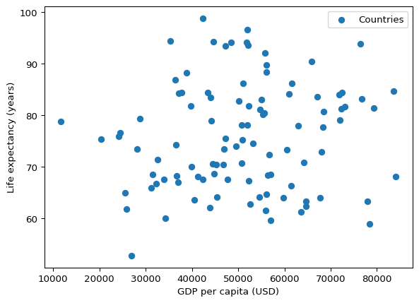
into this!
Scatterplot
@wb_plot(
    title="GDP vs Life Expectancy",
    subtitle="Scatterplot of synthetic data",
    note=[("Source:", "World Bank (fictional).")],
)
def scatter_plot(axs):
    np.random.seed(0)
    x = np.random.normal(50000, 15000, 100)
    y = np.random.normal(75, 10, 100)

    axs[0].scatter(x, y, label="Countries")
    axs[0].set_xlabel("GDP per capita (USD)")
    axs[0].set_ylabel("Life expectancy (years)")


scatter_plot()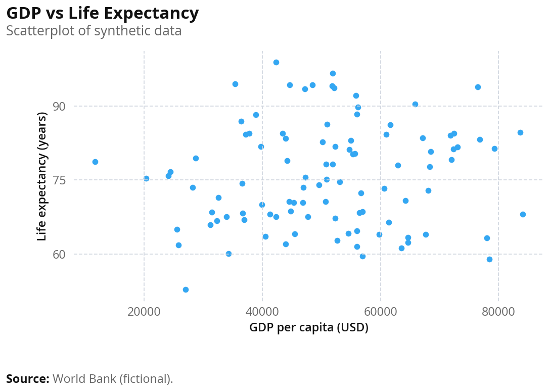
Feel free to switch between matplotlib and plotly by specifying the backend: "plotly" or "matplotlib" – it’s matplotlib by default.
This page recreates the wbplot R package examples from the World Bank data visualization style guide using wbpyplot. The same chart types (scatter, line, bar) are shown with the World Bank theme applied. Beeswarm plots are not yet supported in wbpyplot.
from wbpyplot import wb_plot
import pandas as pd
import numpy as np

gapminder = pd.read_csv("Gapminder Data.csv")
continents = gapminder["continent"].unique().tolist()
Scatter plot
Richer countries have higher life expectancy — GDP per capita (PPP) vs life expectancy at birth, colored by continent. Uses the wb_categorical palette (Gapminder data: country, continent, year, lifeExp, pop, gdpPercap).
@wb_plot(
    title="Richer countries have higher life expectancy",
    subtitle="GDP (per capita $ PPP) vs total life expectancy at birth (years)",
    note=[("Source:", "Gapminder / World Bank.")],
    palette="wb_categorical",
    legend_title="Region",
    width=650,
    height=800,
    dpi=100
)
def scatter_by_region(axs):
    ax = axs[0]
    for cont in continents:
        mask = gapminder["continent"] == cont
        ax.scatter(
            gapminder.loc[mask, "gdpPercap"],
            gapminder.loc[mask, "lifeExp"],
            label=cont,
        )
    ax.set_xlabel("GDP per capita")
    ax.set_ylabel("Life expectancy")

scatter_by_region()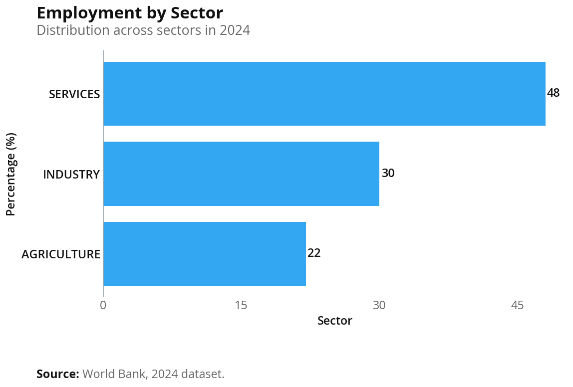
@wb_plot(
    title="Richer countries have higher life expectancy",
    subtitle="GDP (per capita $ PPP) vs total life expectancy at birth (years)",
    note=[("Source:", "Gapminder / World Bank.")],
    palette="wb_categorical",
    legend_title="Region",
    width=650,
    height=800,
    backend="plotly",
)
def scatter_by_region_plotly(fig, gapminder, continents):
    for cont in continents:
        mask = gapminder["continent"] == cont
        fig.add_scatter(
            x=gapminder.loc[mask, "gdpPercap"],
            y=gapminder.loc[mask, "lifeExp"],
            name=cont,
            mode="markers",
        )
    fig.update_layout(
        xaxis_title="GDP per capita",
        yaxis_title="Life expectancy",
    )

scatter_by_region_plotly(gapminder, continents)
Line plot
Multi-series time series in World Bank style: Y-axis label only, no vertical grid or x-axis title. Uses the default categorical palette for the series.
@wb_plot(
    title="Government investment in key sectors",
    subtitle="Spending from 2018 to 2024 (adjusted for inflation)",
    note=[
        ("Source:", "National Treasury Budget Papers"),
        ("Note:", "Data adjusted to 2024 dollars using CPI."),
    ],
    width=650,
    height=500,
    dpi=100
)
def line_plot(axs):
    ax = axs[0]
    x = np.arange(2018, 2025)
    y1 = [10, 15, 20, 23, 25, 27, 30]
    y2 = [5, 8, 12, 16, 20, 21, 24]
    y3 = [2, 4, 8, 10, 15, 18, 20]

    ax.plot(x, y1, label="Education")
    ax.plot(x, y2, label="Healthcare")
    ax.plot(x, y3, label="Transport")
    ax.set_ylabel("Funding (AU$ millions)")

line_plot()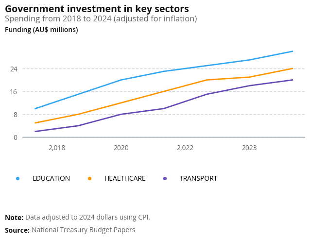
x = np.arange(2018, 2025)
y1 = [10, 15, 20, 23, 25, 27, 30]
y2 = [5, 8, 12, 16, 20, 21, 24]
y3 = [2, 4, 8, 10, 15, 18, 20]

@wb_plot(
    title="Government investment in key sectors",
    subtitle="Spending from 2018 to 2024 (adjusted for inflation)",
    note=[
        ("Source:", "National Treasury Budget Papers"),
        ("Note:", "Data adjusted to 2024 dollars using CPI."),
    ],
    width=650,
    height=500,
    backend="plotly",
)
def line_plot_plotly(fig, x, y1, y2, y3):
    fig.add_scatter(x=x, y=y1, name="Education", mode="lines")
    fig.add_scatter(x=x, y=y2, name="Healthcare", mode="lines")
    fig.add_scatter(x=x, y=y3, name="Transport", mode="lines")
    fig.update_layout(yaxis_title="Funding (AU$ millions)")

line_plot_plotly(x, y1, y2, y3)
Bar chart
Bar chart with the World Bank theme: horizontal grid removed, x-axis on top, bold bar labels. Value labels can be added via the bar container if desired.
@wb_plot(
    title="Employment by sector",
    subtitle="Distribution across sectors in 2024",
    note=[("Source:", "World Bank, 2024 dataset.")],
    width=650,
    height=450,
    dpi=100
)
def bar_plot(axs):
    sectors = ["Agriculture", "Industry", "Services"]
    values = [22, 30, 48]

    ax = axs[0]
    bars = ax.barh(sectors, values, label="Share of employment")
    ax.set_ylabel("Percentage (%)")
    ax.set_xlabel("Sector")

bar_plot()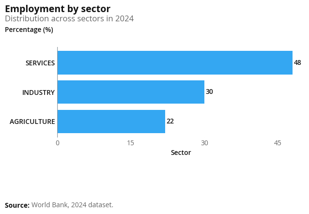
sectors = ["Agriculture", "Industry", "Services"]
values = [22, 30, 48]

@wb_plot(
    title="Employment by sector",
    subtitle="Distribution across sectors in 2024",
    note=[("Source:", "World Bank, 2024 dataset.")],
    width=650,
    height=450,
    backend="plotly",
)
def bar_plot_plotly(fig, sectors, values):
    # Horizontal bar: categories on Y, values on X (zero line runs along X axis)
    fig.add_bar(y=sectors, x=values, orientation="h", name="Share of employment")
    fig.update_layout(
        xaxis_title="Percentage (%)",
        yaxis_title="Sector",
    )

bar_plot_plotly(sectors, values)
Map example
Both Plotly and matplotlib can draw choropleth maps with country-level data. Below we use Gapminder (2007) and map life expectancy by country. Each map is built inside a @wb_plot-decorated function so it gets the same World Bank styling (title, subtitle, notes, fonts). The matplotlib map requires geopandas (pip install geopandas).
gm_map = gapminder[gapminder["year"] == 2007][["country", "lifeExp"]].copy()import geopandas as gpd
# Natural Earth 110m countries (merge on name; some Gapminder names may not match)
world_url = "https://naciscdn.org/naturalearth/110m/cultural/ne_110m_admin_0_countries.zip"
world = gpd.read_file(world_url)
world = world.merge(gm_map, left_on="NAME", right_on="country", how="left")
@wb_plot(
title="Life expectancy by country (2007)",
subtitle="Gapminder data",
note=[("Source:", "Gapminder.")],
width=700,
height=450,
palette="wb_seq_bad_to_good"
)
def map_plot_mpl(fig, axs, world):
ax = axs[0]
world.plot(column="lifeExp", ax=ax, legend=True, legend_kwds={"label": "Life expectancy (years)"}, cmap="Blues", missing_kwds={"color": "lightgray"})
map_plot_mpl(world)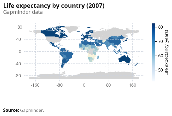
import warnings
import plotly.express as px

@wb_plot(
    title="Life expectancy by country (2007)",
    subtitle="Gapminder data",
    note=[("Source:", "Gapminder.")],
    width=700,
    height=450,
    backend="plotly",
    palette="wb_seq_bad_to_good"
)
def map_plot(fig, gm_map):
    with warnings.catch_warnings():
        warnings.simplefilter("ignore", DeprecationWarning)
        px_fig = px.choropleth(
            gm_map,
            locations="country",
            locationmode="country names",
            color="lifeExp",
        )
    fig.add_trace(px_fig.data[0])
    if hasattr(px_fig.layout, "geo") and px_fig.layout.geo is not None:
        fig.update_layout(geo=px_fig.layout.geo)

map_plot(gm_map)
For more control (custom colors, annotations, or other basemaps), you can extend the geopandas example or use folium; both work well with Quarto.
Beeswarm
Beeswarm plots are shown in the style guide wbplot examples but are not yet supported in wbpyplot. Use the R package wbplot or Flourish templates for beeswarm charts.