poverty_lines <- c(1.9, 3.2, 5.5, 15)
df <- map_dfr(poverty_lines, povcalnet_wb)
out <- df %>%
filter(year >= 1990,
regioncode %in% c("SSA", "EAP")) %>%
select(povertyline, regioncode, regiontitle, year, headcount) %>%
mutate(
povertyline = round(povertyline * 100, 1),
headcount = headcount * 100
) %>%
pivot_wider(names_from = povertyline,
names_prefix = "headcount",
values_from = headcount) %>%
mutate(
percentage_0 = headcount190,
percentage_1 = headcount320 - headcount190,
percentage_2 = headcount550 - headcount320,
percentage_3 = headcount1500 - headcount550,
percentage_4 = 100 - headcount1500
) %>%
select(regioncode, regiontitle, year, starts_with("percentage_")) %>%
pivot_longer(cols = starts_with("percentage_"),
names_to = "income_category",
values_to = "percentage") %>%
mutate(
income_category = recode(income_category,
percentage_0 = "Poor IPL (<$1.9)",
percentage_1 = "Poor LMIC ($1.9-$3.2)",
percentage_2 = "Poor UMIC ($3.2-$5.5)",
percentage_3 = "$5.5-$15",
percentage_4 = "Middle class (>$15)"),
income_category = as_factor(income_category),
income_category = fct_relevel(income_category, rev)
)
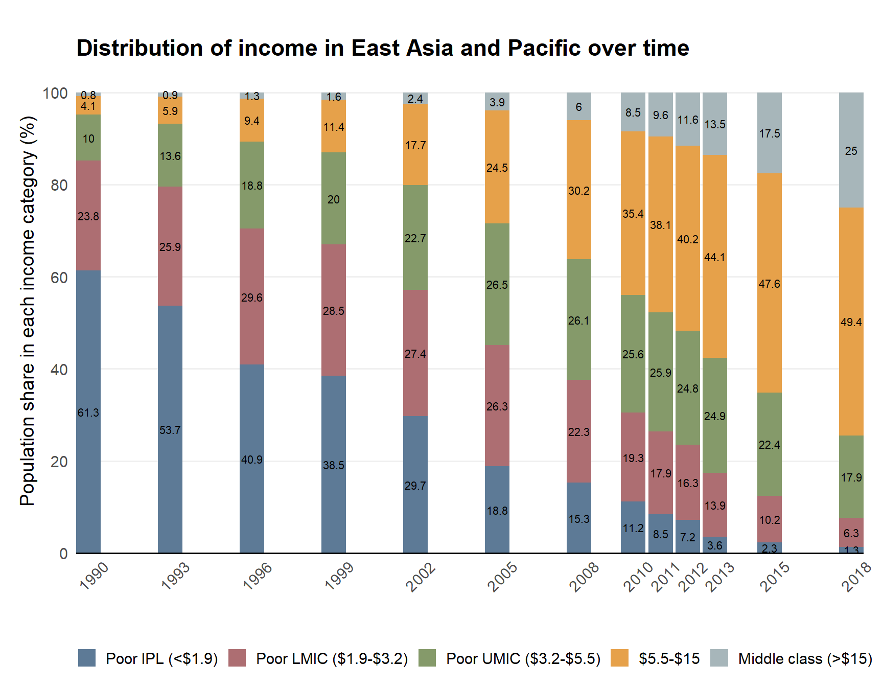
ggplot(out[out$regioncode == "EAP",], aes(x = year, y = percentage, fill = income_category)) +
geom_bar(stat = "identity") +
geom_text(aes(label = round(percentage, 1)),
position = position_stack(0.5),
size = rel(2.9)) +
scale_fill_manual(values = c("#a7b6ba", "#e6a14a", "#859a6a", "#ad6e72", "#5d7a96")) +
scale_y_continuous(breaks = c(0, 20, 40, 60, 80, 100)) +
scale_x_continuous(breaks = unique(out$year)) +
labs(
title = "Distribution of income in East Asia and Pacific over time",
y = "Population share in each income category (%)",
x = ""
) +
coord_cartesian(ylim = c(0, 105), expand = FALSE) +
guides(fill = guide_legend(reverse = TRUE)) +
theme_classic(base_size = 14) +
theme(plot.title = element_text(face = "bold",
size = rel(1.2)),
axis.text.x = element_text(angle = 45,
margin = margin(t = 10)),
axis.line.y = element_blank(),
axis.line.x = element_line(colour="black"),
axis.ticks = element_blank(),
panel.grid.major.y = element_line(colour="#f0f0f0"),
legend.position = "bottom",
legend.direction = "horizontal",
legend.key.size= unit(0.5, "cm"),
legend.margin = unit(0, "cm"),
legend.title = element_blank(),
plot.margin=unit(c(10,5,5,5),"mm"),
strip.background=element_rect(colour="#f0f0f0",fill="#f0f0f0"),
strip.text = element_text(face="bold")
)
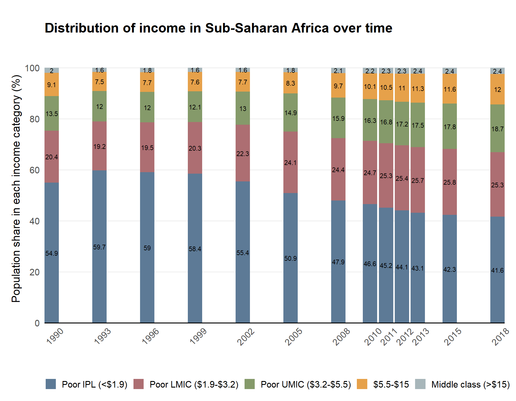
ggplot(out[out$regioncode == "SSA",], aes(x = year, y = percentage, fill = income_category)) +
  geom_bar(stat = "identity") +
  geom_text(aes(label = round(percentage, 1)),
            position = position_stack(0.5),
            size = rel(2.9)) +
  scale_fill_manual(values = c("#a7b6ba", "#e6a14a", "#859a6a", "#ad6e72", "#5d7a96")) +
  scale_y_continuous(breaks = c(0, 20, 40, 60, 80, 100)) +
  scale_x_continuous(breaks = unique(out$year)) +
  labs(
    title = "Distribution of income in Sub-Saharan Africa over time\n",
    y = "Population share in each income category (%)",
    x = ""
  ) +
  coord_cartesian(ylim = c(0, 105), expand = FALSE) +
  guides(fill = guide_legend(reverse = TRUE)) +
  theme_classic(base_size = 14) +
  theme(plot.title = element_text(face = "bold",
                                  size = rel(1.2)),
        axis.text.x = element_text(angle = 45,
                                   margin = margin(t = 10)),
        axis.line.y = element_blank(),
        axis.line.x = element_line(colour="black"),
        axis.ticks = element_blank(),
        panel.grid.major.y = element_line(colour="#f0f0f0"),
        legend.position = "bottom",
        legend.direction = "horizontal",
        legend.key.size= unit(0.5, "cm"),
        legend.margin = unit(0, "cm"),
        legend.title = element_blank(),
        plot.margin=unit(c(10,5,5,5),"mm"),
        strip.background=element_rect(colour="#f0f0f0",fill="#f0f0f0"),
        strip.text = element_text(face="bold")
  )